DOI: 10.14714/CP95.1601
© by the author(s). This work is licensed under the Creative Commons Attribution-NonCommercial-NoDerivatives 4.0 International License. To view a copy of this license, visit http://creativecommons.org/licenses/by-nc-nd/4.0.
Review of Data Visualization: Charts, Maps, and Interactive Graphics
By Robert Grant
CRC Press, 2019
218 pages, 125 figures
Hardcover: $79.96, ISBN 978-1-138-55359-0
Paperback: $23.96, ISBN 978-1-138-70760-3
eBook: $23.96, ISBN 978-1-315-20135-1
Review by: Sarah Kelly, University of Colorado Boulder
Daily, we encounter an overwhelming amount of quantitative data presented through figures, graphics, and maps, and yet we often underestimate or neglect the power of visualization to meaningfully summarize data. Visualizing data requires summarizing its complexity into something easily digestible. But details are lost during the process, and so it’s important to understand how different visualization techniques affect what is finally presented to the reader. Being that there is no single best way in which to visualize any particular dataset, familiarity with a variety of techniques is imperative. Robert Grant’s book, Data Visualization: Charts, Maps, and Interactive Graphics, provides the reader with a wealth of techniques to effectively visualize different types of data, and discusses how to avoid common visualization pitfalls. With seventeen short chapters, along with 125 illustrative graphics, the book is a quick read and immediately useful to anyone who needs to communicate data—including, the author tells us in his preface, data managers, data scientists, and journalists.
The preface explains how and why the book is broken down into its three main sections. Section I is titled “The basics,” and has two chapters that discuss why we should visualize data. Section II, “Statistical building blocks,” consists of four chapters that introduce the reader to basic statistical theory, and can serve as either a refresher for those familiar with statistics or as a very brief overview for those who are not. Section III, “Specific tasks,” covers a wide variety of topics—including uncertainty, time analysis, and machine learning—spread over ten chapters. The author recommends that everyone should read Section I; Section II could be skipped entirely by readers with some experience with statistics; and a reader might, based on their interests, pick and choose which chapters to read in Section III. The preface then goes on to explain that the main goal of the book is to “provide a brief overview of techniques and tools, while all the time emphasizing statistical reasoning. . .” (xxiv). The author also makes clear what is not included in the book—topics such as the visualization of qualitative data, the representation of data with sound, and the affordance of accessibility for the visually impaired. The preface wraps up with a short list of definitions for a few of the terms used in the book, a reference that is particularly helpful for those new to data visualization or statistics.
Chapter 1, entitled “Why visualize?”, introduces the science behind the human brain’s ability to recognize and interpret patterns. Grant explains that data analysts should create visualizations that can guide the reader through the data while still allowing them to make their own interpretation of the information presented. The way to accomplish this, he stresses, is to favor simplicity over complexity. He illustrates this principle with a simple scatterplot, annotated with information about its respective parts, and discusses how a reader is meant to interpret the information contained in it. The chapter continues with a section on best practices for communicating whatever message an analyst wishes to present without overwhelming the reader. The need for visualizations, and the importance of knowing your audience before selecting the type or types of visualization to use are both noted, along with the four questions that all data analysts should ask themselves before making any visualization decisions (12):
- “What is the message?”
- “What parts of the data are evidence for it?”
- “What other parts need to be shown for contrast/context?”
- “Do I/we know how to do this, or can we learn it/adapt someone else’s work, or do we need to hire in?”
The author recommends that data analysts be familiar with a wide range of tools and methods, rather than any one particular software or technique, and, in any event, suggests sketching out ideas for visualization before moving to a software platform.
Chapter 2, “Translating numbers in images,” focuses on a visual design process for presenting data successfully. By showing the same data on different types of plots, the author demonstrates how simple changes can make visualizations easier to understand and more effective. In his first example, Grant shows how a graph can reveal trends in data over time by translating a scatterplot of train delays to a line plot. The same train delay data is then plotted on a year-period grid that uses changes in color to highlight when most delays occur, by year, and by time within the year. This graphic segues into a discussion of visual parameters—such as symbol length and rendering volume in two dimensions—and of the data types these parameters are best used to represent. The author touches again on the need to know the target audience, and specifically on the importance of knowing with which visual parameters the audience will be familiar. Color hue, value, and saturation are discussed in a bit of useful detail, but not in enough detail for someone unfamiliar with color systems to be able to successfully apply them to graphics. The depiction of volumetric data as a two-dimensional symbol is always problematic, and the author explores a few interesting alternatives, such as what the author calls pictographic and photographic “montages” (or what I might call “composites”) to show some kinds of data, such as percentages of delayed trips or levels of traffic congestion. The use of pie and donut charts is discouraged as potentially misleading, but some alternatives are offered that may be easier for viewers to interpret. Grant concludes the chapter by briefly mentioning the importance of effectively annotating graphics and of including user testing in the design process.
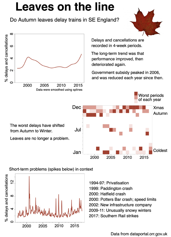
Figure 1. Different visualizations of train delay data.
“Continuous and discrete numbers,” the third chapter—and the first in Section II, “Statistical building blocks”—starts with a very brief discussion of the difference between these two types of numbers and how to tell them apart. The first section of the chapter presents examples of various ways to display one continuous variable, including the use of histograms and kernel density plots, along with a sidebar on how to read such distributions. Methods for transforming skewed data are mentioned, but very little explanation is provided about which transformations would be most appropriate to use in which situations. The author then moves on to discuss matched and unmatched data, and provides examples of datasets and graphics for both situations, including a graphic showing small multiples. The chapter concludes with a section on one of the most important concepts for those new to statistics: correlation versus causation.
Chapter 4, “Percentages and risks,” is similar in format and breadth to Chapter 3, with a different focus. Simple concepts such as percentages versus proportions, the importance of sample size, and binary versus non-binary response data are presented. Matched and unmatched data are again compared, illustrated with examples of waffle plots, ternary plots, stacked bar charts, and clustered bar charts. Associations between variables are also mentioned once more, but here it is specifically in regard to percentage and risk data, with decision trees and waffle plots used to demonstrate effective visualization. Finally, risks, rates, and odds are succinctly discussed.
The next chapter (Chapter 5), “Showing data or statistics,” aims to guide the reader through the process of deciding whether the raw data, or statistics created from the data, should be visualized. The reader is warned against using statistics that just appear interesting, or using them only because they show the conclusion desired. Next, the chapter explains some of the most commonly used statistics, including standard deviation (along with the fact that it requires normally distributed data). Quantiles and skewed data are discussed with a complex box-and-whiskers plot given as an example. Data trimming is first mentioned in this section, but it is not made very clear when or if such methods should be employed. Finally, the smoothing of data for showing long-term trends is explained, but, as with trimming, it is not discussed in enough detail to allow one to understand which method to use and when to use it.
“Differences, ratios, and correlations” (Chapter 6) discusses each of these concepts, but of the three, only correlations are given in sufficient detail for anyone not already familiar with such statistics to be able to grasp the concepts. Making up the bulk of the chapter’s content, they, at least, are explained well, with multiple graphics used to display the strength of association of correlation coefficients, and the different methods for determining correlations.
Chapter 7, “Visual perception and the brain,” is the start of Section III, “Specific tasks.” The author begins by discussing the need for graphics to be clear and to draw attention to the specific message that the analyst wants to convey. Data smoothing is specifically recommended as a good way to visualize overall data trends, even when the background data is also displayed; unfortunately, the technique is still not discussed in useful detail. In reviewing some of the perceptual challenges, Grant once again notes some of the challenges in representing volumetric data, and touches on other representation issues, such variations in cultural associations (for example, in some cultures red means danger, and in others, happiness). Finally, optical illusions such as the café wall (in which parallel, straight dividing lines between staggered rows with alternating contrasting elements can appear to be sloped) and the Ebbinghaus illusion (where the perception of the relative size of an element is affected by the size of surrounding shapes) are presented.
The representation of uncertainty is an often overlooked subject within data visualization. Thankfully, Chapter 8, “Showing uncertainty,” provides an overview of the sources of uncertainty and the importance of showing it, as well as several effective methods for doing so. Bootstrapping, confidence regions, and Bayesian statistics are all discussed here.
Chapter 9, “Time trends,” examines how to visualize data over time using more advanced graphics. Examples here include the use of color on connected scatterplots and the employment of arrows to represent the direction of change through time. Using statistical information that describes change over time raises some special considerations; these are dealt with in their own section within the chapter, along with methods for displaying uncertainty over time.
The tenth chapter, “Statistical predictive models,” moves into more robust statistical methods that can be used to predict future outcomes. The simplest and most straightforward model presented is linear regression. Residuals, root mean squared (RMS) error, and cross validation are also explained. Next, the slope of the regression line and the meaning of the regression coefficient are discussed. The chapter then moves on to logistic regression. Binary outcomes and odds ratios are explained, along with the difficulties one might encounter in presenting them. How and why an analyst should consider using interaction terms in regression are mentioned as well. Semi- and non-parametric models are introduced briefly before the book moves on to determining model fit. The chapter concludes with a section on computer simulation for statistical modeling.
The “Machine learning techniques” chapter introduces the reader to a myriad of unique and advanced technological approaches for modeling and displaying data. Each topic presented—including regression trees, random forests, and support vector machines—is succinctly described. Neural networks and deep learning are also mentioned, along with a detailed illustration of a TensorFlow playground used to visualize how neural networks fit predictions to a data set.
In the next chapter, “Many variables,” Grant introduces a variety of visualization methods and graphic examples for working with multivariate data. The chapter begins by touching on some of the decisions an analyst must make, such as what variables (if any) to leave out, which visual parameters to utilize, and whether or not multiple visualizations better suit the data than a single graphic. Small multiples—one of the simplest and most straightforward methods—is the first one presented. Wireframe plots and 3D bar graphs are recommended for visualizing three continuous variables, heat maps for visualizing distances, and dendrograms for cluster analysis.
Chapter 13, “Maps and networks,” starts by going over some of the basic concepts, such as coordinate projections, map context, user testing, and generalization, to be considered when mapping data. However, these topics are not described or discussed in enough detail to be very useful to even a novice mapmaker. The example maps presented in the next section help make up for the lack of discussion of basic mapping concepts, but are not enough to replace formal cartographic visualization training. Choropleth maps, cartograms, dot density maps, flow maps, small multiples, and contour plots are discussed briefly, but proportional and graduated symbol maps are not—although there is again reference to issues concerning the perception of relative area. Uncertainty, too, is referenced again, but this time in regard to spatial autocorrelation. Lastly, flow maps and radial networks are given as examples of the spatial representation of networks.
Several ways of incorporating interactivity into data visualizations, specifically in web applications, are covered in Chapter 14, and live, interactive examples of the options discussed are available through links to the author’s website (robertgrantstats.co.uk/dataviz-book.html). He explores a range of interactivity levels, from simple to moderately complex, and briefly goes over online methods for analyzing spatial data as well. The chapter concludes with the important topics of online security and data confidentiality.
The last two chapters round out the book with a look at “Big data” (Chapter 15), and “Visualization as part of a bigger package” (Chapter 16). The concept of big data is explained, and recommendations are made on how to visualize data that can be “too big” and/or “too fast.” The author also discusses how to combine and juxtapose multiple types of visualizations into a bigger package such as a dashboard or a poster, and how to incorporate user testing into the project development cycle to ensure the package is successful in getting the information across.
Not mentioned in the book’s preface is Section IV, “Closing remarks.” It provides the reader with a list of skill-developing resources and a chapter-by-chapter list of websites and books for the data and graphics used along with additional books for future reading specific to chapter topics. There are, however, neither any actual remarks, nor any neat wrapping up of the concepts presented—and while the book may not need such remarks, this final section should be renamed to match its content more appropriately.
Overall, this book is a great resource for anyone working in data visualization. With just over two hundred pages, many dominated by graphics, it is a quick read that introduces a plethora of visualization techniques. Most of the example graphics are simple and effective demonstrations, and are taken from a variety of fields. The importance of clear and effective graphics, driven by a clear understanding of the visualization’s target audience, is emphasized throughout the book. The lists of further readings and the materials available in the final section of the book and the author’s GitHub site (github.com/robertgrant/dataviz-book) serve as great resources for deeper dives into the information and graphics presented.
However, many of the book’s topics are covered in such brevity that the reader is often required to utilize additional resources, such as those provided in Section IV, for further explanation; readers without a background in statistics will likely need to look even further afield. Furthermore, some of the example graphics seem obscure and will likely be confusing to any novice data analyst. It was also disappointing to find that, despite having the term “Maps” featured in the title, Data Visualization: Charts, Maps, and Interactive Graphics has only 14 pages dedicated to mapping.
Despite the brevity with which each topic is covered, this book serves as a great primer to the multitude of techniques available to data analysts and meets its goal of providing a “broad overview that covers a lot but not in great detail” (xxiii). With so many practicing data science professionals having never received any formal training in visualization, there is a clear and pressing need for it to be read widely. Whether new to the field of data science or an experienced practitioner, all readers can benefit from Data Visualization: Charts, Maps, and Interactive Graphics, and I expect that it will inspire many analysts to explore the broad field of data visualization even further.