DOI: 10.14714/CP96.1635
© by the author(s). This work is licensed under the Creative Commons Attribution-NonCommercial-NoDerivatives 4.0 International License. To view a copy of this license, visit http://creativecommons.org/licenses/by-nc-nd/4.0.
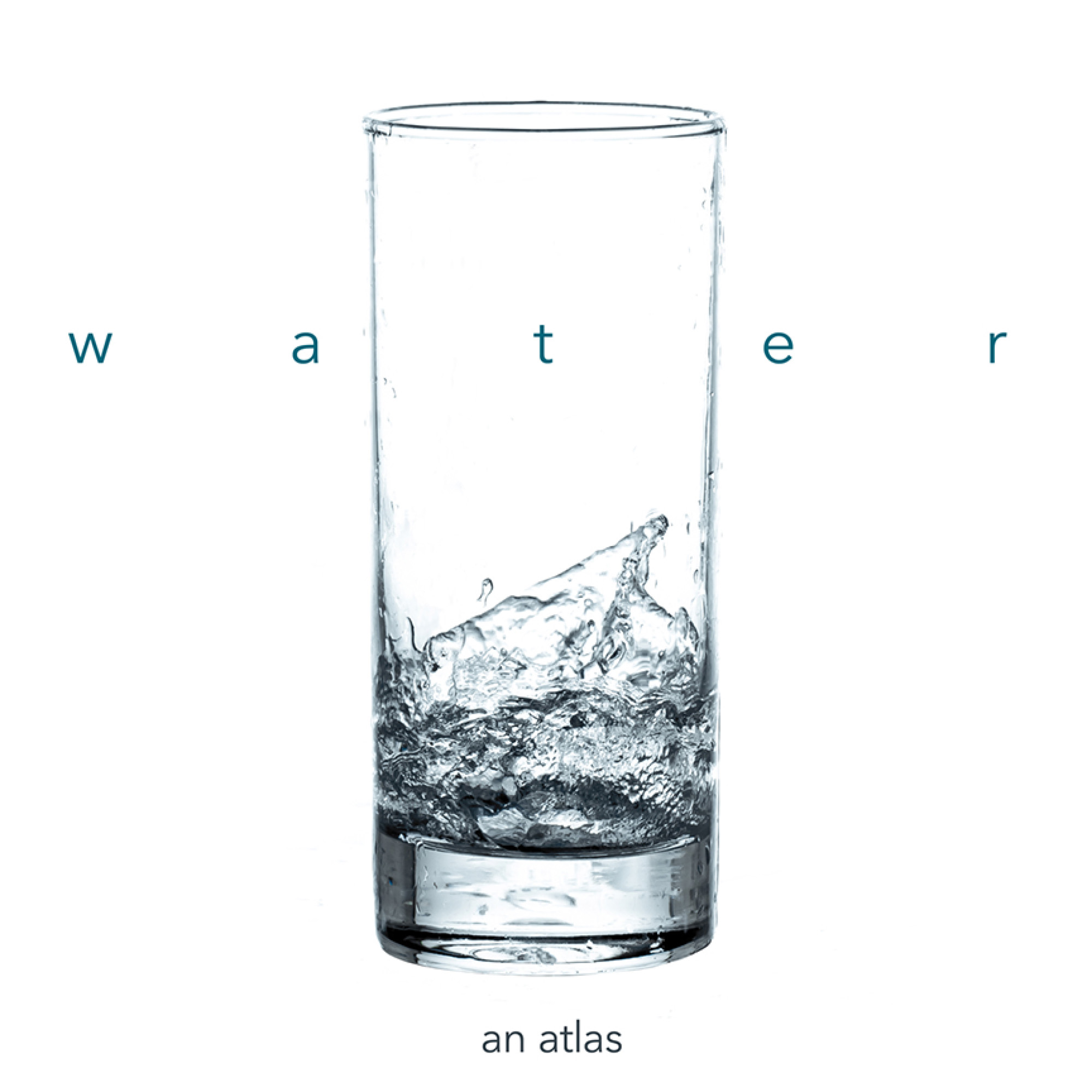
Review of Water: An Atlas
Edited by Darin Jensen, Alicia Cowart, Susan Powell, Molly Roy, Chandler Sterling, and Maia Wachtel
Guerrilla Cartography, 2017
208 pages, 74 maps, 19 illustrations
Softcover: $40.00, ISBN 978-0-9884272-2-8
Hardcover: $80.00, ISBN 978-0-9884272-2-8
Review by: Abraham Kaleo Parrish, University of Miami
Water: An Atlas is a crowdsourced thematic publication focused on water issues around the world. Unlike a traditional thematic atlas—one that covers a particular subject over a specific geography and seeks to construct a focused narrative from its material—this work is more like a curated anthology of maps about water. Its 74 maps were contributed by 134 authors—enthusiasts, activists, academics, resource regulators, resource managers, and scientists—working either individually or collaboratively, in groups of up to seven. Each map presents its own particular issue framed from its own particular viewpoint, and approached in its own, often unique, way. The atlas distilled from this material does not attempt to force any grand narrative upon its contents, but rather allows its diversity to show how complex and varied the issue of water really is.
Most of the mapmakers represented in the atlas are American, and this may explain the fact that 31 of the 74 maps depict North America. There are also, however, substantial contributions from creators from all over the world, and that diversity is reflected in the overall geographic scope. Maps of the world are the second most numerous (17), followed by Asia (10), Africa (6), Europe and Oceania (4 each), and lastly South America, with only two maps. The various maps in the collection range in scale from small world maps at 1:130,000,000 up to some local area maps at about 1:5,000.
The contents are organized into eight chapters, each more or less representing a loosely watery topic—“Imagination,” “Place,” “Habitat,” “Control,” “(Over)Use,” “Politics,” “Pollution,” and “Climate”—with between eight and fourteen maps each, followed by a chapter entitled “Exploration” with activities for kids. Each chapter opens with a short introductory paragraph or two provided by the editors, but these serve more as a description of the chapter’s theme than as an analysis of its contents—very much in keeping with the overall editorial approach that prevails throughout the atlas, of letting the map creators express their viewpoints and tell their own stories.
In one of the three introductory essays, editor Darin Jensen describes Guerrilla Cartography (guerrillacartography.org) as “an atlas publisher with a mission to widely promote the cartographic arts and facilitate the expansion of the art, methods, and thematic scope of cartography, through collaborative projects” (xv). This atlas certainly delivers on that mission, but with varying degrees of success. While I found the majority of maps to be very engaging, drawing me in for a significant amount of time, there were a number that were significantly less so, eliciting just a few moments of interest before I moved on to the next.
Some of the aspects of the cartographic arts Jensen sees himself and his fellow editors promoting include aesthetic concerns, technical accuracy, thematic clarity, qualitative descriptive text, and supplemental graphics—including pictorial illustrations, conceptual diagrams and quantitative statistical visualizations. The editors view them all as contributing to the expression of the overall point the creator is trying to communicate to the reader through the map.
The editors see data projection and scale as key components of mapmaking’s technical accuracy aspect, and several projects incorporating interesting and pertinent projections can be found throughout the atlas. Sarah Dorrance’s “Synergy: a Buckminster Fuller World Map Projection” (34) in the “Imagination” chapter utilized (as advertised) a Fuller projection. The map, a mosaic assembly of ceramic tiles, is abstract in appearance—yet it carries real information about mean low oceanic water temperatures while simultaneously functioning as a decorative art piece. Benjamin D. Henning’s Where the Algae Grow (56) makes use of a gridded cartogram to reveal long-term ocean and large lake chlorophyll concentration estimates in an effective way.
Henning’s cartogram is interesting, but Atlanta architect Chuck Clark takes geographic geometry to an extreme by using his own non-Euclidean world projection to create two of the most interesting, beautiful, and technical maps I have ever seen. Clark’s composition, entitled Two Complementary World Maps With Constant-Scale Natural Boundaries Composed to Show Watersheds and Currents with Uninterrupted(!) Oceans (40) utilizes his Constant-Scale Natural Boundary projection, which he describes as a foldable projection geometry requiring “hand plotting with Renaissance-era tools and skills” (41). Each map depicts the worldwide movement pattern of water as it drains from mountains to circulate in the “closed lake” (40) we usually think of as the oceans, and then, in the complementary map, shows it again—inside out! This is a pair of maps that must be seen to be appreciated. The volume and usability of the detail on this map—the indication of inter-basin waterways, the selection of landmarks along edges/divides, and the way the Panama and Suez Canals are depicted as looping around through the non-space of the projection interruptions—provide just the right amount of locational information to allow and facilitate a good read of the geography on this unusual and (at first) seemingly disorienting projection without over-cluttering the space. This, along with his balanced composition, excellent use of color—especially the comprehensive elevation symbolization spanning both land and water—not only places this map among the best this atlas has to offer, but produces a uniquely comprehensive and comprehendable map of planetary hydrology that stands with the best in any atlas.
There were some other examples of maps in the atlas, however, with projections that I think were less than ideally suited for the information and message they were attempting to convey. Water Depletion in Global Watersheds (96) by Kate A. Brauman, Perrine Laroche, and Natalee Desotell in the “Over(Use)” chapter presents us with an equirectangular projection when something equal area would have been better suited to a map trying to show the percentage area of world water depletion. Compounding the problem, the legend for the map mixes quantitative percentage depletion categories (e.g., 5–25%) with two qualitative categories: “Dry-Year” and “Seasonal.” Furthermore, the text explains that the percentage depletion is based on water availability between 1971 and 2000, but the water use data is just for 2005. Thus, not only is water depletion—either as a volume or as a proportion—hard to gauge, but the ranges and categories of data values are vague. An accompanying logarithmic graph, with consumption by sector, does not make anything any clearer, leaving me uninterested in the map.
The use of color, composition, and style are tools for the cartographer aiming to produce beautiful, attractive maps, and are key elements in the cartographic arts that Jensen tells us were central to the atlas curators. Aesthetic signals are an important part of communicating a message—they draw the reader’s attention, and keep that attention focused long enough for the reader to discover the map’s message or to appreciate its artisanship.
Some of the map creators focused their efforts mostly on aesthetics. Louis Paul White’s Whales of Alaska (66) could have been an uninteresting map, but for the highly stylized watercolor-like appearance of Alaska and surrounding oceans, the mystical looking north arrow, the migration routes indicated with a curved string of whale species names, and the amazingly detailed line drawings of whale types sorted by size in the legend. White utilizes a variety of elegant fonts for labels and is very creative in arranging them. For example, while his mountain ranges are labeled rather conventionally with curved text, he labels selected mountain peak labels with a text triangle—the mountain name forming the peak top and the elevation (in feet) serving as the slightly rockered bottom. This gives a nicely stylized and distinguished label for these features that contrasts well with the impressionistic coloring of the base map, which by itself gives only vague indication of the presence of mountains. White’s composition is spot-on, with a textured seascape (that is just as interesting as the landscape), sprinkled with lens flare effects, one of which focuses your attention on the shield-shaped cartouche and another on a nicely illustrated sperm whale in the Gulf of Alaska that appears to be vomiting up pink ambergris. Along with the use of color and style, the composition provides a nice balance to this map, and, like the extremely valuable end product of ambergris, White has produced a valuable aesthetic work of cartography. Most importantly, I believe, he has captured the essence of whales in his cartographic style by evoking feelings of magic, majesty, and elegance.
By contrast, some of the other maps in Water succeeded in communicating pertinent data, but left me aesthetically disappointed. One such map is How Much Water do we use to Raise Catfish? (Amanda Buczynski et al., 106), unnecessarily cluttered by a thicket of call-out arrows. There were also maps that were visually appealing, but could have done a better job of communicating. Greg Fiske’s Yukon River Delta (178) displays a beautiful Landsat false-color composite image of the Yukon River delta, and points out how the “spectral band combination” he chose to use “reveals the vast complexity of the water-dominated landscape.” The text mentions how fires and melting permafrost contribute to carbon loss to the atmosphere, but it remains unclear what this map was intended to show. The reader is told the colors represent some sort of “complexity,” but without any indication as to what the complex of colors might mean. Furthermore, a regional inset map showing recent and historical burn areas shows clearly that the main image includes only a tiny (although, no doubt significant on the ground) burn zone—one that seems, frankly, indistinguishable on the main map.
Supplemental illustrations and data graphics can add a lot of weight to a message conveyed through cartography. This atlas has no shortage of these elements, and some of the best are demonstrated in Martino Correggiari’s Fog Collection: Alternative Technology for Local Water Projects (76). It features a detailed illustration of advection fog collection equipment and set-up, and another of a system installed in the Chilean Atacama coastal mountain range, alongside a world map showing locations of current and potential fog collection projects by type. There is also a small but cleverly designed high-data-density chart showing the surprising amount of water that can be collected with this technology, accompanied by succinct, descriptive text. Altogether, through clarity and context at multiple scales, Correggiari communicates his message promoting this alternative technology very effectively.
In contrast, I felt Bartlett, Gibbs, and Sweely’s map of Aquaponics in California: Potential Agricultural Water Savings (108) fell short of its potential for communicating this equally interesting alternative technology. There is a schematic diagram of the aquaponics cycle, and some text stating that it has potential to save what may or may not be be significant volumes of water, but it is all presented without significant context. It would have been more informative to, for example, provide statistics on current water-use volumes, allowing a comparison to the size of the claimed savings. An illustration of the mechanics of the technology would also have been useful. I, myself, was at first imagining farmers harvesting fish waste and sprinkling it as fertilizer on plants, but, upon further research, I discovered the method is actually a symbiotic combination of aquaculture with hydroponics—growing plants with their roots dipping into water (instead of soil) in tanks used for raising aquatic animals, such as fish. None of this was revealed clearly in the map.
In the atlas’ opening essay, Maps as Story, Douglas Gayeton tells of situations where maps communicate by presenting coherent stories (a language) to impart understandability to the geography. That the opposite also happens is evidenced by Susan Powell’s map, Counties in Mongolia Containing Color-named Lakes (46). In this situation it is that which is found in the world—the geography—that formatively influences the language used to discuss it and thus the way it is understood. Some years ago, Susan Powell and I were librarians for the same map collection, and I remember discussing with her how the Hawaiian words for north and south were the same as the words for left and right, indicating that the cultural direction of the Hawaiians was eastward facing. Susan, who had spent a substantial amount of time in Mongolia and was fluent in the language, shared that the Mongolian words for east and west were the same as the words for right and left—making south the Mongolian cultural direction. Our theory was that this influence on language was due to geography, particularly in relation to the sun. In this case, Hawaii is practically on the Tropic of Cancer, where the sun always rises close to due East, while Mongolia is much further north, where the sun is mostly in the southern sky and yurt doors always face south. I was impressed to see Susan’s map illustrating the influence geography asserts on language, applied to the realm of lake names in Mongolia.
Although Water: An Atlas was never meant to be comprehensive, consistent, or cohesive, I would have liked to have seen the editors work into their chapter descriptions a bit more analysis of what they saw as the significance of the maps they chose to include. Without their guidance, I was forced to find my own way of approaching the contents. I found it useful to explore the atlas in different sequences—looking, for example, at the seven maps of California that are scattered among the chapters, or viewing various maps of overlapping geographic areas as temporal comparisons. A section about the backgrounds, influences, experiences, and philosophies of some of the map creators as cartographers and storytellers would also have been interesting. Much as the life of an artist in an art history book reveals certain things about their artwork, it would be interesting to learn what it was that led these mapmakers to the variety of perspectives expressed in the atlas.
Overall, this atlas has a substantial number of high quality maps communicating a variety of interesting perspectives on the topic of water. The collection meets the goal set out by the editors to use this crowdsourced, collaborative project to widely promote and expand the cartographic arts, its methods, and its thematic scope. I rate Water: An Atlas as a good value in terms of the quality and quantity of maps, and appreciate the generously wide, 30 centimeter, page size. This atlas is a great resource for cartographers or map enthusiasts looking for a wide variety of examples of contemporary cartographic techniques.
Water: An Atlas takes its place beside Guerrilla’s earlier publication, Food: An Atlas, and, after reviewing this one, I know I am looking forward to whatever comes next from the Guerrilla Cartography community.
[note from the CP Reviews editor: That would be Atlas in a Day: Migration, featured in Cartographic Perspectives 94.]