DOI: 10.14714/CP97.1671
© by the author(s). This work is licensed under the Creative Commons Attribution-NonCommercial-NoDerivatives 4.0 International License. To view a copy of this license, visit http://creativecommons.org/licenses/by-nc-nd/4.0.
James Monteith: Cartographer, Educator, and Master of the Margins
Andrew Rhodes (he/him), Washington Map Society | andy@thinkinginspace.net
James Monteith (1831–1890) was a leading figure in American geography education in the late nineteenth century, but his career has been largely forgotten and his contribution to cartography has been underappreciated. Monteith’s maps and geography textbooks were targeted at the general reader, but included innovative ways to highlight comparative spatial relationships. Much of the text in Monteith’s books is typical of that found in other works of the period, but his geography volumes included unique illustrations to help the reader visualize terrain on a continental scale and place individual maps in a global context. Monteith produced fairly pedestrian maps in his books but surrounded them with remarkable symbology and amplifying data that ought perhaps to earn him the title “master of the margins.”
KEYWORDS: James Monteith (1831–1890); geography textbooks; cartography; map symbols; map margins; nineteenth century education; comparative geography
James Monteith (1831–1890) has been largely forgotten as an American cartographer, but his four-decade career demonstrated a surprisingly innovative and sophisticated approach to educating map users about comparative spatial relationships. Monteith’s geography textbooks were published widely in the United States from the late 1850s until well after his death, and they offered some of the most readily available reference maps in the country in the late nineteenth century. However, Monteith’s work has gone underappreciated, possibly because his books targeted school-aged audiences and his maps did not attempt to provide comprehensive detail. He was fundamentally an educator and publisher of teaching materials: he was not trying to create the latest sophisticated reference atlas. Indeed, it is not the maps themselves that make Monteith’s work so interesting, but rather the way he used comparative data, especially in the margins of those maps to amplify the map reader’s understanding of the cartographic story on the page. Monteith’s work evolved steadily over his career, and his later maps are complex works that invite continued study and generate new insights for the map reader.
WHO WAS JAMES MONTEITH?
Monteith’s life has not been well documented, despite his commercial success. He received a brief passing reference in Tooley’s Dictionary of Mapmakers, which calls his maps “crude” and states the years of his life incorrectly (Scott 2003, 273), and he is not mentioned in Ristow’s American Maps and Mapmakers (1986). Yet the New York Times noted in their September 12, 1890 obituary for Monteith that his name was one “nearly every school boy and girl in the country is familiar with because of its being on the covers of the geographies.”
James Monteith’s story resembles the idealized nineteenth-century tale of the successful immigrant. He was a self-made man who started from modest means and grew wealthy and successful on the strength of his own curiosity and creativity. Monteith was born on April 3rd 1831 in Strabane, along the banks of the Foyle River that now marks the border between the Republic of Ireland and Northern Ireland. He immigrated to the United States at four years old and attended New York public schools. He started teaching in the same school system not long after graduation: it does not appear that he received any post-secondary education, and he was listed as a teacher employed by New York Board of Education as early as 1849 (New York Board of Education 1849). In 1854 he was teaching in a school on 47th Street for an annual salary of $800 (New York Board of Education 1855). Monteith was reportedly a “splendid draughtsman” and taught art—among other subjects—to his students, but sometime in the 1850s he started to combine his artistic talents with his teaching and began to create textbooks (Delaware Gazette and State Journal 1890).
Monteith’s first published books were small, trim volumes, such as Youth’s Manual of Geography and First Lessons in Geography, first published in 1853 and remaining in print through the 1850s. By 1856–1857, his textbooks were starting to receive favorable reviews in New York and New England (The R. I. Schoolmaster 1858). Monteith was prolific in his twenties, and had published at least four textbooks by 1858, the year he turned 27. All of this he apparently did in addition to his usual work as an educator—he kept teaching as the Civil War broke out, and by 1863 was the headmaster of the school on 47th Street (New York Board of Education 1863).
Monteith’s most direct influence appears to have been Francis McNally, another New York public school teacher who published geography textbooks until his death in 1854 (there is no apparent relation to the printer Andrew McNally of Chicago who started, with William Rand, the great mapmaking firm of Rand McNally). It is not clear how long the two men collaborated—it is possible that McNally identified Monteith’s talents while the younger man was still a student, or perhaps they met when Monteith began his teaching career. Nevertheless, the two men launched a successful collaboration in the final years of McNally’s life, and the McNally brand would remain a part of Monteith’s work for several years after the older man’s death. Although Monteith developed his own techniques and style, he clearly learned a great deal from McNally, and the fact that A. S. Barnes published both men together as a series likely allowed Monteith to make use of McNally’s maps, as the company already owned the copyrights. One of Monteith’s obituaries suggested that it was the death of McNally that prompted Monteith to stop teaching and dedicate himself full time to the publishing work that he and McNally had shared, but this may be incorrect or only partially true, as he remained employed by the New York Board of Education until at least 1863.
Monteith married Emma Palmer in the 1860s and they had three children before Emma’s death in 1870. He later married Ella Florence Brown in 1888, who gave birth to a daughter not long before Monteith died suddenly in his New York home, of an apparent heart attack, on September 11th, 1890. He was 59 years old. He was buried together with Emma, who was from Philadelphia, in that city’s Laurel Hill Cemetery in a plot with a commanding view of the Schuylkill River. Ella was buried in the same plot upon her death in 1916. At the time of his death, Monteith had become wealthy not only due to the great commercial success of his books and maps, but also his purchase in the 1860s of land in the Washington Heights neighborhood of New York, which grew immensely in value in the following decades. Despite his dedication to the study and comparison of distant and exotic locations, Monteith spent his whole adult life in New York City.
MONTEITH AND NINETEENTH-CENTURY GEOGRAPHY TEXTBOOKS
Monteith was far from alone in creating geography textbooks for the students of a rapidly expanding United States. The mid-nineteenth century was a golden age for innovative mapmaking, and the market was fiercely competitive for atlases and textbooks (Patton 1999). As Jeffrey Patton notes, these textbooks had a major influence on how Americans came to understand the world around them, even if the books themselves “were in no way reflective of the highest form of the atlas makers [sic] craft” (1999, 4). Monteith’s books are excellent examples of geographies that could not only “show the location of places, but also what those places were like” (11). Monteith’s textbooks were well illustrated, some of them lavishly so, and much of the art was probably done by Monteith himself, particularly in the earlier phase of his career.
Many common elements appear in geography textbooks of the 1870–1890s, and both Monteith and his competitors were drawing on many of the same reference sources to compile their books. Monteith indicated in an 1866 textbook that the references he had consulted included those of Charles Lyell, Edward Hitchcock, James Dwight Dana, Hugh Miller, Alexander K. Johnston, Thomas Milner, Carl Ritter, Arnold Guyot, and Matthew Fontaine Maury (Monteith 1866). A. K. Johnston is well known for his nineteenth-century atlases, which helped introduce Americans to the great European geologists, geographers, and cartographers of the period, such as Alexander Humboldt and Humboldt’s favorite cartographer, Heinrich Berghaus. Through Johnston’s work, Monteith further illustrated, visualized, and popularized the scientific work of these geographers for the general American reader.
The influence of Johnston’s 1848 atlas is suggested in Monteith’s drawing of, from the 1860s, his own versions of diagrams that appeared in atlases like Johnston’s, such as a composite view of the world’s mountains to show their relative height. Wolter notes that these composite mountain height diagrams derive principally from the work of Humboldt in the early nineteenth century, as popularized in the atlases by Johnston and Berghaus (Wolter 1972). American cartographers began to adapt these comparative diagrams in the 1820s and 1830s, but Monteith was not the first American to do so: Emma Willard (1831, 97) had done so decades earlier. Monteith does not mention Willard, nor her close collaborator William C. Woodbridge, as sources, but the organization of the text and the use of some similar visual elements suggest they did influence Monteith, and A. S. Barnes was publishing books by both Willard and Monteith in the 1850s (Woodbridge 1844).
Guyot and Maury both published geography textbooks later in life—though they were probably not greatly involved in the actual writing of these books—and the Guyot-branded series from 1861–1875 may have been a particular influence on Monteith. Monteith’s organization of textbook sections and topics, the inclusion of map-drawing supplements, and the repeated use of small terrain cross-sections, bear key similarities, for example, to the 1867 edition of Guyot’s Intermediate Geography. From the late 1860s Monteith’s textbooks showed the influence of Maury’s published work, including maps of climate zones and ocean currents. Maury’s grand Washington Map of the United States first published in 1860, does not exhibit the specific devices that Monteith later employed, but it may have encouraged Monteith to use the margins more creatively, for, as Susan Schulten points out “the real innovations on the ‘Washington Map’ are actually at its edges” (2012, 109).
While Monteith’s textbooks are full of illustrations unrelated to the maps, such as views of foreign cities or depictions of foreign cultures and customs, many of Monteith’s diagrams are geographic, and help amplify the maps. The “balloon views” of large regions or composite “transcontinental views” resemble the late nineteenth-century “bird’s eye” city views, only at a vastly different scale (see Figure 1). The introduction to the 1885 edition of Monteith’s New Physical Geography takes particular pride in noting that this textbook is the “only Physical Geography to contain Bird’s-eye Relief Maps” (emphasis in original). In some ways they also preview the oblique orthographic views of the globe popularized in the twentieth century by cartographers like Richard Edes Harrison.
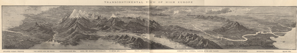
Figure 1. “Transcontinental View of High Europe,” circa 1890. Monteith's later books include several of these illustrations that create an oblique compilation of exaggerated terrain across a full continent—from the Atlantic Ocean to the Black Sea in this example. This is a composite scan of the original, which is more than 43 centimeters wide, spanning both pages.
Monteith’s books frequently employ a catechistic style typical of mid-nineteenth century textbooks (especially those targeted at the youngest students), asking students to answer a series of questions by reference to the book. The books also contain practical exercises in map drawing and knowledge tests. Monteith regularly took his students (and their teacher) on a guided tour, imagining a region and its geographic features, then depicting it with fictional vistas, detailed engravings, and a notional map. Sometimes he would ask the reader to follow a shipping route in the real world and name some of the geographic features passed along the way.
EVOLUTION OF MONTEITH’S STYLE
Although Monteith benefitted greatly from, and was influenced by, other cartographers like McNally, Johnston, and Guyot, he was making his own original maps from the beginning and remained committed to using maps as an instructional device throughout his career. A complete listing and description of every variety of Monteith map or textbook would require a very lengthy study, as he authored several related and complementary textbook series, and updated many of them regularly. There are probably more than one hundred different Monteith geography textbooks, some with only subtle variation between editions and minor changes to individual maps between editions. As was typical of geography texts from the period, the publisher also created specialized editions for different regions by adding an appendix with more maps and details on the home region where that edition would be sold. The Library of Congress (LOC) has 44 entries for Monteith in its catalog, mostly geography textbooks but also three atlases—a very incomplete sample, because the LOC generally does not catalog school textbooks (Castner 1997). The LOC and the New York Public Library also have a small number of individual sheet maps created by Monteith.
Figure 2. An 1885 full-page Monteith map, showing the use of all four margins and innovative symbology to provide contextual and comparative information.
The maps Monteith created near the end of his career have a unique style, incorporating multiple amplifying elements of comparative geography (see Figure 2). These maps—which represent Monteith’s late style and will be referred to later as “fourth generation”—pack information into all four margins of each map, most notably showing:
- Comparative extent and latitude in the left and right margins.
- Comparative area symbols, particularly the outline of an American state at the same scale (after the 1870s, always Kansas).
- Multiple scale bars, showing travel time by land and sea, in addition to distance.
- Terrain cross sections along the bottom margin of the map, often combined with a bar showing the east-west extent of regions.
In addition to this unique combination of marginal information, Monteith also included a variety of conventional data typical of other atlases, such as longitude east of both Greenwich and Washington, temperature isolines, distance of key shipping routes, and clocks to indicate time differences from London.
By contrast, the maps in his earliest books are, as noted in Tooley’s (Scott 2003), somewhat crude; but from these humble beginnings to his late style, there is a clear evolution in the quality of his maps. Monteith included more and more contextual information over time, such that the last maps he produced were rich infographics with amplifying details crowded into the margins. The key trends in the evolution of Monteith’s textbooks may be seen by generalizing his work into four main “generations”:
- First Generation (beginning in the 1850s): elementary textbooks with simple reference maps, such as First Lessons in Geography.
- Second Generation (from the late 1860s): increasingly sophisticated maps with early signs of Monteith’s innovations with comparative data, as demonstrated by Physical and Intermediate Geography.
- Third Generation (throughout the 1870s): a wide variety of detailed maps and diagrams, best represented by his 1876 Comprehensive Geography.
- Fourth Generation (from the mid-1880s): perfected around 1885 and bringing all elements together, and with richly detailed margins. This generation is typified by Barnes’s Complete Geography, which stayed in print for three decades.
FIRST GENERATION
Few examples remain of the textbooks that Monteith published in the 1850s in modest print runs. Youth’s Manual of Geography was first copyrighted in 1853 and circulated within the New York Public School system, but by 1860 was sold more broadly and carried the endorsement of a list of New York teachers, including Francis McNally. By the late 1850s, A. S. Barnes and Co. had published four works by Monteith: Youth’s History of the United States, which was “copiously illustrated with Maps and Engravings” and three geography textbooks for different levels (Monteith 1858). The geography books were advertised as part of the “National Series of Geographies” by James Monteith and Francis McNally. Initially three books in 1856 (priced from 25 cents to one dollar), the series soon grew to four: Monteith’s First Lessons in Geography, Monteith’s Introduction to Manual of Geography, Monteith’s New Manual of Geography, and McNally’s Complete School Geography.
Figure 3. This simple, hand-colored reference map from a first-generation Monteith textbook of the mid-1850s has none of the contextual symbology of later Monteith maps.
First Lessons in Geography is around 13 by 18 centimeters in size, running 63 pages with twelve color maps and a small illustration on most pages. These 1850s books were relatively inexpensive to produce, printed by wood engraving and hand-colored with watercolor stencils.1 The catechistic style of the text and Monteith’s illustrations are consistent with his later work, but the maps in this first generation include none of the amplifying symbols and devices Monteith later employed. In this period Monteith had not yet found his own approach to explanatory cartography.
SECOND GENERATION
By 1866 the Barnes geography series had grown to five books, adding Monteith's Physical and Intermediate Geography as a more detailed accompaniment to his three introductory texts, though McNally’s Geography remained the “advanced” option. The 1866 edition was larger, measuring 24 by 30 centimeters, with many more maps and illustrations in its 90 wood-engraved pages.
These second-generation Monteith textbooks, mostly from the late 1860s, begin to introduce limited examples of his innovative comparative techniques and marginal symbols. Monteith was clearly experimenting in this period with new ways of making the reader draw connections between an individual map and distant areas beyond the map’s extent. These include bands of comparative extent and two different methods of showing foreign areas compared to more familiar geography in the United States. However, these elements are isolated, used inconsistently, and are not as refined as seen in Monteith’s later work. World maps added in this generation chart data on climate trends and ocean currents, the best example of the influence of Matthew Fontaine Maury on Monteith.
One characteristic of this generation of textbooks is the inclusion of a variety of sophisticated cross-sections. Some of these are derivative of other cartographers, including the terrain diagrams used by McNally, Willard, and Woodbridge. However, many of Monteith’s cross-section diagrams bring much finer detail and compelling context, such as his depiction of the Great Lakes, which shows their configuration, elevation, depth, and the location of key cities and landmarks (see Figure 4).
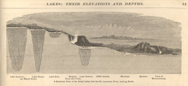
Figure 4. Diagram showing the configuration, depth, and context of the Great Lakes and the St. Lawrence River watershed, circa 1866.
THIRD GENERATION
Various editions of Physical and Political Geography and Comprehensive Geography produced in the 1870s are some of Monteith’s finest work. Commercially successful and published in many regional editions, copies of Comprehensive Geography are still available to collectors today.2 This is a confusing generation of textbooks to sort out: not only are there many different names and versions of each title, but this was also a period in which Monteith was making great strides with his own style, and the subtle differences between editions from the early 1870s and the late 1870s reveal important refinements. Although they do not exhibit the full maturity of his style, these editions again grew larger (25 cm by 32 cm) and are packed with maps and inventive diagrams. The larger format is consistent with a trend Patton (1999, 11) identifies in geography textbooks of the period, which grew from an average size of around 258 square centimeters in the 1840s, to 451 square centimeters in the 1860s, and 645 square centimeters in the 1880s. The quality of the printing and color alignment are notably improved in this generation, which made a shift from wood engraving to cerography (wax engraving). These editions were around 100 pages, plus any regional edition supplement, and printed on a thicker and rougher, probably rag, paper.
These editions also include a commitment to making the geography student into an amateur cartographer by offering detailed exercises on map drawing. These exercises in the third-generation Monteith texts resemble those published by Guyot in the 1860s: they assign letters to key vertices and direct students to connect these points with lines of defined length to create a framework within which the amateur cartographer can fill in natural contours. Some editions of the 1876 Comprehensive Geography in this generation included a globe-making exercise in an appendix, with colored gores to be cut out and pasted together by the student (Monteith 1876). The gores themselves were drawn by the German-American cartographer Joseph Schedler who began his career in New York around the same time as Monteith. This edition also included an advertisement for “Monteith’s globes,” although these appear to have been rebranded Schedler globes for what was probably a brief collaboration in the 1870s, based on a review of advertisements and Schedler’s Illustrated Manual for the Use of the Terrestrial and Celestial Globes (1878).3
FOURTH GENERATION
Editions of Barnes’s Complete Geography, the primary Monteith textbook published after 1885, show the full evolution of Monteith’s late style, which will be discussed further below. Versions of this book stayed in print for more than three decades. These editions kept the large (25 by 32 centimeter) size of the third generation, and ran to 140 pages before any special regional supplements. They also feature a thinner paper with a slight gloss, reflecting a possible shift to wood pulp paper, a major change in American publishing technology that began to take hold in the 1870s (Valente 2010).
During this period, A. S. Barnes continued to publish a range of different textbooks for different classrooms. Even though Monteith’s advanced books had grown more and more sophisticated, he also continued to author introductory texts during this period, such as Barnes’s Elementary Geography. These are smaller (20 by 25 centimeters, 96 pages), with only 15 color maps, and less amplifying detail on the maps, but there are some clear efforts to employ Monteith’s comparative techniques, even in the simpler editions.
Most of the large maps from these editions indicate a copyright of 1885, with some noting revisions in 1890, the year of Monteith’s death. In 1890, A. S. Barnes and many other textbook producers were acquired by the American Book Company, which led to the blending and adaptation of work by many cartographers, illustrators, and educators in this period.4 The American Book Company gained the copyrights to and continued to publish Monteith’s maps, with minimal revisions (changes to titles and attribution) well into the twentieth century. Mutual imitation and influence were rampant in American textbooks throughout the nineteenth century, and many books bearing Monteith’s name after his death were corporate products with illustrations and some reference maps sourced from other artists and cartographers. For example, the geography texts authored by Jacques Redway and published by E. H. Butler and Company and the American Book Company overlap closely with the Monteith/Barnes series and include some identical illustrations, as well as some—but not all—of Monteith’s comparative elements (Redway 1887). The latest Monteith edition that I have identified is a 1916 revision of Barnes’s Complete Geography, which still lists Monteith’s 1885 copyright, along with additional copyrights to the American Book Company in 1896 and 1914. Despite the corporate rebranding and the mingling with others’ work, there is a recognizable style that Monteith perfected around 1885, and which endured after his death.
BRINGING ELEMENTS TOGETHER AND PACKING THE MARGINS
As stated above, the devices that Monteith used had emerged slowly and separately but were all in use in some form in the 1870s and, by 1885, Monteith had integrated all the pieces into the unique late style of his fourth-generation books (as listed earlier in the section "Evolution of Monteith's Style"). This style is best represented by the widely produced Barnes’s Complete Geography. Some early editions in this generation were titled Monteith’s Complete Geography, but the Barnes-branded editions were produced in large numbers and are still widely available to collectors. The Barnes-branded editions still bore James Monteith’s name on the title page and included his copyright.
Monteith steadily added more and more details and comparative data to his maps over the course of his career, mostly through creative use of the margins. But he did so without clutter—indeed there is a modernist aspect to his later work, in that it is highly functional, with no wasted ink on the page. The margins are packed with fine lines, but only with information and not decorative adornments.
COMPARATIVE EXTENT AND LATITUDE
Comparisons of latitude appear in the margins of some of Monteith’s earliest maps, and he continued to include this element throughout his career. The 1866 Physical and Intermediate Geography includes colored marginal bands to depict the relative extent of other regions at comparable latitude, as in the case of the vertical margins of the Europe map, or regions of comparable east-west extent, as in the Africa map. Occasionally maps in the late 1860s editions use both (see Figure 5), which is confusing to the map reader since the symbology is actually different, showing two pieces of data (latitude and extent) on the vertical but only one (extent) on the horizontal. Perhaps due to this contradiction, Monteith’s later maps employ the horizontal margins only for the longitudinal span of the adjacent map.
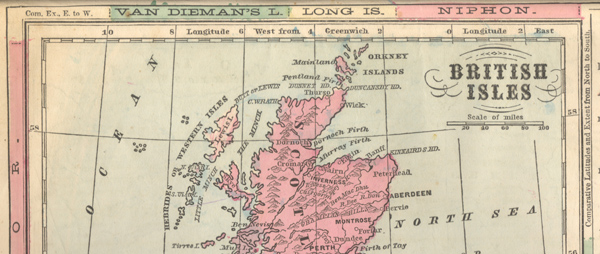
Figure 5. Detail of a second-generation Monteith map using both the horizontal and vertical margins to show comparative extent, but in different ways, circa 1866.
Editions of Monteith’s Comprehensive Geography from the 1870s make heavy use of comparative latitude and extent in the vertical margins, but also, in a foldout map of the United States, include a detailed column aligning nearly forty world cities with their comparative latitudes. These editions also include several examples of a graphic symbol within the marginal band. These rare symbols, scattered around individual maps in different editions, go beyond a simple geometric point symbol for a city and show the stylized shapes of distant mountains, lakes, capes, and straits (see Figure 6).
Figure 6. Detail of left and right margins of a map of Maine at the 46th parallel, which, beyond the borders of Maine, also passes near Mont Blanc and Trieste far to the east and the Strait of Mackinaw (sic) and the mouth of the Columbia River far to the west. From the 1872 New England edition of Comprehensive Geography.
The 1870s textbooks also introduce other marginal devices on a “Physical and Commercial Chart of the World,” which charts “Number of Miles in a Degree of Longitude” in the left margin and “Longest Day and Night at Different Latitudes” in the right margin (Monteith 1872). Abstract and not as intuitive as other techniques, Monteith seemed to move away from these experiments: later editions of a similar chart include more inventive symbology and only the number of miles in a degree of longitude remained, as tiny numbers in the right-hand margin. The technique of locating cities at comparable latitude appears in some other textbooks of the period, but all of them later than Monteith and on a more limited scale (Redway 1887; Frye 1906).
After experimenting with a variety of different techniques, Monteith’s fourth-generation style settled into using the horizontal margin for the adjacent map and using the vertical margins for comparative latitude and extent, as well as comparative temperature (which connected to temperature isolines crossing through the map; see Figure 2).
COMPARATIVE AREA SYMBOLS
Several of Monteith’s marginal devices were in use before he began making maps, but the one that is most characteristic of his work may also be the most original: the comparative area symbol. Monteith had a clear interest in helping map readers understand the comparative area of different regions of the world early in his career. As noted above, Monteith first published a map explicitly comparing US states to foreign countries and regions in the second-generation textbooks in the late 1860s. This practice became commonplace in geography textbooks in the late nineteenth century but it is not clear that anyone did it before Monteith. Patton (1999) notes the trend in his review of nineteenth-century geography textbooks but does not identify when the technique started or who originated it. Monteith experimented in the 1870s with using many different states—occasionally the entire United States—as comparative outline symbols (see Figure 7). These comparative symbols generally appear on regional or continental maps using conic or polyconic projections that do not preserve area. Since Monteith provided no details about the projections for the map or symbols, the accuracy of the comparisons is uncertain and serves only as a general heuristic.
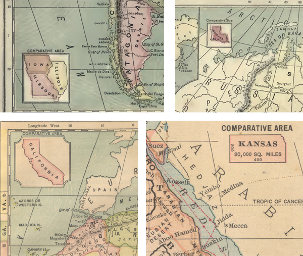
Figure 7. Outlines of US states used as comparative area symbols. Monteith started making area comparisons to states in the mid-1860s, but did not begin using these symbols until the late 1870s, experimenting with different states, and groups of states, before finally settling on Kansas as the standard comparative area symbol.
Starting in the 1870s, Monteith developed a particular fixation on the state of Kansas as a standard comparative metric. In his 1870s Comprehensive Geography he reveals his thinking in detail, using the outline of Kansas as an “oblong frame” to remember the sizes of geographic features and even a means to master these shapes by drawing them (Monteith 1872). He uses the easily remembered 200 × 400 mile outline of Kansas no fewer than 26 times in this edition, sometimes rotated or sometimes multiplied: drawing Lake Superior inside one Kansas or Austria around the outlines of three upright Kansases (see Figure 8). The fixation on Kansas is interesting because few of Monteith’s students, and few Americans in general in the nineteenth century, would have visited Kansas or have a personal sense of its size. The direct comparative symbol is nonetheless effective in showing how vast Africa, or a part of the Pacific Ocean, is next to Kansas. Monteith wished to have a uniform symbol for use across the entire book, instead of a different state-symbol on each map, and Kansas proved useful as a standard of measure.
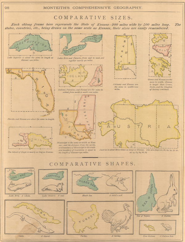
Figure 8. This remarkable page of comparative shapes and sizes appeared in several editions of Comprehensive Geography in the 1870s, although only some were printed in color. The comparisons range from technical to playful in helping the reader to study, memorize, and reproduce map shapes.
By contrast, Monteith did not commit to his experiment in his third-generation textbooks of comparative shapes. In contrast to the plain rectangle of Kansas, and perhaps to compensate for his fixation on a single geometric shape, Monteith suggested comparing the shape of geographic features to familiar objects. An amusing effort, but less compelling than his other comparisons, these editions suggested remembering that the shape of Cuba resembles a lizard and the Sea of Japan looks like a rabbit (see Figure 8).
MULTIPLE SCALE BARS SHOWING TIME AND DISTANCE
Time-scale bars are a useful and inventive element that appear in later Monteith maps and were ideally suited to the rapid growth of rail and steamship travel in the late nineteenth century. As the editors of the recent book Time in Maps point out, static maps do not often intentionally depict time, but when they do, the results are often surprising and versatile (Wigen and Winterer 2020, 6–7). Communicating practical knowledge through common analogy, alongside the abstract map, is consistent with Monteith’s educational approach. Adjacent to a scale bar of abstract units, Monteith placed a scale of railroad time (in hours) and steamship time (in days). Thus, the map reader could more easily grasp how long it would take to travel across the area in Monteith’s map without having to make their own calculations and assumptions. Although a simple addition to the legend, these time scale bars explicitly highlight the linkage between space and time that is left unstated by most maps, past and present.
The bars first appear in some of Monteith’s maps in the late 1870s, where a scale of “railroad time” appears together with, and in the same style as, the traditional scale bar of statute miles.5 In many of the fourth-generation maps, Monteith uses three scale bars together: statute miles, railroad time, and steamship time (see Figure 9). As noted above, Monteith did not indicate the details of the projections that he used, nor the standard lines along which these scales would be accurate.
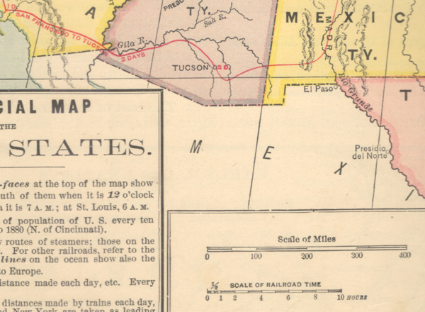
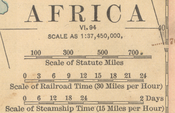
Figure 9. Time-scale bars. Top: Railroad time on an 1870s map of the United States, Bottom: Triple scale bar typical of Monteith’s late maps, which remained in use for many years after his death.
In addition to the scale bars, Monteith’s “commercial” maps of both the world and the United States bring time scales onto the main body of the map, showing rail and steamship travel routes either with marked divisions in the lines for elapsed time in days or hours, or using a dashed line in which every segment represents one day or hour of travel. The “Physical and Commercial Chart of the World” from the post-1885 editions also captures an interesting moment in the evolution of global shipping; it displays, with different symbology, the routes taken by commercial sailing ships in contrast to the more direct routes taken by steamships (see Figure 10).
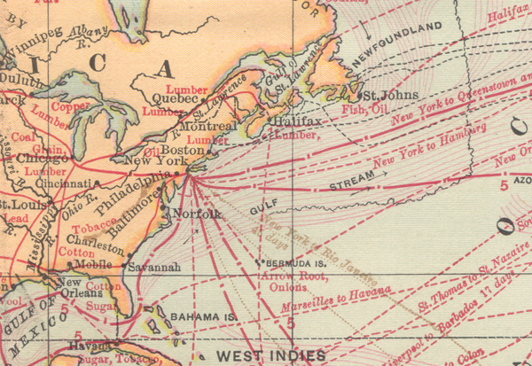
Figure 10. Detail of a “Physical and Commercial” world map from an 1885 Monteith textbook showing steamship and railroad routes in red, with tick marks denoting the distance traveled in one day and numerals for every fifth day. Finer black lines in the background show sailing ship routes and submarine cables. Later revisions of this map, appearing in Barnes's Complete Geography after Monteith's death, eliminate the sailing routes and the numerals for elapsed travel time.
TERRAIN CROSS SECTIONS
Nineteenth-century cartographers had many different techniques for depicting topography, but Monteith used no tints or contours to show elevation in his maps, and used hachures very sparingly to show mountain ranges. Nevertheless, he encouraged careful consideration of terrain and separately included a number of unlabeled shaded relief maps and the aforementioned oblique views with exaggerated terrain (Figure 1). Monteith’s clear preference for emphasizing the terrain of his color reference maps was the terrain cross section. Wolter (1972) states that the profile technique may have been used as early as dynastic Egypt, but entered widespread use in the eighteenth century with French sea-level diagrams of islands, and English canal plans. The influence of Humboldt was key to popularizing this technique: multiple terrain cross sections were featured in German atlases of the early nineteenth century, and they appeared in American geography textbooks by the 1840s, such as Woodbridge (1844). The way McNally used cross sections in the 1850s suggests it was his influence that started Monteith onto the path of including so many of them (see Figure 11). Monteith’s interest in capturing the terrain variation across a large east-west extent is also in evidence with his wide-angle oblique illustrations. These views are impossible and deliberately distorted, but nonetheless compelling for showing how all of the mountain ranges, rivers, and cities of an entire continent relate.
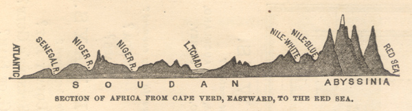
Figure 11. A monochrome terrain cross-section of Africa, typical of Monteith texts from the 1860s. These diagrams, which were not always attached to a map or inside the neatline, appeared in many atlases and geography textbooks in the mid-nineteenth century.
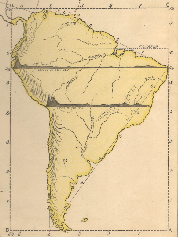
Figure 12. These map drawing exercises appeared in Monteith textbooks in the 1870s. Such cross-sections, often at multiple latitudes, had been in use for decades, but Monteith placed greater emphasis on aligning them with the map.
Monteith had two particular emphases with the terrain cross-sections: he placed them in the bottom margin to align with the main body of the map, and he wanted students to draw them. While in the 1870s editions of Comprehensive Geography he overlays the cross-sections (or multiple sections) directly atop a continent in the map drawing exercises (see Figure 12), Monteith in the post-1885 books like Barnes’s Complete Geography regularly includes the regional or continental cross section, along with a minuscule scale of the exaggerated elevation, in the bottom margin. Placing the cross section in the margin and aligning it with the main body adopts the same technique he used for comparative latitude in the vertical margins. Indeed, the later Monteith maps include both a terrain cross section and multicolor bar showing east-west extent of the areas in the main map (see Figures 2, 13, and 14).
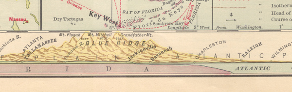
Figure 13. A detailed terrain cross-section in the bottom margin, aligned in longitude with the base map, typical of fourth-generation Monteith maps. Monteith's cross-sections grew more refined over time, and versions after 1885 were rendered with shading, depth, rivers, and cities.
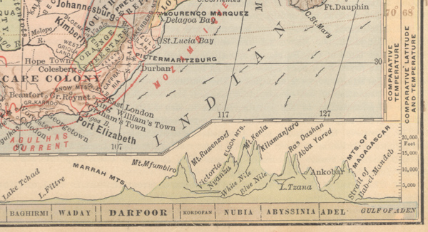
Figure 14. Detail from a full-page Africa map, circa 1890, with the densely-packed margins typical of late Monteith maps. Note the terrain cross-section aligned to the horizontal extent for the map, with twin bars for comparative latitude and temperature in the right margin.
CONCLUSION
It is not clear that Monteith had any training in technical cartography: his fourth-generation textbooks briefly discuss the differences between conic, polyconic, and Mercator projections, but many of his comparative techniques fail to account for how those projections distort area or distance. Monteith never employed equal area or equidistant projections, nor does he indicate that his comparative area symbols or time scale bars would be accurate only for portions of the map. Despite any technical shortcomings, the way Monteith framed and contextualized maps added greatly to their value as teaching tools, and he surrounded them with more and more beautiful detail as his style developed. His evolution towards packing the margins also helped Monteith avoid one common pitfall of nineteenth century mapmaking: cluttering the main map with a plethora of small, hard-to-distinguish symbols (Robinson 1982, 17).
Monteith’s style clearly represents his focus on educating the general reader through maps. He experimented with simple, practical techniques to help his reader think about geography, and refined his methods to create visually compelling texts that remain engaging today. Monteith’s work invites us to explore many comparisons within and across the maps in each book. Such study is more engaging than that encouraged by school atlases produced a century later. As Castner wrote in 1997, “[t]here is little evidence that our twentieth-century atlases actually encourage, in their design, any user goals, other than the rather simplistic activities of ‘looking up’ various place-names or other geographic facts” (410).
Many aspects of Monteith’s maps were basic and unoriginal, and there was nothing obviously revolutionary about his geography books. Yet, his cartographic style was more than the sum of its parts. His margins offered more than mere exuberance or ornamentation, relying on inventive symbology and comparative techniques to help the reader better understand the world. Unfortunately, none of what Monteith included in his margins remains in common use today. John Wolter laments, after tracing the evolution of some nineteenth-century diagrams similar to those in Monteith’s geographies, that “we will, however, probably never again see the elaborate, exuberant, and colorful illustrative plates that were so popular a hundred or more years ago” (1972, 200).
Mapmakers now have access to data and visualization tools that Monteith couldn’t have imagined, but today’s challenges of mapmaking have less to do with assembling details and ensuring the accuracy of the maps, and more to do with what they can tell us about our world. Monteith’s tools may have been imperfect, but these are challenges that he understood well: challenges that he met with inventive cartography. Modern software’s ability to manage projections and layer data make trivial the handling of technical inaccuracies in Monteith’s comparative symbology. But the way that Monteith’s maps draw the eye to those comparative symbols and contextual margins makes today’s typically unadorned maps seem bleak. Not only has James Monteith largely been forgotten, but his maps brought together an array of largely forgotten techniques. These techniques of Monteith and his contemporaries merit further study: modern cartographers could learn from this master of the margins and use their powerful cartographic tools and rich data sets to adapt his style to the twenty-first century.
ACKNOWLEDGEMENTS
I wish to thank Ron Grim for his enthusiastic support and for his thoughtful comments on the draft. Karen Cook and Jeff Patton were kind enough to lend their expertise, and several fellow members of the Washington Map Society provided critical research leads, particularly Ed Redmond and Tom Sander.
NOTES
1 I am grateful to Ms. Karen Cook, Special Collections Librarian at the University of Kansas, for examining a number of Monteith textbooks and sharing her expertise on the printing and coloring techniques.
2 It is not clear when the transition from Physical and Political Geography to Comprehensive Geography took place, but the two titles are very similar in scope and content. More copies of Comprehensive Geography are available from book dealers; Physical and Political Geography was produced first, with a stated copyright of 1866, although the edition studied for this article was revised sometime after 1875. This dating is based on a printed notation pertaining to Stanley’s 1875 claims about the source of the Nile. Monteith may have plotted the source—which is off by hundreds of miles—from a preliminary newspaper account, as Stanley published his detailed maps in 1878.
3 Only some editions of Comprehensive Geography included the globe-making appendix, but this 1876 printing has other characteristics of a deluxe edition, such as color versions of maps that appear only in black and white in similar editions.
4 The Special Collections Research Center at Syracuse University holds the archives and business records of the American Book Company, a valuable source on textbooks and textbook publishers from the late nineteenth century. See library.syr.edu/digital/guides/a/amer_book_co.htm.
5 The earliest example that I have been able to identify to date is in the regional US maps from an edition of Comprehensive Geography with a stated copyright of 1872. However, there is considerable variation among editions of Comprehensive Geography, and the railroad time scale bars do not appear in all of them.
REFERENCES
Castner, Henry W. 1997. “Twentieth-Century Children’s Atlases: Social Force or Educational Farce,” in Images of the World: The Atlas Through History, edited by John A. Wolter and Ronald E. Grim, 401–417. Washington, DC: McGraw Hill.
Delaware Gazette and State Journal. 1890. “James Monteith.” September 18, 1890.
Frye, Alexis Everett. 1906. First Steps in Geography. Boston: Ginn and Company.
Guyot, Arnold. 1867. Intermediate Geography. New York: Scribner, Armstrong, and Co.
Maury, Matthew Fontaine. 1860. Washington Map of the United States. Washington, DC: H. G. Bond. https://lccn.loc.gov/98685759.
Monteith, James. 1853. First Lessons in Geography. New York: A. S. Barnes and Co.
———. 1853. Youth’s Manual of Geography. New York: A. S. Barnes and Co.
———. 1858. Youth’s History of the United States. New York: A. S. Barnes and Co.
———. 1866. Physical and Intermediate Geography. New York: A. S. Barnes and Co.
———. 1872. Comprehensive Geography—New England Edition. New York: A. S. Barnes and Co.
———. 1876. Comprehensive Geography. New York: A. S. Barnes and Co.
———. 1885. New Physical Geography. New York: A. S. Barnes and Co.
———. 1890. Barnes’s Complete Geography. New York: A. S. Barnes.
New York Board of Education. 1849. Manual of the Board of Education of the City and County of New York. New York: Wm C. Bryant.
———. 1855. Documents of the Board of Education of the City of New York for the Year Ending January 1, 1855. New York: Wm. C. Bryant and Co.
———. 1863. Documents of the Board of Education of the City of New York for the Year Ending December 31st 1862. New York: Westcott.
Patton, Jeffrey C. 1999. “The American School Atlas: 1784–1900.” Cartographic Perspectives 33: 4–32. https://doi.org/10.14714/CP33.1018.
Redway, Jacques W. 1887. Butler’s Complete Geography. Philadelphia: E. H. Butler and Co.
The R. I. Schoolmaster. “Our Book Table.” 4 (10): 318–320. https://www.jstor.org/stable/i40202488.
Ristow, Walter. 1986. American Maps and Mapmakers—Commercial Cartography in the Nineteenth Century. Detroit: Wayne State University Press.
Robinson, Arthur. 1982. Early Thematic Mapping in the History of Cartography. Chicago: University of Chicago Press.
Schedler, Joseph. 1878. An Illustrated Manual for the Use of the Terrestrial and Celestial Globes. New York: E. Steiger.
Schulten, Susan. 2012. Mapping the Nation: History and Cartography in Nineteenth-Century America. Chicago: University of Chicago Press.
Scott, Valerie. 2003. Tooley’s Dictionary of Mapmakers, K–P (Revised Edition), Riverside, CT: Early World Press.
Valente, A. J. 2010. “Changes in Print Paper During the 19th Century.” Proceedings of the Charleston Library Conference. https://doi.org/10.5703/1288284314836.
Wigen, Karen and Winterer, Caroline, eds. 2020. Time in Maps: From the Age of Discovery to Our Digital Era, Chicago: University of Chicago Press.
Willard, Emma Hart. 1831. Geography for Beginners. Hartford, CT: O. D. Cooke.
Wolter, John. 1972. “The Heights of Mountains and the Lengths of Rivers.” The Quarterly Journal of the Library of Congress 29 (3): 186–205.
Woodbridge, William Channing. 1844. System of Modern Geography. Hartford, CT: Belknap and Hamersley.