DOI: 10.14714/CP100.1727
© by the author(s). This work is licensed under the Creative Commons Attribution-NonCommercial-NoDerivatives 4.0 International License. To view a copy of this license, visit http://creativecommons.org/licenses/by-nc-nd/4.0.
That’s a Relief: Assessing Beauty, Realism, and Landform Clarity in Multilayer Terrain Maps
Nathaniel A. K. Douglass (he/him), University of Oregon | ndougla7@uoregon.edu
Carolyn S. Fish (she/her), University of Oregon | cfish11@uoregon.edu
Terrain maps are often composed of shaded relief along with other raster layers which we call thematic terrain layers to create aesthetically pleasing and clear maps of physical geography. Despite the fact that the interplay of layers is of primary concern to a cartographer, much of the research on terrain mapping has focused on studying terrain layers individually. This research aimed to fill this gap by evaluating the effect of combining shaded relief with thematic terrain layers and assessing ratings of beauty, realism, and landform clarity in an exploratory online user study. Specifically, we tested the combination of: manual, multidirectional, and ray-traced shaded relief with three thematic terrain layers: hypsometric tinting, land cover, and orthoimagery. There are five main findings from this exploratory study: (1) there was a direct correlation between beauty and realism scores, (2) the manual relief we tested was consistently rated lowest for beauty, realism, and landform clarity, and orthoimagery was rated the highest for beauty and realism, (3) shaded relief was more influential than thematic terrain layers on landform clarity ratings, (4) participant’s geographic familiarity had a significant impact in four specific instances of the user study, and (5) neither shaded relief nor thematic terrain layers were the sole contributors to map reader perceptions of beauty, realism, or landform clarity. We conclude by identifying limitations in our stimuli design and presenting ideas for future research studies on terrain design.
KEYWORDS: aesthetics; terrain mapping; shaded relief; landform clarity; perception, beauty; realism; cartography; map design; hillshade
INTRODUCTION
Shaded relief, relief shading, and hillshading are terms often used interchangeably to refer to the cartographic technique of creating intuitive and realistic representations of topographic features on maps by mimicking the shadows cast by a light source. Shaded relief was initially created manually with an airbrush, pencil, or similar methods. However, modern digital processes have simplified the creation of beautiful, realistic, and clear relief for maps. We commonly access these tools in geographic information systems (GIS), but novel methods are increasing in popularity, some of which use 3D rendering software (Huffman 2017). Such tools allow cartographers to create shaded relief that more closely mimics the expressiveness and beauty of early manual shaded relief, but is more easily reproducible and time efficient to create.
The cartographer’s chosen shaded relief method is not necessarily the sole contributor to a successful terrain map. Shaded relief is frequently combined with other raster layers, such as imagery or land cover, to create maps that offer the reader a clearer idea of the complexity of the landscape. The fact that these combinations are so popular suggests that an interaction between shaded relief and thematic terrain layers is often necessary to enhance the perceived beauty, realism, and clarity of the representation. Empirical research on relief shading has increased over the past decade, providing insight into new digital techniques to represent the topographic relief on maps (Jenny 2021; Jenny et al. 2020; Kennelly and Stewart 2014; Marston and Jenny 2015), user perception of illumination angles (Biland and Çöltekin 2017), and the perceived effectiveness of relief shading techniques (Farmakis-Serebryakova and Hurni 2020). However, few studies have investigated shaded relief combined with other thematic terrain layers (e.g. Çöltekin and Biland 2019; Huffman and Patterson 2013; Raposo and Brewer 2014). In these examples, authors focused on one type of shaded relief and one type of thematic terrain layer, but to our knowledge, none of these studies specifically measured perceptions across combinations of different shaded relief designs and thematic terrain layers.
In this study, our goal was to better understand how the combination of shaded relief and thematic terrain layers affects map readers’ perceptions of beauty, realism, and landform clarity. After examining two volumes of the North American Cartographic Information Society (NACIS) Atlas of Design (Steingisser, Rose, and Tierney 2018; Marston et al. 2020), along with award-winning maps from the NACIS Conference, we identified three shaded relief techniques that were commonly used: (1) manual shaded relief, (2) multidirectional shaded relief, and (3) ray-traced relief. In addition, cartographers often paired these types of shaded relief with other layers to portray the landscape more realistically. Across the selection of maps we viewed, many included (1) hypsometric tinting, (2) land cover, or (3) orthoimagery. After reviewing these maps, our study was guided by the following research question:
How do manual and analytical shaded relief techniques influence reader perceptions of beauty, realism, and landform clarity in terrain maps that incorporate hypsometric tinting, land cover, and orthoimagery?
Cartography is as much an art as it is a science (Cosgrove 2005). Thus, it makes sense to understand not only the effects of combining different layers to create terrain maps, but also how those combinations affect the perceived beauty, realism, and the clarity of landforms in a two-dimensional map.
The rest of the paper is organized as follows: in the next section we describe shaded relief and thematic terrain layers, then we describe the importance of aesthetics in cartography. We follow with a description of our methods for an exploratory online user study. In the fourth section we illustrate the results of our exploratory study and follow with a discussion of those results. In the final section of the paper, we conclude with an overview of our findings, some limitations, and future research ideas.
BACKGROUND
SHADED RELIEF
Shaded relief began as a hand-drawn art form that gave depth to a two-dimensional view from above by accurately representing landforms using localized light sources (Marston and Jenny 2015; Imhof 1982; Brassel 1974; Collier, Forrest, and Pearson 2003). Manual relief has its own individual styles, determined by the cartographer who designed the map. This means that these maps are difficult to reproduce since any two cartographers are likely to draw very different representations of the same location due to their personal style, skill level, and interpretation of the landscape. Manual techniques also allow a cartographer to adjust their representation to meet the needs of the particular landscape being shown. However, creating these maps manually is extremely time intensive, though generalization is a common way to reduce the time burden (Patterson 2018). Recently, there has been a reinvigorated interest in exploring manual techniques amongst contemporary practicing cartographers (e.g., Bell 2018), while cartographic researchers have also attempted to replicate the aesthetic quality of manual relief through algorithmic processes, allowing the style to be more available to digital mapmakers (Jenny et al. 2020).
With the onset of computers, digital, analytic methods overtook manually-created shaded relief due to the speed and consistency with which the cartographer could now create these types of terrain layers. Basic analytical relief shading can be created quickly in a GIS from a digital elevation model (DEM). Since this standard shaded relief algorithm uses a single light source, all landforms are treated equally, which sometimes results in (1) less explicit landscape depictions with a lack of structure in larger landforms (Marston and Jenny 2015), and (2) a lack of clarity for minor landforms, especially those within the shadowed slopes of larger landforms (Zakšek, Oštir, and Kokalj 2011). Adjusting the light angle to better capture most landforms in a relief map is one solution to this limitation (Biland and Çöltekin 2017). Multidirectional shaded relief also provides a solution by casting multiple light sources from different sun angle directions (Loissios, Tzelepis, and Nakos 2007; Mark 1992; Tzelepis et al. 2020; Veronesi and Hurni 2014) and is now more easily accomplished in GIS.
Of growing interest to practicing cartographers, however, is the use of 3D rendering software to create shaded relief maps, specifically ray-tracing methods. Ray-tracing is a well-known computer graphics technique for 3D modeling and can simulate natural light to create photo-realistic digital images (Glassner 1989; Rademacher 1997). Similar to GIS methods for rendering relief, ray-tracing produces a 2D greyscale image given a light source direction. The major difference from typical GIS methods is that ray-tracing can render more complex optical effects and surface textures, which makes it a unique tool for depicting topographic relief. While an analytical hillshade algorithm determines a pixel’s shading based solely on its orientation toward a light source, without accounting for any of the rest of the landscape, ray-tracing can model the light as it reflects, refracts, scatters, and diffuses off the adjacent surfaces (Huffman 2014; Morgan-Wall 2018; Stevens 2014). A handful of cartographers have openly shared tools, tutorials, and processes for generating relief using a 3D modeling program called Blender (blender.org), which utilizes ray-tracing algorithms (Huffman 2017; Powell 2016; Underwood 2019; Larson 2019; Atwood 2020). These materials have made this method for generating shaded relief more accessible and reproducible.
THEMATIC TERRAIN LAYERS
While shaded relief is often the key element in representing the physical landscape in terrain maps, it is just one layer. To create a more complete image of the terrain, shaded relief is typically paired with additional layers to provide context to the underlying landscape (Imhof 1982; Imus and Loftin 2012). Some of these layers can be derived from the elevation surface and augment the visualization of elevation change; Imhof (1982) refers to these layers as “abstractions,” and they include hypsometric tinting, hachuring, and contour lines. In addition, layers such as land cover and orthoimagery can represent variation in vegetation and surface cover to add context and texture to the map.
In this exploratory research, we focus specifically on three layers which are commonly used in terrain mapping: hypsometric tinting, land cover, and orthoimagery (Figure 1). Hypsometric tinting is a method of representing elevation values using a continuous or classed single hue, multi-hue, or spectral color scheme (Figure 1, A). This, combined with shaded relief, reinforces elevation heights through color cues. However, using an evenly stretched scheme on world maps can cause a loss of lowland and highland detail, which can be remedied by creating locally enhanced hypsometric tinting (Huffman and Patterson 2013). In addition, the colors used may mislead a map reader if they do not mimic those of the underlying geography. Many authors suggest that the colors in elevation tinting should reflect hues one might see in the natural landscape (Imhof 1982; Patton and Crawford, 1977; Patterson and Jenny 2011). Land cover (Figure 1, B), in comparison, is a separate dataset which is often paired with shaded relief to create a naturalistic aesthetic (Patterson 2002). Land cover is typically stored as a raster dataset, in which each cell is assigned a singular land cover type (e.g., forest). Finally, orthographic imagery (Figure 1, C), such as geometrically corrected aerial photos or satellite images, can allow for instant recognition of place through the landforms, and the texture of the underlying topography (Peterson 2012; 2020). Supporting this claim, Hoarau and Christophe (2017) found that orthoimagery in maps adds realism and context, while other research has contradicted this by showing negative effects on map readers. For example, Çöltekin and Biland (2019) found that, when paired with shaded relief, orthoimagery can negatively affect landform perception.
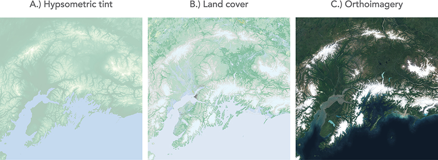
Figure 1. (A) Hypsometric tint colorizing high elevations with a pale yellow color and lower elevations in darker pale green; (B) data from the National Land Cover Database with naturalistic colors applied to the land cover classes; (C) orthographic imagery (from Google) giving readers a realistic sense of the terrain.
AESTHETICS
The very nature of relief representation is rooted in artistic qualities and requires that careful thought be given to the aesthetic characteristics of a map (Imhof 1982). Cartographers frequently debate aesthetics, because of cartography’s close ties to art and visual representation. As Kent et al. (2012, 14) state “opinions are strong and varied [regarding aesthetics] and there are no universal rules, even though when we say a map is ‘beautiful’ we believe others ought to agree with us.” Regardless of the data conveyed and message being shared, the map must appeal in its representation (Field and Demaj 2012). While learning a set of rules and conventions for representing map features is conceivable, a cartographer’s goal with a map is to not only be informationally effective but also aesthetically pleasing (Dent, Torguson, and Hodler 2008).
In the last decade, a handful of researchers have attempted to quantify the aesthetic response of map readers on several fronts. Limpisathian (2017) tested the visual contrast of maps at multiple scales and asked map readers to rank a series of color and contrast schemes based on their clarity and aesthetic qualities. Similarly, Fabrikant et al. (2012) tested a small group of map readers’ arousal levels while reading several design iterations of the same map to investigate aesthetic preferences. Cartographers have also examined the micro-aesthetics in map typefaces (Guidero 2016). Contemporary cartographic researchers are answering a call to bring aesthetics to the center of cartographic theory and critique the factors that influence aesthetic decision making in cartography (Kent 2005).
The success of a terrain map is not dependent purely on how efficiently it conveys the information, but also on how it looks aesthetically. The function of the map and its graphical appearance are intertwined, and the visual effect of a map is constructed from the interplay of its elements (Kent et al. 2012). Creating an effective terrain map takes time, artistry, and aesthetic sensitivity (Imhof 1982). While mapmakers today have many digital tools to create shaded relief quickly and easily, many terrain cartographers refine, adjust, and perfect the relief in post-processing software (Patterson 1997; 2002; Tait 2002; Jenny and Patterson 2007; Imus and Loftin 2012). For example, by incorporating orthoimagery in terrain maps, the cartographer can achieve an appealing design aesthetic that adds complexity, texture, and realism to the representation (Raposo and Brewer 2014). Some researchers have conducted studies that test terrain maps to understand the design and aesthetic preferences (Raposo and Brewer 2014; Jenny et al. 2020). However, there is still minimal empirical research attempting to compare the aesthetic qualities between digital and manual shaded relief techniques.
METHODS
To answer the research question, we designed a within-subject user study to examine: (1) beauty, (2) realism, and (3) landform clarity across a set of maps with variations in shaded relief and thematic terrain layers.
PARTICIPANTS
We solicited 105 participants for the study from the recruitment site Prolific. Participants were able to participate if they were using a desktop computer and their Prolific profile indicated they were 18 years of age or older, a US resident, and fluent in English. Each participant was paid $4.97 USD through Prolific for approximately 15 minutes of their time after they completed the user study, and we approved their answers.
STIMULI
The stimuli for the user study consisted of nine different terrain maps of Crater Lake, Oregon, in the United States. The maps were made up of a combination of three shaded relief layer designs and three thematic terrain layer designs (Figure 2).
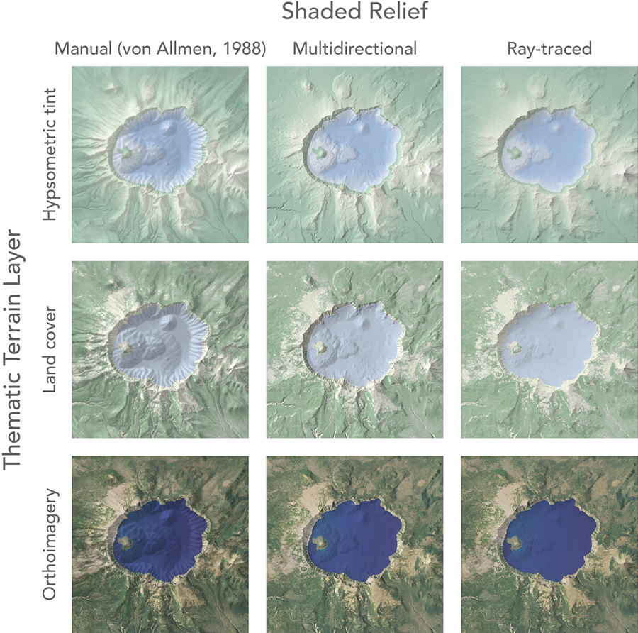
Figure 2. Nine variations of Crater Lake were created by overlaying three shaded relief maps (manual relief, multidirectional relief, and ray-traced relief) with three thematic terrain layers (hypsometric tint, land cover, orthoimagery).
The three relief layers we used were: (1) a manual shaded relief created by Bill von Allmen of the US National Park Service in 1988 and later edited by Tom Patterson, (2) a multidirectional shaded relief, and (3) a ray-traced shaded relief. We downloaded the manual relief map from the Shaded Relief Archive (shadedreliefarchive.com/Crater-Lake.html). The analytical relief layers (multidirectional and ray-traced) were derived from a 3.33-meter resolution DEM from a set of sample elevation models provided by Kennelly et al. (2021), and the bathymetry was derived from a 1-meter ASCII XYZ grid re-sampled to 3.33 meters (pubs.usgs.gov/dds/dds-72/site/gridfaq.htm#getacopy). The multidirectional shaded relief was created in QGIS (version 3.16.3) using the GDAL hillshade tool. The following parameters were set for the hillshade tool: vertical exaggeration (Z factor) was set to 3.0, the azimuth was set to 337.5 as suggested by Biland and Çöltekin (2017), the altitude was set to 45.0 degrees, with the multidirectional shading option. Our ray-traced relief map was created in Blender (version 2.82a). Using Blender for relief modeling requires the DEM to be converted to a 16-bit unsigned integer, which we did using a GDAL Warp command (Larson 2019). The parameters we used to create the ray-traced relief in Blender mimicked what is detailed in Huffman’s tutorial (2017). The only deviating parameter we used was the surface displacement method, which we set to “Displacement and Bump.” This option combines both the displacement option, allowing for larger amounts of displacement in the 3D model, and the bump mapping option, which preserves finer details and textures in the rendering. Combining the two methods can provide a good balance and reduce memory usage (Blender Documentation Team 2021).
The three thematic terrain layers we used were: (1) hypsometric tint, (2) land cover, and (3) orthographic imagery. The hypsometric tint layer was created from the same DEMs as the analytical shaded relief layers and used two separate color schemes, one for land surface elevations, using colors designed to mimic the vegetation and land cover of the region as suggested by Patterson and Jenny (2011), and a second color scheme for bathymetric depths. The land cover layer used raster data collected from the National Land Cover Database (NLCD), reclassified into three land cover types: (1) tree cover, (2) shrub/grass, and (3) water. Finally, the orthographic image layer was derived from Google Maps. To avoid oversaturation and opposing shadows, we used the content-aware fill tool in Photoshop on areas of the orthoimage that appeared to be shaded so they did not conflict with the shaded relief’s shadows.
There are two limitations of our stimuli design that we acknowledge could have had a confounding effect on the eventual results. First, von Allmen’s manual relief depicted more generalized land and bathymetric relief and thus had less detail in the landforms depicted, compared to the multidirectional and ray-traced relief models. Second, we did not control for contrast, lightness, or saturation across the nine maps. We discuss the implications of these limitations more in the conclusion.
USER STUDY PROCEDURE
Participants found the study through the Prolific recruitment site. Once they clicked on the study, they were redirected to a Qualtrics site to take part in the user study. Participants were first asked to enter their Prolific ID and read through the consent form. Participants then continued to the four sections of the study: (1) a pre-test questionnaire, (2) a tutorial, (3) the main user study, and (4) a final feedback question. The pre-test questionnaire consisted of six questions: two demographics questions on gender and education level, a question about their knowledge of cartography and map design, and three questions about their familiarity with the geographic focus of the study, Crater Lake, asking whether they had (1) heard of, (2) seen pictures or maps of, (3) or visited the area. Following the pre-test, participants navigated through a tutorial where they were introduced to the five rating tasks they would complete during the main user study. The tutorial used only three map designs and depicted a different geographic area, Churfürsten, Switzerland (Figure 3). This section introduced the term “terrain map,” the purpose of relief shading in maps, and asked participants to rate the sample maps for their “beauty,” “realism,” and “landform clarity” (Figure 4).
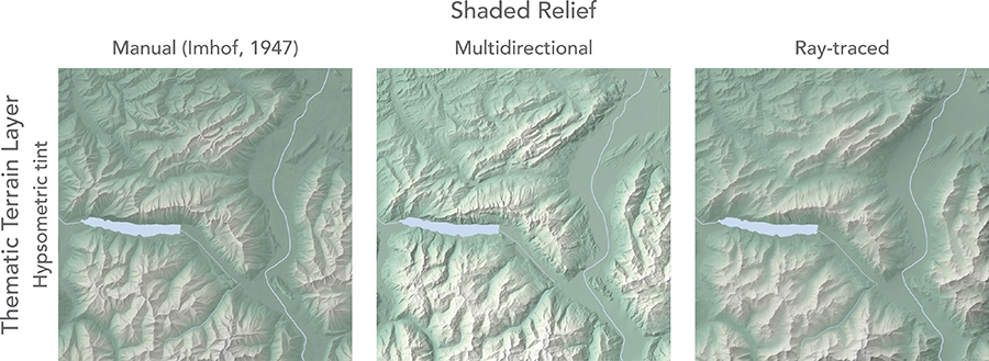
Figure 3. Three variations of Churfürsten, Switzerland were used to introduce participants to the rating tasks they would be completing later in the study. The manual shaded relief was created by Eduard Imhof in 1947 (shadedreliefarchive.com/NortheastSwitzerland.html).
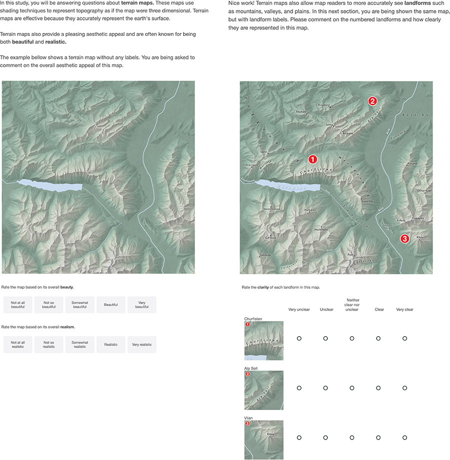
Figure 4. The tutorial section introduced the beauty, realism (left), and landform clarity (right) tasks to prime participants for the main portion of the user study.
Following the tutorial, participants started the main user study. In the main user study, the participants answered the same five questions they were introduced to in the tutorial, but for nine map designs, for a total of 45 questions. The five rating tasks per map design were divided across two web pages in Qualtrics. The first page included one of the nine stimuli maps and asked participants to rate its beauty and realism (Figure 5, left). The second page showed the same map with numbered annotations on the three landforms (Wizard Island, Mount Scott, and Grouse Hill) and asked participants to rate the clarity of those landforms (Figure 5, right). We selected these three landforms because they were similar in size and were located proximally to the main landform feature in the map (Crater Lake). Since the study was within-subjects, all participants saw all nine of the map designs. These were presented in random order for each participant to limit the possibility of a learning effect. Once participants finished the 45 rating tasks in the main user study, they were shown a final feedback question. The final feedback question of the user study asked participants to “Please provide any comments or feedback on your experience while taking part in this study,” to gain qualitative insights on the stimuli design, user experience, and study design. Two attention-check questions were presented to participants during the study to ensure they were actively engaging in the survey. Once they finished all the questions, they were redirected back to Prolific and compensated for their time once we approved their answers.
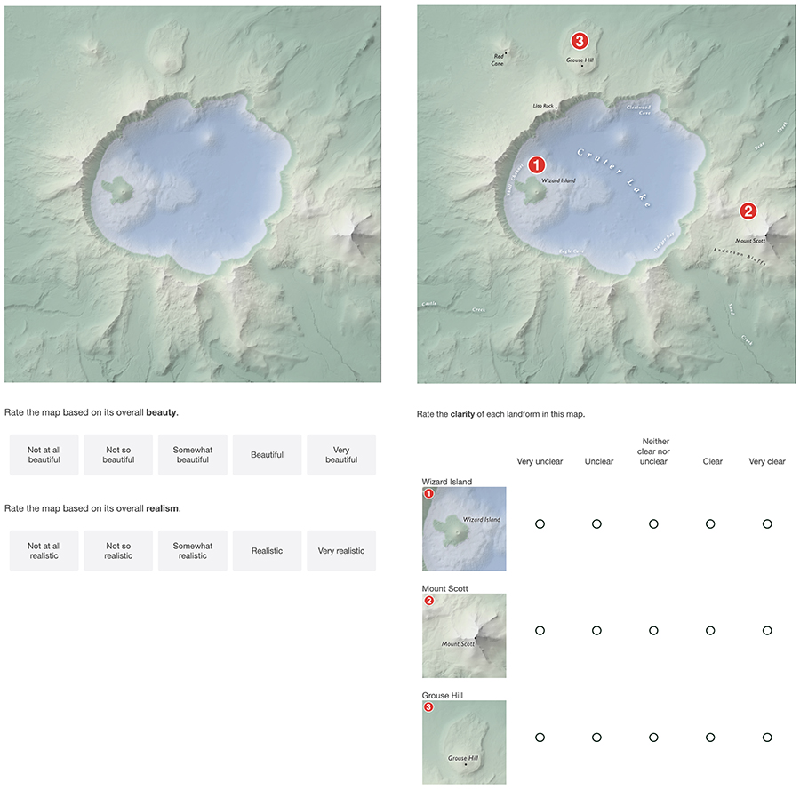
Figure 5. Example from the study asking a user to rate the beauty, realism (left), and landform clarity (right) of the Crater Lake map design that blended a hypsometric tint and ray-traced relief.
ANALYSIS
First, we tested the data for normality using a Shapiro-Wilk test, and then we tested for equality of variance using a Levene’s test. The results indicated that most of our data were not normally distributed and failed to demonstrate homogeneity of variance. Given this, non-parametric tests would be best suited for our data. However, there is some debate over to what degree the violation of these two assumptions affects statistical results (Scariano and Davenport 1987; Lix, Keselman, and Keselman 1996), and so we felt comfortable performing a parametric test: a two-way ANOVA with a Tukey HSD post-hoc test.
This ANOVA test was used to assess whether the choice of shaded relief and thematic terrain layers had a significant effect on beauty, realism, and landform clarity ratings. We chose a two-way ANOVA because in addition to independently testing the effect that shaded relief and thematic terrain layers had on rating scores, it also determines if there is a significant interaction effect between the two layers. This ability makes the two-way ANOVA a robust and valuable analysis for studies with two categorical independent variables (Norušis 2012). Essentially, an interaction occurs when “the effect of one independent variable is not the same for all levels of the other independent variable” (Rahman 2019, 125). However, since most of the samples failed the assumptions for a parametric analysis, we also ran a Welsh and Brown-Forsythe test to validate the ANOVA results. We then ran a Spearman’s rank-order correlation to test the relationship between beauty and realism rating scores.
To assess if a participant’s degree of familiarity with Crater Lake would have a confounding impact on the user study results, we ran two separate Independent Samples Mann-Whitney U tests for each of the three self-reported geographic familiarity questions. The first was for the combined mean rating scores of the participant’s beauty, realism, and landform clarity task responses. The second was on the participant’s independent rating scores for beauty, realism, and landform clarity tasks across the nine maps. For the samples that did pass the Shapiro-Wilk test or the Levene’s test, we used an independent t-test to validate the results.
RESULTS
Of the initial 105 respondents, we removed ten responses because of incomplete answers, failed attention checks, or an indication that they had expert knowledge of cartographic design, leaving 95 total responses for analysis. Forty-eight of the participants indicated they identified as female, 46 identified as male, and one identified as non-binary. Most of our participants either had some college education (20%) or a 4-year degree (38%). When indicating their familiarity with Crater Lake, 64% had heard of it, 42% had seen photos or maps, and 11% had visited Crater Lake. Since our project was an exploratory examination of our research question, we did not formulate a hypothesis for the results. However, we did run a series of statistical analyses that would help us better understand the relationships between perceived beauty, realism, and landform clarity among our user study population.
BEAUTY AND REALISM RESULTS
Both beauty and realism had similar results from the two-way ANOVA. The beauty rating task showed a significant main effect for both shaded relief (F(2,4) = 13.495, p < 0.001), and thematic layer (F(2,4) = 94.520, p < 0.001), but we found no significant interaction between the two (F(2,4) = 1.799, p = 0.115) for the beauty rating scores. The thematic terrain layers had a larger effect size (η2 = 0.18) on beauty rating scores than did shaded relief (η2 = 0.03). Similarly, the realism rating task showed a significant main effect for both shaded relief (F(2,4) = 16.46, p < 0.001) and thematic layer (F(2,4) = 132.996, p < 0.001) on realism rating scores, but no significant interaction between the two (F(2,4) = 2.202, p = 0.067). Thematic terrain layers also had a larger effect size (η2 = 0.24) on realism rating scores than did shaded relief (η2 = 0.04).
The Spearman’s rank-order correlation showed a statistically significant relationship (rs(8) = 0.653, p < 0.001) and indicated there was a positive correlation between beauty and realism rating scores. Figure 6 shows the estimated marginal means plotted for beauty and realism. The estimated marginal means are the mean beauty and realism scores for each thematic terrain layer averaged across the three shaded relief techniques
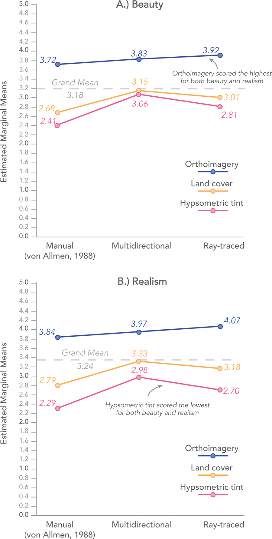
Figure 6. Estimated marginal means of beauty and realism scores from the two-way ANOVA. This graph shows the weighted means of beauty and realism scores for each thematic terrain layer averaged across the three shaded relief techniques. Greater distance between lines on the y-axis indicates a greater difference in rating scores for the combination of relief and thematic terrain layer.
The shaded relief Tukey HSD post-hoc test results were similar between the beauty and realism tasks. Results of the post-hoc tests revealed that beauty and realism scores for von Allmen’s manual shaded relief were statistically significantly lower than both the ray-traced relief (p = 0.001 for beauty; p < 0.001 for realism) and multidirectional shaded relief (p < 0.001), and there was no significant difference between multidirectional shaded relief and ray-traced relief (Figure 7, A).
The Tukey HSD post-hoc test results for the thematic terrain layers differed slightly between the beauty and realism tasks. The tests revealed that beauty scores for orthoimagery were statistically significantly higher than both hypsometric tinting (p < 0.001) and land cover (p < 0.001); but there was no significant difference between hypsometric tinting and land cover. The post-hoc test for realism rating scores showed that all thematic terrain layers differed significantly from one another (p < 0.001), confirming that orthoimagery was perceived as the most realistic and hypsometric tinting as the least realistic (Figure 7, B).
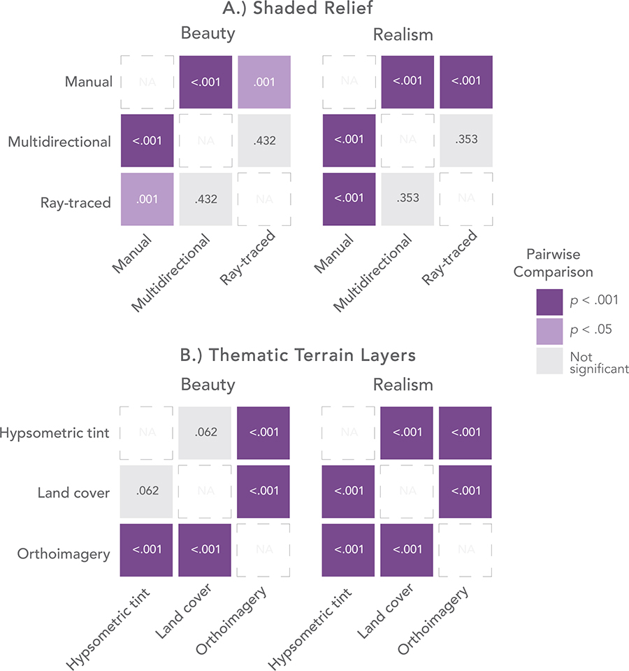
Figure 7. Pairwise comparison of beauty and realism results from the Tukey HSD post-hoc test.
LANDFORM CLARITY RESULTS
Across the three landforms (Wizard Island, Mount Scott, and Grouse Hill), results of the two-way ANOVA were not as consistent as the beauty and realism scores. For Wizard Island, the results of the two-way ANOVA showed a significant main effect for both shaded relief (F(2,4) = 25.28, p < 0.001), and thematic layer (F(2,4) = 17.187, p < 0.001), and a significant interaction between the two (F(2,4) = 3.196, p = 0.013) on clarity rating scores. Mount Scott also showed a significant main effect for both shaded relief (F(2,4) = 21.76, p < 0.001), and thematic layer (F(2,4) = 10.86, p < 0.001), and a significant interaction effect (F(2,4) = 2.798, p = 0.025). However, Grouse Hill only showed a significant main effect for shaded relief (F(2,4) = 44.16, p < 0.001) and a significant interaction effect (F(2,4) = 2.798, p = 0.014), but thematic terrain layers were not significant (F(2,4) = 0.641, p = 0.527). One similarity across the three landforms was that shaded relief had a larger effect size (Wizard Island: η2 = 0.056; Mount Scott: η2 = 0.049; Grouse Hill: η2 = 0.095) on landform clarity scores than thematic terrain layers (Wizard Island: η2 = 0.039; Mount Scott: η2 = 0.025; Grouse Hill: η2 = 0.002). Figure 8 shows the estimated marginal means of landform clarity scores plotted for each landform, which are the mean landform clarity scores for the shaded relief technique averaged across each thematic terrain layer.
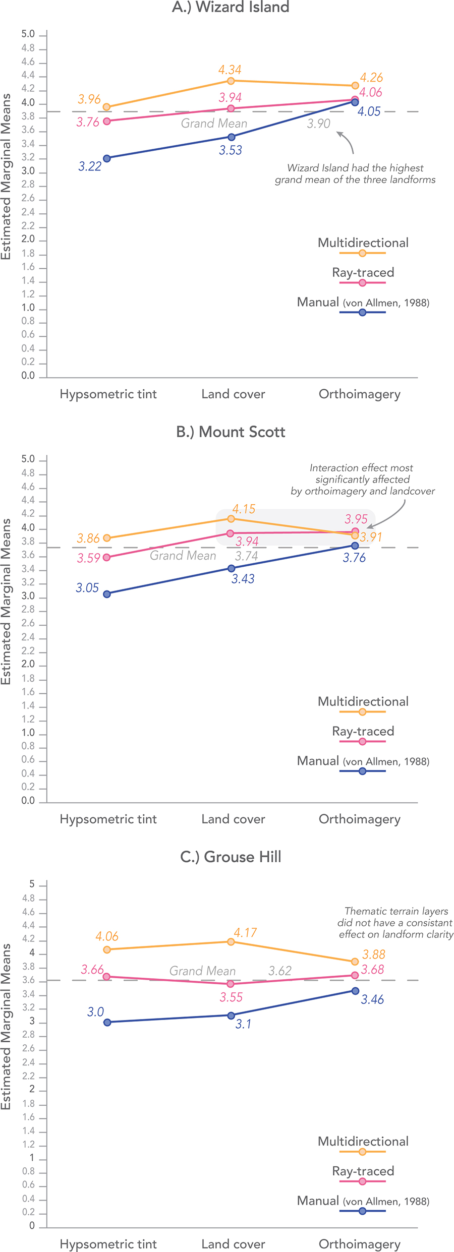
Figure 8. Estimated marginal means of landform clarity scores from the two-way ANOVA. This graph shows the weighted means of landform clarity scores for each thematic terrain layer averaged across the three shaded relief techniques. When the lines cross along the y-axis, it indicates that there was an interaction effect. In other words, the results depended on the combination of shaded relief and thematic terrain layers.
The Tukey HSD post-hoc tests for shaded relief were similar for Wizard Island and Grouse Hill, but Mount Scott had differences (Figure 9, A). The results showed all shaded relief methods were significantly different from one another (p < 0.05) for Wizard Island and Grouse Hill. However, for Mount Scott, von Allman’s manual relief differed significantly from the other two shaded relief designs (p < 0.001); but multidirectional shaded relief and ray-traced relief were not significantly different from one another (p = 0.213).
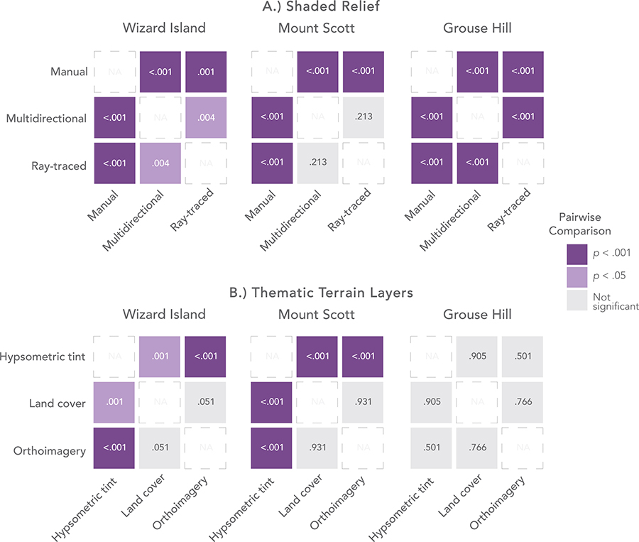
Figure 9. Pairwise comparison of landform clarity for Wizard Island, Mount Scott, and Grouse Hill from the Tukey HSD post-hoc test.
For thematic terrain layers, the HSD post-hoc tests showed similar results between Wizard Island and Mount Scott, but not for Grouse Hill (Figure 9, B). Wizard Island and Mount Scott showed there was a significant difference between hypsometric tint and land cover (Wizard Island: p = 0.001; Mount Scott: p < 0.001); hypsometric tint and orthoimagery were significantly different (p < 0.001); but orthoimagery and land cover were not significantly different (Wizard Island: p = 0.051; Mount Scott: p = 0.931). Results for Grouse Hill indicated that thematic terrain layers were not a significant main effect, thus there was no significant difference between hypsometric tint, land cover, and orthoimagery.
GEOGRAPHIC FAMILIARITY RESULTS
Geographic familiarity had no significant effect on participants’ combined mean rating scores for beauty, realism, and clarity (Table 1). However, geographic familiarity had a statistically significant impact on four specific map designs between groups for each familiarity question (Table 2). Even though more participants had heard of Crater Lake (N = 61, M = 42.98), those who had not heard of Crater Lake (N = 32, M = 57) gave higher clarity ratings for Wizard Island when looking at the map design with multidirectional shaded relief and hypsometric tinting (U = 1343, p = 0.009). Participants who had seen photos or maps of Crater Lake (N = 40, M = 56.44) gave higher realism ratings for the map using multidirectional shaded relief and hypsometric tinting (U = 762.5, p = 0.008) than those who had not seen maps or photos of Crater Lake (N = 55, M = 41.86). Those same participants who had seen photos or maps of Crater Lake (N = 40, M = 64.90) also gave higher clarity ratings for Wizard Island when looking at the map design using multidirectional shaded relief and land cover (U = 1386, p = 0.017) compared to those who had not seen maps or photos of Crater Lake (N = 55, M = 46.01). Of those who had visited Crater Lake (N = 10, M = 64.90) gave higher clarity ratings for Mount Scott when looking at the map design with von Allmen’s manual shaded relief and orthoimagery (U = 256, p = 0.031) than those who had not visited.
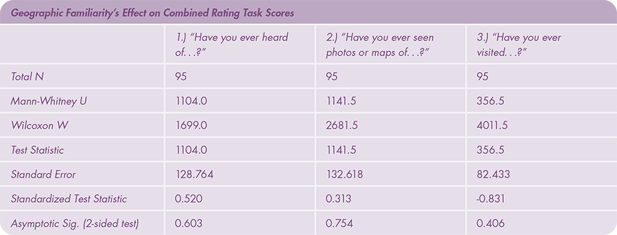
Table 1. No significant differences were found for the combined mean rating scores for beauty, realism, and landform clarity across the three geographic familiarity questions.
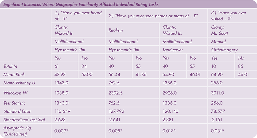
Table 2. Significant differences were found amongst four specific instances in the user study across the three geographic familiarity questions.
DISCUSSION
BEAUTY AND REALISM RATING TASKS
Overall, there was a wide variety of responses to the beauty and realism rating tasks, and the ratings depended on the shaded relief and thematic terrain layers used. The ratings were influenced more by the thematic terrain layers than shaded relief designs in our stimuli, although they were both significant effects. And while both shaded relief and thematic terrain layers were significant, the scores were not dependent on the combination of thematic terrain and shaded relief, rather the two variables had unique outcomes on users’ perceptions. Finally, the outcomes from both tasks showed there to be a correlation between perceived beauty and realism.
The effect of shaded relief on the beauty and realism ratings showed that participants consistently rated von Allmen’s manual relief as the least beautiful and realistic of the three shaded relief methods. To some, this may be a surprising finding, because the cartographic community time and again has pointed to manual relief as the most artistic and realistic technique for representing terrain (Imhof 1982; Brassel 1974; Collier, Forrest, and Pearson 2003; Marston and Jenny 2015). However, this result confirmed our expectations, since manual relief inherently is tied to the cartographer’s individual interpretation of the landscape through generalization (Patterson 2018). Our ray-traced relief and multidirectional shaded relief were both rated highly for perceived beauty and realism; however, even though multidirectional relief had a higher mean score compared to the ray-traced relief, the ratings were not significantly different between the two, so we cannot conclude if one was truly perceived as more beautiful or realistic.
For the thematic terrain layers, map readers found orthographic imagery to be the most beautiful and realistic. Orthographic imagery often adds more visual complexity than other thematic terrain layers, and tends to feature darker colors, making it a challenging layer to pair with overlaying vector data (Hoarau, Christophe, and Mustière 2013). It was surprising to see that orthoimagery was rated as the most beautiful, but this finding might suggest that visually complex images can be deemed aesthetically preferable. It was, however, not surprising that orthoimagery was the highest rated for the realism task, given the literature (Hoarau and Christophe 2017; Peterson 2012). This confirms Peterson’s (2012) notion that incorporating satellite imagery into maps, such as with Google Maps, Google Earth, and other online navigation maps, provides context and an aesthetic that is more relatable to average map users. Further, common web map applications rarely use hypsometric tinting and land cover, which could have contributed to orthoimagery being rated higher in the beauty and realism rating tasks, since average map readers are more (and increasingly) familiar with imagery. Land cover and hypsometric tinting were both rated lower for perceived beauty and realism; however, for beauty ratings, the two thematic terrain layers were not significantly different, but for realism ratings, the results indicated that hypsometric tinting was perceived as the least realistic. This finding may have some merit, since hypsometric tinting is an abstraction of reality and, depending on the design, it is not always a realistic visualization of how the landscape looks. Depending on the location and the colors used in the representation, it has the potential to convey inaccurate information about vegetation, rainfall, or temperature (Patton and Crawford 1977). It was clear from these results that the combination of von Allmen’s manual shaded relief and hypsometric tinting do not elicit a strong sense of realism, especially when compared to other depictions that use orthoimagery.
Our research found, regarding aesthetics, that more realistic images (maps with orthoimagery) were ranked higher than abstract images (maps with land cover or hypsometric tinting). This is interesting because researchers who have studied the effects of naïve realism posit that photorealistic representations are strongly desired by participants, despite exhibiting lower performance scores in map interpretation as compared to abstract representations (Hegarty et al. 2009; Smallman and St. John 2005). Since our research did not have a series of map reading tasks, we cannot gauge if map interpretation is also negatively affected by more realistic representations. However, participants were clearly more drawn to orthoimagery for its aesthetic appeal. More research should be done to investigate the difference in map preference and performance as it is related to thematic terrain layers.
One of the most surprising findings was the direct correlation between beauty and realism scores. Cartographers have alluded to a connection between beauty and realism, claiming that a realistic cartographic representation of the landscape can aid in creating an appealing aesthetic quality for readers (Harvey 1980; Robinson 1989). In other words, the literature has suggested that a beautiful map is a realistic map. A Spearman’s correlation statistic confirmed this relationship and showed that our map readers found the most/least beautiful maps were also the most/least realistic ones (Figure 10). Our research illustrates that beauty and realism are linked when shaded relief is combined with thematic terrain layers in terrain maps. Based on this research, it was clear that abstract representations like hypsometric tinting and von Allmen’s manual relief were less preferable for beauty ratings, perhaps not because they are inherently unattractive, but because they were not as realistic and did not resemble the landscape as explicitly as did the orthoimagery and ray-traced relief used in our stimuli (Figure 11).
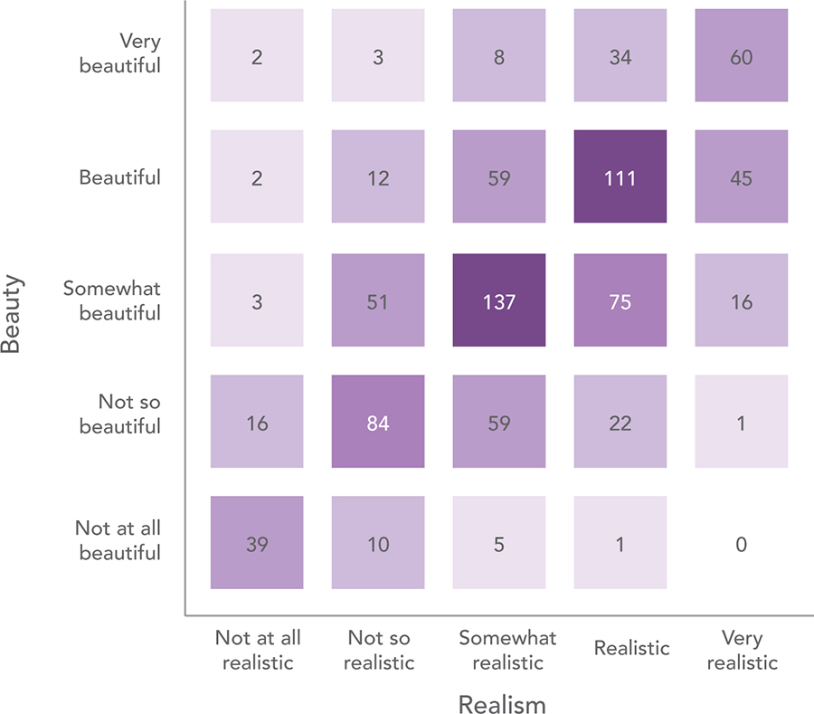
Figure 10. Heatmap showing the frequency of correlated beauty and realism responses for the entire user study. Participants frequently rated maps with the same Likert value for both beauty and realism. The graph shows a positive correlation between the two rating variables.
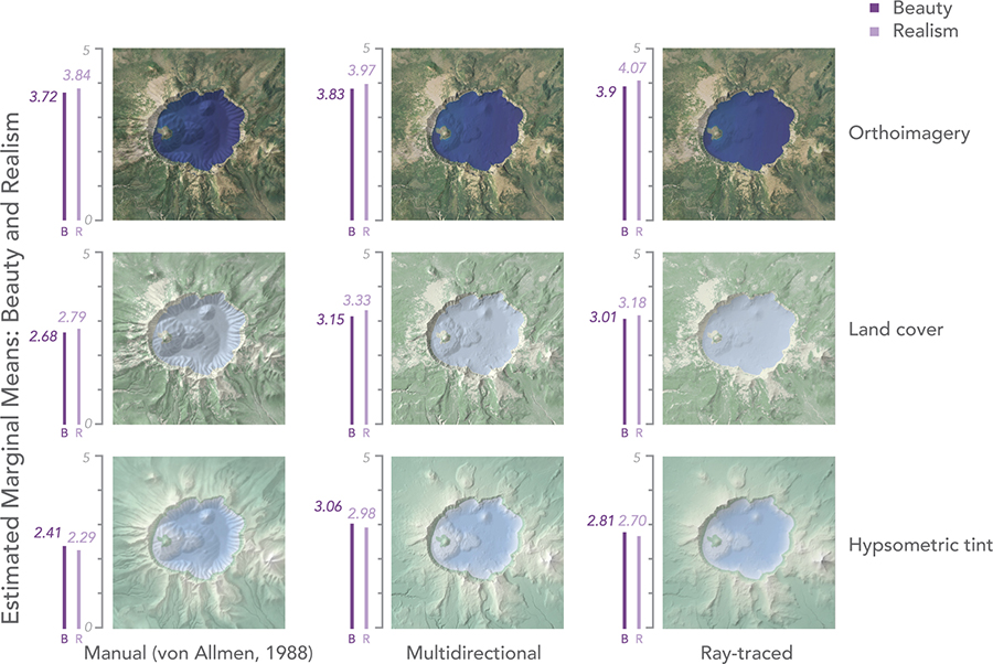
Figure 11. Comparison of estimated marginal means for beauty and realism rating scores by map. Scores were statistically similar between beauty and realism.
LANDFORM CLARITY RATING TASKS
The results of the user study showed that landform clarity ratings differed from beauty and realism ratings in certain ways but had some similarities as well. Much like the outcomes from the beauty and realism ratings, von Allmen’s manual relief was rated lowest. Unlike the beauty and realism ratings, the landform clarity ratings showed that shaded relief was more influential on participant perceptions of landform clarity than thematic terrain layers. There was also a significant interaction effect between the shaded relief layers and the thematic layers for landform clarity ratings for all three landforms: Wizard Island, Mount Scott, and Grouse Hill, which we did not find for beauty and realism. This meant that there were unique outcomes for user perceptions of landform clarity depending on the pairing of shaded relief and thematic layers. This is an interesting finding because it suggests that specific pairings of shaded relief and thematic terrain layer types were more important for landform clarity than they were for beauty and realism in our study.
In terms of shaded relief on its own, depending on the landform in question, there was a different order of most to least clear shaded relief layer. Grouse Hill and Wizard Island both had the same, statistically significant order of perceived clarity: multidirectional shaded relief was the highest rated, ray-traced relief was second, and manual relief was the least clear. However, for Mount Scott, von Allmen’s manual relief was the least clear, but there was no statistically significant difference between the two analytical shaded relief methods.
The effect of the thematic terrain layers on landform clarity ratings was also inconsistent across the three landforms, and not always a significant influencing factor. For example, the thematic terrain layers had an influence on clarity ratings for Wizard Island and Mount Scott, but not for Grouse Hill. This finding confirms that shaded relief had a stronger impact on each landform, since we statistically did not find that the thematic terrain layers played a significant role in influencing landform clarity on their own.
Testing the interaction of combining shaded relief and thematic terrain layers was statistically significant and provided insights into designing terrain maps with the goal of more clearly depicting landforms to map readers. In short, the differing combination of shaded relief and thematic layers led to different ratings of landform clarity, and this was dependent on the specific landform. For instance, with Mount Scott, landform clarity was highest when multidirectional relief was paired with land cover, but when multidirectional relief was paired with orthoimagery, the clarity was negatively affected. This was not the case for Grouse Hill and Wizard Island. For those two landforms, while the interaction effect was still significant, the pairing of the thematic terrain layers with multidirectional relief did not lead to such a dramatic effect on landform clarity. The interaction effect was interesting because shaded relief is rarely used in isolation, and it was clear that the thematic terrain layers had an effect depending on how they were paired with the shaded relief layers. This confirms that neither shaded relief nor thematic terrain layers are the sole contributor to a beautiful, realistic, or clear terrain map, but that the layers provide distinct qualities, and the interaction between shaded relief and thematic terrain is of importance for landform clarity, specifically.
Finally, the results of the landform clarity section of the user study experiment imply that figure-ground may be a confounding factor in landform clarity. For example, Wizard Island had the highest grand mean value for perceived clarity (M = 3.90), with Mount Scott following (M = 3.74), and Grouse Hill with the lowest (M = 3.62), suggesting that map readers on average found Wizard Island to be clearer than the other landforms. It is easy to see when looking at a map of Crater Lake, Oregon that, indeed, Wizard Island is a very prominent feature in the water-filled crater, followed by Mount Scott, the largest mountain landform in the vicinity, followed by Grouse Hill, which is far less visually prominent. It’s understood that there is a special relationship between land and water regarding map interpretation (Head 1972) and that foreground features move up higher in the visual order (Haber and Hershenson 1973). This is especially true when foreground features have greater visual contrast (like the contrast between Wizard Island and the water of Crater Lake) which can help them stand out, become more distinguishable, and create a perceptually distinct sense of hierarchy (MacEachren and Mistrick 1992). The lower clarity scores for Grouse Hill, on the other hand, can be explained by these same theories. Indeed, one participant said that Grouse Hill “was [the] hardest to make clear” which was perhaps because of its lower elevation, minimal vertical height difference, and less contrast between the landform and the base of the hill. While the aim of this research was not to understand the connection between landform clarity and contrast, this result indicates that certain landforms might receive higher landform clarity ratings, regardless of their shaded relief and thematic terrain pairing, because of their figure-ground relationship.
GEOGRAPHIC FAMILIARITY
It is known that a person’s landscape preference (Dearden 1984; Herzog et al. 2000) and map reading ability can depend on their prior level of geographic knowledge (Kaplan 1987). In this study, familiarity with Crater Lake, Oregon had a statistically significant impact in four specific instances in the user study. Participants who had never heard of Crater Lake were more likely to find Wizard Island to be most clear when multidirectional shaded relief and hypsometric tinting were combined. Interestingly, those who had seen photos and maps of Crater Lake rated Wizard Island as most clear when multidirectional shaded relief was combined with land cover instead. Those same participants were also more likely to rate the combination of multidirectional shaded relief and hypsometric tinting as most realistic. And finally, those who had visited Crater Lake were more likely to rate Mount Scott as most clear when von Allmen’s manual relief was combined with orthoimagery.
CONCLUSION
Cartographers often combine shaded relief with thematic terrain layers when creating terrain maps, thus the primary aim of this research was to understand the relationship between these two layers on map reader perceptions of beauty, realism, and landform clarity. In an exploratory online user study, we tested the combination of three shaded relief layers (manual, multidirectional, and ray-traced) with three common thematic terrain layers (hypsometric tinting, land cover, and orthoimagery) in a series of maps of Crater Lake, Oregon and measured participants’ ratings of beauty, realism, and landform clarity.
OVERVIEW OF THE FINDINGS
There were five main findings in this research, which we summarize here.
First, the results of this research showed there to be a direct correlation between beauty and realism scores, which were more influenced by thematic terrain layers than by shaded relief. Cartographers have long suggested a connection between beauty and realism, claiming that a realistic cartographic representation of the landscape can lead to a more appealing aesthetic (Harvey 1980; Robinson 1989), and our empirical research corroborated those claims. Given this, cartographers should keep in mind the link between these two aspects when designing terrain maps.
Second, we found von Allmen’s manual relief to be consistently rated lowest for beauty, realism, and landform clarity, while orthoimagery was rated as most beautiful and realistic, and—when combined with certain shaded relief layers—sometimes improved landform clarity scores. These findings are surprising because, in general, professional cartographers hold manual relief in high regard. They promote it as a beautiful hand-drawn artform (Imhof 1982; Brassel 1974; Collier, Forrest, and Pearson 2003; Marston and Jenny 2015), while orthoimagery is often dismissed as being pedestrian and adding unnecessary visual complexity to maps (Hoarau, Christophe, and Mustière 2013; Touya, Hoarau, and Christophe 2016). This finding may suggest that cartographic experience affects a person’s preferences, however, we cannot make any generalizing claims, given that we only tested novice map users and only used one example of hand-drawn shaded relief.
Third, in contrast to beauty and realism, the landform clarity ratings showed that shaded relief was more influential than the thematic terrain layers; however, there was a significant interaction effect, which meant that different landform clarity ratings arose from different combinations of layers. This is important because past research has focused largely on analyzing map reader perceptions of shaded relief on its own (Biland and Çöltekin 2017; Farmakis-Serebryakova and Hurni 2020; Jenny et al. 2020); however, this research makes it clear that every map has its own unique effect, based upon the combination of shaded relief and thematic terrain layers.
Fourth, a participant’s familiarity with Crater Lake did not influence the overall combined rating scores for all nine maps, but only had a statistically significant impact in four specific instances in the user study. The findings suggest that different levels of familiarity influence reader perceptions depending on the question being asked and the specific combinations of shaded relief and thematic terrain layers.
Finally, in our study, neither shaded relief nor thematic terrain layers were the sole contributors to map readers’ perceptions of beauty, realism, or landform clarity. Instead, these layers had distinct effects in different situations depending on their pairing. This confirms that the interaction between shaded relief and thematic terrain layers is an important consideration when creating terrain maps.
LIMITATIONS AND FURTHER RESEARCH
Future research would be well served by building on the following limitations of this study:
- While participants consistently rated von Allmen’s manual relief as the least beautiful, realistic, and clear in depicting landforms, the particular drawing used in this study was just one example of this relief method. The look of a manual relief varies depending on the cartographer’s style, skill level, and interpretation of the landscape. Additionally, both the land and bathymetric landforms in von Allmen’s relief of Crater Lake were less detailed when compared to the digital relief models, which may have led to confounding effects on aesthetic perceptions between the different relief methods. Further research should verify these findings by testing multiple manual shaded relief drawings (Jenny et al. 2020), multiple geographies and landform types (Farmakis-Serebryakova and Hurni 2020), varying spatial scales, and different levels of detail.
- This study did not consider contrast, lightness, or saturation, which may have had confounding effects on the results. The analysis showed that participants felt orthoimagery was the most realistic and beautiful; it was also the darkest, had the highest contrast, and the most saturated colors. One participant commented: “I noticed I liked the darker contrasted maps better than the lighter colored ones.” Likewise, the maps that had the lowest ratings used hypsometric tinting, which was significantly lighter and less saturated. Other cartographic research has shown that map readers’ preferences are strongly affected by contrast (Fabrikant et al. 2012; Limpisathian 2017; Brewer 1992). Future research should emphasize consistency in contrast, lightness, and saturation in terrain representation to avoid this potentially confounding variable.
- In this research we only tested maps of one location. However, Raposo and Brewer (2014) found that map location and the types of landforms present in the stimuli played a significant role in readers’ aesthetic preferences. Future research could involve showing participants maps of a variety of locations, such as in Jenny and Patterson (2021), manual relief from shadedreliefarchive.com, or using different landforms such as in Farmakis-Serebryakova and Hurni’s (2020) experiment to either corroborate or challenge the findings of our exploratory research.
- The results of this study also implied that the visual contrast of a landform may have been important in explaining why certain features were consistently rated higher for landform clarity than others. In this study, Wizard Island, arguably the most prominent feature in the Crater Lake area, was consistently rated as the most clearly distinguishable landform, while Grouse Hill was rated as the least clear. Since it is understood that land-water representation has a strong effect on map reader interpretation (Head 1972), there could be a correlation between Wizard Island’s higher visual contrast and higher landform clarity ratings. Future research should control for or test the implications of contrast and figure-ground on ratings of beauty, realism, and landform clarity.
- Participants noted, in the open-ended question, that seeing one map at a time lead to difficulty in judging the beauty and realism across all nine stimuli maps. Future experiments could involve allowing participants to see all or some of the map designs side-by-side when rating beauty and realism.
- This research was conducted online and was limited to participants in the United States who did not have expert knowledge in cartographic design. Several potentially confounding variables should be controlled for or explored in future research. Perceptions of clarity and beauty might differ between participants using different screen sizes or digital devices; between participants given digital or paper maps; between participants in different parts of the world; and between novice participants and experts or practicing cartographers.
- Participants were only asked to rate the beauty and realism of each map and comment on the clarity of landforms. Future research could build upon our exploratory findings to also incorporate tasks that would require participants to interpret large and small landforms, engage in way-finding and navigation, or read overlaying vector information, all in order to investigate map reader performance (Castner and Wheate 1979; Hegarty et al. 2009; Raposo and Brewer 2014; Smallman and St. John 2005).
- Finally, our research focused on just three shaded relief layers and three thematic terrain layers. Future researchers could expand on this by testing a wider range of layers or a range of parameters used to create these layers. Some examples of terrain map representation techniques to include in a future analysis are: texture shading (Brown 2014), neural network relief shading (Jenny et al. 2020), sky models (Kennelly and Stewart 2014), sky-view factor hillshading (Zakšek, Oštir, and Kokalj 2011), aerial perspective (Jenny and Patterson 2021), 2D versus 3D relief representations (Taveras 2018), plan oblique relief (Jenny and Patterson 2007), and Swiss-style color relief shading (Imhof 1982; Jenny and Hurni 2006).
CONCLUDING THOUGHTS
Maps are not just tools for navigating when we get lost, but also works of art worth getting lost in (Ribeiro and Caquard 2018; Harmon 2009). Perceived beauty and realism, in combination with assurance that map readers can accurately see specific landforms, is essential for producing a successful terrain map. With this in mind, our exploratory research provides cartographic researchers with a methodology for investigating aesthetics and landform clarity in terrain maps, with mindful consideration to both traditional and contemporary shaded relief methods when combined with thematic terrain layers. While the results of our research might imply some best practices, we cannot make any definitive claims that can be generalized outside of this study, due to the limitations discussed above. Given this, we encourage future researchers to build upon our work, and provide some helpful insight by further testing the combination of relief and thematic terrain layers.
REFERENCES
Atwood, Peter. 2020. “Relief Shading in Blender - Tips and Tricks with Peter Atwood.” Geospatial Frontier. Accessed January 3, 2021. https://www.geospatialfrontier.com/medialibrary/relief-shading-in-Blender-tips-and-tricks-with-peter-atwood.
Bell, Sarah. 2018. “Drawing Hillshade: A Tutorial (with Time Lapse Videos).” Petrichor. Accessed January 3, 2021 https://petrichor.studio/2018/10/22/drawing-hillshade-shaded-relief-with-time-lapse-video-demos.
Biland, Julien, and Arzu Çöltekin. 2017. “An Empirical Assessment of the Impact of the Light Direction on the Relief Inversion Effect in Shaded Relief Maps: NNW is Better than NW.” Cartography and Geographic Information Science 44 (4): 358–372. https://doi.org/10.1080/15230406.2016.1185647.
Blender Documentation Team. 2021. “The Blender 2.93 Manual.” Accessed January 3, 2021. https://docs.blender.org/manual.
Brassel, Kurt. 1974. “A Model for Automatic Hill-shading.” The American Cartographer 1 (1): 15–27. https://doi.org/10.1559/152304074784107818.
Brewer, Cynthia A. 1992. “Review of Colour Terms and Simultaneous Contrast Research for Cartography.” Cartographica 29 (3–4): 20–30. https://doi.org/10.3138/80ML-3K54-0204-6172.
Brown, Leland. 2014. “Texture Shading: A New Technique for Depicting Terrain Relief.” 9th ICA Mountain Cartography Workshop, April 22–26, 2014. http://www.mountaincartography.org/activities/workshops/banff_canada/papers/brown.pdf.
Castner, Henry W., and Roger Wheate. 1979. “Re-assessing the Role Played by Shaded Relief in Topographic Scale Maps.” The Cartographic Journal 16 (2): 77–85. https://doi.org/10.1179/caj.1979.16.2.77.
Collier, Peter, David Forrest, and Alastair Pearson. 2003. “The Representation of Topographic Information on Maps: The Depiction of Relief.” The Cartographic Journal 40 (1): 17–26. https://doi.org/10.1179/000870403235002033.
Çöltekin, Arzu, and Julien Biland. 2019. “Comparing the Terrain Reversal Effect in Satellite Images and in Shaded Relief Maps: an Examination of the Effects of Color and Texture on 3D Shape Perception from Shading.” International Journal of Digital Earth 12 (4): 442–459. https://doi.org/10.1080/17538947.2018.1447030.
Cosgrove, Denis. 2005. “Maps, Mapping, Modernity: Art and Cartography in the Twentieth Century.” Imago Mundi 57 (1): 35–54. https://doi.org/10.1080/0308569042000289824.
Dearden, Philip. 1984. “Factors Influencing Landscape Preferences: an Empirical Investigation.” Landscape Planning 11 (4): 293–306. https://doi.org/10.1016/0304-3924(84)90026-1.
Dent, Borden, Jeff Torguson, and Thomas Hodler. 2008. Cartography: Thematic Map Design, 6th Edition. New York: McGraw-Hill.
Fabrikant, Sara I., Sidonie Christophe, Georgios Papastefanou, and Sara Lanini-Maggi. 2012. “Emotional Response to Map Design Aesthetics.” GIScience 2012: Seventh International Conference on Geographic Information Science, Columbus, OH, 18 September 18–21, 2012. https://doi.org/10.5167/uzh-71701.
Farmakis-Serebryakova, Marianna, and Lorenz Hurni. 2020. “Comparison of Relief Shading Techniques Applied to Landforms.” ISPRS International Journal of Geo-Information 9 (4): 253. https://doi.org/10.3390/ijgi9040253.
Field, Kenneth, and Damien Demaj. 2012. “Reasserting Design Relevance in Cartography: Some Concepts.” The Cartographic Journal 49 (1): 70–76. https://doi.org/10.1179/0008704112Z.00000000011.
Glassner, Andrew S., ed. 1989. An Introduction to Ray Tracing. San Francisco: Morgan Kaufmann.
Guidero, Elaine Meredith. 2016. “Where Cartography Meets Typography: Choosing Typefaces and Semantic Effects for Maps Using Microaesthetics.” PhD diss., The Pennsylvania State University.
Haber, Ralph N., and Maurice Hershenson. 1973. The Psychology of Visual Perception. New York: Holt, Rinehart & Winston.
Harmon, Katharine. 2009. The Map as Art: Contemporary Artists Explore Cartography. New York: Princeton Architectural Press.
Harvey, Paul Dean Adshead. 1980. The History of Topographical Maps: Symbols, Pictures and Surveys. London: Thames and Hudson.
Head, C. Grant. 1972. “Land-water Differentiation in Black and White Cartography.” Cartographica 9 (1): 25–38. https://doi.org/10.3138/L486-X2R8-6821-14P7.
Hegarty, Mary, Harvey S. Smallman, Andrew T. Stull, and Matt S. Canham. 2009. “Naïve Cartography: How Intuitions about Display Configuration Can Hurt Performance.” Cartographica 44 (3): 171–186. https://doi.org/10.3138/carto.44.3.171.
Herzog, Thomas R., Eugene J. Herbert, Rachel Kaplan, and C. L. Crooks. 2000. “Cultural and Developmental Comparisons of Landscape Perceptions and Preferences.” Environment and Behavior 32 (3): 323–346. https://doi.org/10.1177/0013916500323002.
Hoarau, Charlotte, and Sidonie Christophe. 2017. “Cartographic Continuum Rendering Based on Color and Texture Interpolation to Enhance Photo-Realism Perception.” ISPRS Journal of Photogrammetry and Remote Sensing 127: 27–38. https://doi.org/10.1016/j.isprsjprs.2016.09.012.
Hoarau, Charlotte, Sidonie Christophe, and Sébastien Mustière. 2013. “Mixing, Blending, Merging or Scrambling Topographic Maps and Orthoimagery in Geovisualization?” 26th International Cartographic Conference, Dresden, Germany. https://www.researchgate.net/publication/255979488_Mixing_blending_merging_or_scrambling_topographic_maps_and_orthoimagery_in_geovisualizations.
Huffman, Daniel P. 2014. “Shaded Relief in Blender.” 9th ICA Mountain Cartography Workshop, April 22–26, 2014. http://www.mountaincartography.org/activities/workshops/banff_canada/papers/huffman.pdf.
———. 2017. “Creating Shaded Relief in Blender.” somethingaboutmaps. Accessed January 1, 2021. https://somethingaboutmaps.wordpress.com/2017/11/16/creating-shaded-relief-in-blender.
Huffman, Daniel P., and Tom Patterson. 2013. “The Design of Gray Earth: A Monochrome Terrain Dataset of the World.” Cartographic Perspectives 74: 61–70. https://doi.org/10.14714/CP74.580.
Imhof, Eduard. 1982. Cartographic Relief Presentation. Berlin: Walter de Gruyter. https://doi.org/10.1515/9783110844016.
Imus, David, and Paula Loftin. 2012. “The Beauty of Clear Communication.” Cartographic Perspectives 73: 103–106. https://doi.org/10.14714/CP73.591.
Jenny, Bernhard, and Lorenz Hurni. 2006. “Swiss-Style Colour Relief Shading Modulated by Elevation and by Exposure to Illumination.” The Cartographic Journal 43 (3): 198–207. https://doi.org/10.1179/000870406X158164.
Jenny, Bernhard, Magnus Heitzler, Dilpreet Singh, Marianna Farmakis-Serebryakova, Jeffery Chieh Liu, and Lorenz Hurni. 2020. “Cartographic Relief Shading with Neural Networks.” IEEE Transactions on Visualization and Computer Graphics 27 (2): 1225–1235. https://doi.org/10.1109/TVCG.2020.3030456.
Jenny, Bernhard. 2021. “Terrain Generalization with Line Integral Convolution.” Cartography and Geographic Information Science 48 (1): 78–92. https://doi.org/10.1080/15230406.2020.1833762.
Jenny, Bernhard, and Tom Patterson. 2007. “Introducing Plan Oblique Relief.” Cartographic Perspectives 57: 21–40. https://doi.org/10.14714/CP57.279.
———. 2021. “Aerial Perspective for Shaded Relief.” Cartography and Geographic Information Science 48 (1): 21–28. https://doi.org/10.1080/15230406.2020.1813052.
Kaplan, Stephen. 1987. “Aesthetics, Affect, and Cognition: Environmental Preference from an Evolutionary Perspective” Environment and Behavior 19 (1): 3–32. https://doi.org/10.1177/0013916587191001.
Kennelly, Patrick J., and A. James Stewart. 2014. “General Sky Models for Illuminating Terrains.” International Journal of Geographical Information Science 28 (2): 383–406. https://doi.org/10.1080/13658816.2013.848985.
Kennelly, Patrick J., Tom Patterson, Bernhard Jenny, Daniel P. Huffman, Brooke E. Marston, Sarah Bell, and Alexander M. Tait. 2021. “Elevation models for reproducible evaluation of terrain representation.” Cartography and Geographic Information Science 48 (1): 63–77. https://doi.org/10.1080/15230406.2020.1830856.
Kent, Alexander J. 2005. “Aesthetics: a Lost Cause in Cartographic Theory?” The Cartographic Journal 42 (2): 182–188. https://doi.org/10.1179/000870405X61487
Kent, Alexander J., Kenneth Field, Bernhard Jenny, and Anja Hopfstock. 2012. “Cartographic Design and Aesthetics ‘FAQ’.” Cartographic Perspectives 73: 13–16. https://doi.org/10.14714/CP73.594.
Larson, Joe. 2019. “Yet Another Blender Hillshade Tutorial.” Joe’s Page. Accessed January 3, 2021. https://joelarson.com/2019/04/07/Blender-hillshades.html.
Limpisathian, Pongpichaya. 2017. “Evaluating Visual Contrast and Hierarchy Relations of Cartographic Features Across Multi-Scale Map Displays.” Master’s thesis, The Pennsylvania State University.
Lix, Lisa M., Joanne C. Keselman, and Harvey J. Keselman. 1996. “Consequences of Assumption Violations Revisited: A Quantitative Review of Alternatives to the One-Way Analysis of Variance F Test.” Review of Educational Research 66 (4): 579–619. https://doi.org/10.3102/00346543066004579.
Loissios, Dimitrios, Nikolaos Tzelepis, and Byron Nakos. 2007. “A Methodology for Creating Analytical Hill-shading by Combining Different Lighting Directions.” 23rd International Cartographic Conference, August 4–10, 2007. http://www.mountaincartography.org/publications/papers/ica_cmc_sessions/5_Moscow_Session_Mountain_Carto/moscow_loisios.pdf.
MacEachren, Alan M., and T. A. Mistrick. 1992. “The Role of Brightness Differences in Figure-ground: is Darker Figure?” The Cartographic Journal 29 (2): 91–100. https://doi.org/10.1179/caj.1992.29.2.91.
Mark, Robert K. 1992. A Multidirectional, Oblique-weighted, Shaded-relief image of the Island of Hawaii. No. 92-422. US Geological Survey. https://doi.org/10.3133/ofr92422.
Marston, Brooke E., and Bernhard Jenny. 2015. “Improving the Representation of Major Landforms in Analytical Relief Shading.” International Journal of Geographical Information Science 29 (7): 1144–1165. https://doi.org/10.1080/13658816.2015.1009911.
Marston, Brooke, Caroline Rose, Nat Case, and Vanessa Knoppke-Wetzel, eds. 2020. Atlas of Design, Volume Five. Milwaukee, WI: North American Cartographic Society.
Morgan-Wall, Tyler. 2018. “Throwing Shade at the Cartographer Illuminati: Raytracing the Washington Monument in R.” Rayverse Blog. Accessed January 20, 2022. https://www.tylermw.com/throwing-shade.
Norušis, Marija J. 2012. IBM SPSS Statistics 19 Statistical Procedures Companion. Upper Saddle River, NJ: Prentice Hall.
Patterson, Tom. 1997. “A Desktop Approach to Shaded Relief Production.” Cartographic Perspectives 28: 38–39. https://doi.org/10.14714/CP28.694.
———. 2002. “Getting Real: Reflecting on the New Look of National Park Service Maps.” Cartographic Perspectives 43: 43–56. https://doi.org/10.14714/CP43.536.
———. 2018. “Relief Presentation on US National Park Service Maps.” Proceedings of the ICA 1: 1–5. https://doi.org/10.5194/ica-proc-1-90-2018.
Patterson, Tom, and Bernhard Jenny. 2011. “The Development and Rationale of Cross-blended Hypsometric Tints.” Cartographic Perspectives 69: 31–46. https://doi.org/10.14714/CP69.20.
Patton, Jeffrey C., and Paul V. Crawford. 1977. “The Perception of Hypsometric Colours.” The Cartographic Journal 14 (2): 115–127. https://doi.org/10.1179/caj.1977.14.2.115.
Peterson, Gretchen N. 2012. Cartographer’s Toolkit: Colors, Typography, Patterns. Fort Collins, CO: PetersonGIS.
Peterson, Gretchen N. 2020. GIS Cartography: A Guide to Effective Map Design. Boca Raton, FL: CRC Press. https://doi.org/10.1201/9781003046325.
Powell, Owen. 2016. “Owen Powell - Maps and Terrain Models.” BlenderNation. Accessed January 3, 2021. https://www.Blendernation.com/2016/09/03/owen-powell-maps-terrain-models.
Rademacher, Paul. 1997. “Ray Tracing: Graphics for the Masses.” XRDS: Crossroads, The ACM Magazine for Students 3 (4): 3–7. https://doi.org/10.1145/270955.270962.
Rahman, Akm Samsur. 2019. “Effects of Nanofibers on Properties of Geopolymer Composites.” In Nanotechnology in Eco-efficient Construction, edited by Fernando Pacheco-Torgal, Maria Vittoria Diamanti, Ali Nazari, Claes Goran Granqvist, Alina Pruna, and Serji Amirkhanian, 123–140. Cambridge: Woodhead Publishing. https://doi.org/10.1016/B978-0-08-102641-0.00006-2.
Raposo, Paulo, and Cynthia A. Brewer. 2014. “Landscape Preference and Map Readability in Design Evaluation of Topographic Maps with an Orthoimage Background.” The Cartographic Journal 51 (1): 25–37. https://doi.org/10.1179/1743277412Y.0000000027.
Ribeiro, Daniel Melo, and Sébastien Caquard. 2018. “Cartography and Art.” The Geographic Information Science & Technology Body of Knowledge. https://doi.org/10.22224/gistbok/2018.1.4.
Robinson, Arthur. 1989. “Cartography as an Art.” Cartography Past, Present, and Future: A Festschrift for F. J. Ormeling, edited by D. W. Rhind and D. R. F. Taylor, 91–102. https://doi.org/10.1016/B978-1-85166-336-1.50013-8.
Scariano, Stephen M., and James M. Davenport. 1987. “The Effects of Violations of Independence Assumptions in the One-Way ANOVA.” The American Statistician 41 (2): 123–129. https://doi.org/10.1080/00031305.1987.10475459.
Smallman, Harvey S., and Mark St. John. 2005. “Naïve Realism: Misplaced Faith in Realistic Displays.” Ergonomics in Design 13 (3): 6–13. https://doi.org/10.1177/106480460501300303.
Steingisser, Alethea, Caroline Rose, and Lauren Tierney, eds. 2018. Atlas of Design, Volume Four. Milwaukee, WI: North American Cartographic Society.
Stevens, Joshua. 2014. “HDRI Lighting for Shaded Relief Maps.” Joshuastevens.net. Accessed January 20, 2022. https://www.joshuastevens.net/cartography/hdri-lighting-for-shaded-relief-maps.
Tait, Alex. 2002. “Photoshop 6 Tutorial: How to Create Basic Colored Shaded Relief” Cartographic Perspectives 42: 12–17. https://doi.org/10.14714/CP42.550.
Taveras, Aaron M. 2018. The Performance of 2D and 3D Tsunami Evacuation Maps: A Case Study for Seaside, Oregon. Master’s thesis, Humboldt State University.
Touya, Guillaume, Charlotte Hoarau, and Sidonie Christophe. 2016. “Clutter and Map Legibility in Automated Cartography: A Research Agenda” Cartographica 51 (4): 198–207. https://doi.org/10.3138/cart.51.4.3132.
Tzelepis, Nikolaos, Alexandra Kaliakouda, Vassilios Krassanakis, Loukas-Moysis Misthos, and Byron Nakos. 2020. “Evaluating the Perceived Visual Complexity of Multidirectional Hill-shading.” Geodesy and Cartography 69 (2): 161–172. https://doi.org/10.24425/gac.2020.131085.
Underwood, Nick. 2019. “Beyond Hillshading in Blender - Breaking Cartographic Convention with Care” North American Cartographic Information Society Annual Meeting, October 15–18, 2019. https://www.youtube.com/watch?v=VUyR8GQYuU8.
Veronesi, Fabio, and Lorenz Hurni. 2014. “Changing the Light Azimuth in Shaded Relief Representation by Clustering Aspect.” The Cartographic Journal 51 (4): 291–300. https://doi.org/10.1179/1743277414Y.0000000100.
Zakšek, Klemen, Kristof Oštir, and Žiga Kokalj. 2011. “Sky-View Factor as a Relief Visualization Technique.” Remote Sensing 3 (2): 398–415. https://doi.org/10.3390/rs3020398.