DOI: 10.14714/CP100.1759
© by the author(s). This work is licensed under the Creative Commons Attribution-NonCommercial-NoDerivatives 4.0 International License. To view a copy of this license, visit http://creativecommons.org/licenses/by-nc-nd/4.0.
Visual Storytelling with Maps: An Empirical Study on Story Map Themes and Narrative Elements, Visual Storytelling Genres and Tropes, and Individual Audience Differences
Zihan Song, Esri | zsong@esri.com
Robert E. Roth, University of Wisconsin–Madison | reroth@wisc.edu
Lily Houtman, The Pennsylvania State University | lhoutman@psu.edu
Timothy Prestby, The Pennsylvania State University | tprestby@psu.edu
Alicia Iverson, University of Wisconsin–Madison | aiverson3@wisc.edu
Song Gao, University of Wisconsin–Madison | gao@wisc.edu
Visual storytelling describes the communication of stories through illustrations, graphics, imagery, and video instead of, or in addition to, oral, written, and audio formats. Compared to their popularity and wide reach, empirical research on map-based visual stories remains limited. We work towards infilling this gap through an empirical study on data journalism, providing the first assessment of four emerging design considerations for visual storytelling with maps: story map themes and their constituent narrative elements, visual storytelling genres, visual storytelling tropes, and individual audience differences. Specifically, we recruited 125 participants to an online map study, requiring them to separately review two visual stories and respond to a series of free-response and Likert scale questions regarding their retention, comprehension, and reaction. We followed a 2×2×2 factorial design for the visual stories, varying their themes (US presidential campaign donations, US coastal sea-level rise), genres (longform infographic, dynamic slideshow), and tropes (color highlighting, leader lines), while holding other design dimensions constant. The story theme did not influence the participants’ total retention or comprehension, indicating that a three-act narrative and its constituent elements can be applied consistently and effectively across variable kinds of topics. Instead, genres and, to a weaker degree, tropes influenced total participant retention, pointing to the importance of intentional design in map-based visual storytelling. Overall, participants performed better when the visual storytelling designs used longform infographics or “scrollytelling” (genres) to structure content and leader lines (tropes) to visually accent information. In contrast, the story theme influenced audience reaction, with participants feeling significantly more concerned about and upset with the US presidential campaign donations story compared to the US sea-level rise story. Individual audience differences by expertise, motivation, and prior beliefs also influenced participant reaction. Our study signals a need for establishing a research and education agenda on map-based visual storytelling in both cartography and data journalism.
KEYWORDS: visual storytelling; data journalism; spatial narratives; story maps; scrollytelling; narrative visualization
INTRODUCTION
Here, we report on empirical research aimed at understanding how to design maps that support visual storytelling. Mapping and storytelling have long been intertwined (Denil 2017). The fourth-century Classic of Mountains and Seas made visual the mythical story of ancient China; the medieval Beatine Map was embedded within and reinforced the story of Christianity; Ogilby’s Britannia atlas of 1675 presented sequenced recollections of life on the road in an increasingly interconnected Britain. While any storyteller can use maps, graphics, sketches, etc., to advance their narrative and enhance their story, spatialized stories designed by cartographers traditionally were contained within the margins of a single printed map or unfolded through an atlas-like sequence of bound maps (Ormeling 1995). In the following, we use story to describe an account of specific events, places, and people, and narrative to describe the structure and presentation of this content that shapes the meaning of the story (Pearce 2008).
Arguably, both maps and stories are more accessible and influential today than ever due to pervasive computing, innovations in new media, and advancing geoweb technologies (Haklay, Singleton, and Parker 2008; Sui and Goodchild 2011; Sieber et al. 2016; Young, Hermida, and Fulda 2018). Unsurprisingly, narrative and storytelling have garnered substantial research attention at the intersection of cartography, geography, and GIScience (e.g., Elwood 2006; Pearce 2009; Phillips 2012; Caquard 2013) and increasingly are topics of inquiry in related, visual-centric fields such as information visualization and visual analytics (e.g., Gershon and Page 2001; Eccles et al. 2008; Ma et al. 2012; Kosara and Mackinlay 2013). Professionally, the use of maps and graphics for storytelling has become a defining trait of data journalism, or news stories supplemented and even generated by analysis and presentation of digital information (Gray, Chambers, and Bounegru 2012). While journalists have a long history of using data-driven maps as evidence in their news reports (Monmonier 1989), many news organizations are exploring novel narrative structures and design strategies as they transition from a primarily print to a primarily digital medium (Wallace 2016; Cairo 2017). In the following, we adopt a broad definition of visual storytelling as the communication of stories through illustrations, graphics, imagery, and video instead of or in addition to oral, written, and audio formats (for a review of storytelling visualizations, see Segel and Heer 2010).
Despite both scholarly and practical advancement in the history, application, and critique of narrative and story in cartography and related fields, there remains relatively limited empirical research on the intentional design of visual stories, particularly on map-based strategies and techniques, and the subsequent interpretation of these designs by their audiences. We addressed this gap through an empirical study providing the first assessment of four emerging design considerations for visual storytelling with maps: story map themes and their constituent narrative elements, visual storytelling genres, visual storytelling tropes, and individual audience differences. Specifically, we asked:
- What is the influence of story map themes and their constituent narrative elements on the audience’s retention, comprehension, and reaction? Visual stories covering different kinds of topics, or story themes, still can share design similarities based on the underlying narrative structure. A three-act narrative—dating to Aristotle’s Poetics (ca. 335 BCE) and commonly adopted in play- and screenwriting—comprises a set-up (Act 1), a conflict/confrontation (Act 2), and a resolution (Act 3) to give the story a beginning, middle, and ending. Each act includes recurring narrative elements paced to build suspense through rising action and then tie up loose threads through falling action. The elements of a three-act narrative can inform the selected sequence of maps and graphics for a visual story, enforcing continuity to produce a linear reading of inherently non-linear, often two-dimensional, geographic information. For our research, we designed two map-based visual stories on timely topics seen in US media outlets, using a consistent three-act narrative structure and similar constituent narrative elements: the first about the influence of US presidential campaign donations on election results and a second about the influence of US coastal sea-level rise on climate change vulnerability.
- What is the influence of visual storytelling genres on the audience’s retention, comprehension, and reaction? Broadly, a genre is a category of literature, music, or other form of artistic expression that exhibits similarity in structural and stylistic elements (see Cartwright [1999] for the first reference to genres related to storytelling in cartography). Our prior work has extended Segel and Heer (2010) to identify seven visual storytelling genres made possible by developments in pervasive computing, new media, and geoweb technologies (Roth 2021). These genres differ by the visual or interactive techniques they use to enforce continuity of elements in the narrative sequence. In the research we present here, we examined differences in the audience’s retention, comprehension, and reaction between two visual storytelling genres: longform infographics and dynamic slideshows.
- What is the influence of visual storytelling tropes on the audience’s retention, comprehension, and reaction? A trope is a literary or rhetorical device used to advance a story, much like a figure of speech (Smith 1996). We previously established seven visual storytelling tropes that capture a range of design techniques used not to represent information, but to advance the narrative and develop narrative elements (Roth 2021). Employing visual storytelling genres that enforce a linear, three-act narrative utilizes a first trope—continuity—by unifying otherwise disparate visual elements into a logical structure (Gershon and Page 2001). In addition, we examined design techniques used to focus attention—a second trope first discussed by Gershon and Page—on important or unusual information that should not be missed by the audience. Specifically, we investigated differences in the audience’s retention, comprehension, and reaction between two visual attention strategies commonly used in cartography and information visualization (e.g., Robinson 2011; Griffin and Robinson 2015): leader lines and color highlighting.
- What is the influence of individual audience differences on their retention, comprehension, and reaction? Visual stories are presented from a situated perspective and invite the audience to draw from their personal backgrounds and experiences to derive meaning from the story (Pearce 2014). Maps and stories are persuasive and political (Harley 1989; Cronon 1992), and commonly are employed together for controversial, divisive topics (Vujaković 2014; Kent 2017). Multiple personal characteristics can influence retention, comprehension, and reaction, and therefore the success of a visual story design. We term these variable audience characteristics individual differences, and collected information on expertise, motivation, and prior beliefs on a number of topics related to visual storytelling to examine the influence of individual audience differences on retention, comprehension, and reaction.
We addressed these research questions through an online map study with 125 participants recruited from Amazon Mechanical Turk. The study required participants to separately review two visual stories and then respond to a series of multiple choice, free response, and Likert scale questions to assess their retention, comprehension, and reaction. We followed a 2×2×2 factorial design for our visual story materials, varying one of our test dimensions (themes, genres, or tropes) while holding the others constant, resulting in eight unique visual story designs in total. The remainder of this paper describes related background work, specifics about our method design, overall results, and concluding take-homes for the intentional design of map-based visual stories.
RELATED WORK
“Spatial narratives,” “story maps,” and “visual storytelling” are now commonplace terms in the cartographic lexicon, often evoked to simultaneously describe a mode of individual expression, a visual design method, and a technological platform. Research on “narrative cartography” is as diverse as that on maps themselves, with storytelling opening new intellectual spaces for cinematic (e.g., Caquard and Taylor 2009; Muehlenhaus 2014), imaginative (e.g., Joliveau 2009; Caquard 2011), Indigenous (e.g., Chapin, Lamb, and Threlkeld 2005; Pearce and Louis 2008), literary (e.g., Moretti 2005; Bushell 2012), multimedia (e.g., Monmonier 1992; Cartwright 1999), and participatory (e.g., Elwood 2006; Miller 2006) mappings. Maps can give spatial structure to oral, written, and audio-visual forms of storytelling (Caquard and Cartwright 2014), and often are combined with graphics, images, videos, and text to provide a deep account of people, places, and events (Macfarlane 2007).
We explored map-based visual storytelling through the lens of data journalism, an area that has seen increased research and professional interest in cartography, information visualization, and related fields (for recent edited volumes, see Gray, Chambers, and Bounegru 2012; Riche et al. 2018; Engebretsen and Kennedy 2020). Data journalism is an iterative process that includes collecting disparate data, analyzing and filtering the collected data, visualizing the data, and ultimately forming a story that hinges upon key insights within the data (Weber and Rall 2012; Rogers 2014). Thus, the data journalism process is much like the highly iterative process we follow in cartography: both journalist and cartographer are active in shaping an explanation of the compiled text, graphics, and images. In other words, both maps and news stories—and the various combinations therein—exhibit purposeful design (Roth 2021). In our research, we approached four emerging design considerations for visual storytelling using a case study in data journalism.
STORY MAP THEMES AND THREE-ACT NARRATIVE ELEMENTS
First, we drew from elements of a linear, three-act narrative to inform the content and sequence of maps, graphics, and text for two different visual storytelling themes common in data journalism. Conceptually, nearly all data journalism lends itself to mapping, as events occur in specific geographic, historical, and social contexts. Vujaković (2014, 15) characterizes seven “news maps” themes and 18 sub-themes receptive to mapping in data journalism, ranging from environmental concerns to politics. Each story theme covers a unique knowledge domain and therefore may represent a different reporting responsibility in a news room, with the themes broad enough to apply to many geographic locations.
If the theme informs the content of the story, a linear narrative provides design guidance for structuring and presenting this story content. In this way, map-based visual stories covering very different themes can share similarities in their design if using the same narrative structure (see Phillips 2012 for an analysis of common narrative structures in geography), and consideration of the constituent narrative elements of this structure during story planning offers new opportunities for visual story design. Specifically, we organized narrative elements into a three-act structure defining the beginning, middle, and end of each of our story themes:
- The set-up (Act 1) introduces the setting, key characters, and problem context. The set-up often includes a hook, or an exciting early scene that captures the attention of the audience and encourages them to continue reading. For visual storytelling, a map primarily frames the setting and problem context in the set-up act, but places depicted within the map also can be treated as exemplar protagonist or antagonist characters.
- The conflict or confrontation (Act 2) first intervenes with the problem, or key issue driving the story, and then slowly builds suspense through rising plot points. The problem produces tension among characters, particularly between the protagonist and antagonist for critical juxtaposition. The characters respond and evolve at each plot point. In a cartographic context, individual plot points can be represented as either unique symbols and annotations within a single map or unique maps within a broader sequence of graphics, images, and text. Accordingly, representation of a single narrative element often is described as a frame within the overall visual story (after Pearce 2008).
- The resolution (Act 3) culminates the narrative arc with the dramatic climax, or final confrontation between characters. The resolution concludes the story with falling action in the denouement, in which remaining matters are explained or resolved. Several narrative elements can be left unresolved for the audience in a cliffhanger, stimulating their imagination and curiosity while allowing them to “fill in the gaps” using their own experiences and predictions.
There are a number of modifications and extensions of a three-act narrative (see Hullman et al. 2013; Thöny et al. 2018), and visual storytelling often deviates from a linear narrative to temporarily withhold information or build suspense (Muehlenhaus 2014). However, we tested two different visual story themes instead of two different narrative structures, both to simplify the factorial study design described below and to mitigate the effect of participant biases towards any single theme, which otherwise might skew our results when testing other visual story design considerations (i.e., genres and tropes). We selected the case studies of US presidential campaign donations and US coastal sea-level rise to exemplify Vujaković’s (2014) “Politics, Internal” versus “Environment and Science” themes, two timely topics in US media outlets. Table 1 defines the aforementioned constituent elements of a linear, three-act narrative based on Roth (2021) and describes their application to the two case studies used in the online study.
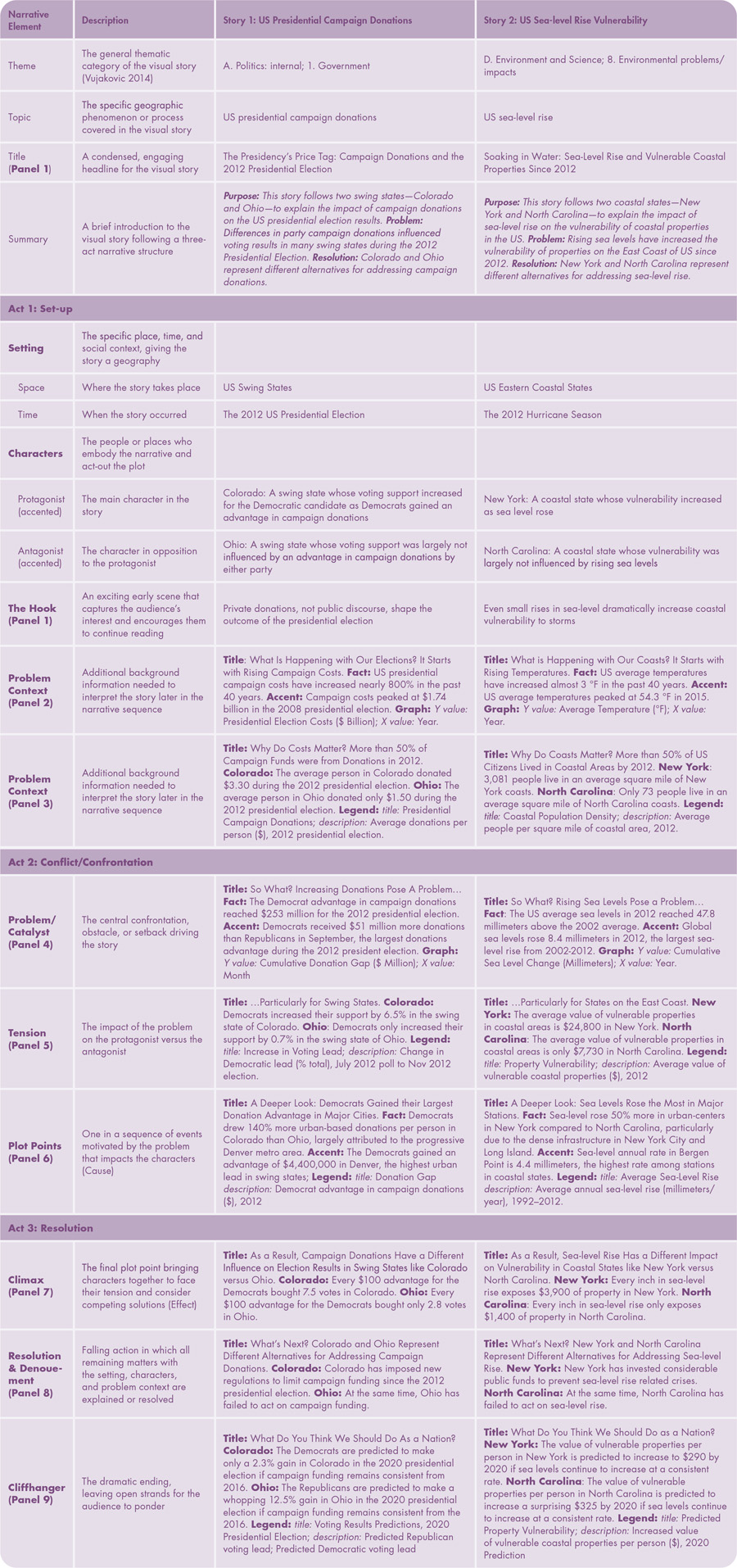
Table 1. Elements of a Three-act Narrative. A linear, three-act narrative comprises a set-up (Act 1), conflict/confrontation (Act 2), and resolution (Act 3). This table describes how we applied the constituent elements of a linear, three-act narrative to the pair of visual stories used in this study. Continued on next page.
VISUAL STORYTELLING GENRES
Second, we examined the influence of the visual storytelling genre on participants’ retention, comprehension, and reaction. Segel and Heer (2010, 1139) proposed seven basic “genres of narrative visualization,” differentiating each genre by the number and order of frames within the story: magazine style, annotated chart, partitioned poster, flow chart, comic strip, slide show, and film/video/animation. While foundational, the original Segel and Heer taxonomy drew primarily upon printed news maps and passive television news reporting, thus preceding many emerging design practices made possible by pervasive computing, new media, and geoweb technologies (Kosara and Mackinlay 2013). Further, the number of frames is less relevant with these emerging technologies, where page space is unlimited. In response, we previously proposed a revised taxonomy of visual storytelling genres based only on the visual or interactive technique used to enforce continuity of elements in the narrative sequence: static visual stories (encapsulating most of the Segel and Heer taxonomy), longform infographics, dynamic slideshows (from Segel and Heer), narrated animations (from Segel and Heer), multimedia visual experiences, personalized story maps, and compilations (Roth 2021; Table 2). We also imagine the ability to mash up these genres, combining different visual or interactive techniques for enforcing continuity within a single visual story.
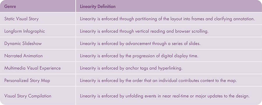
Table 2. Visual Storytelling Genres. Visual storytelling genres are defined by the visual or interactive technique used to enforce linearity of elements in the narrative sequence. This table describes the taxonomy of visual storytelling genres introduced by Roth (2021), expanded from Segel and Heer (2010). We examined the longform infographic and dynamic slideshow genres in this study.
Of these possible genres, we narrowed our focus for this research to longform infographics and dynamic slideshows. Longform infographics enforce continuity through vertical reading and browser scrolling, with the genre often described as “scrollytelling” by data journalists (Stolper et al. 2016, 8; citing Bostock 2014). In contrast, dynamic slideshows enforce continuity by advancement through a series of visual panels or frames of consistent size and format, producing a discrete, typically horizontal scroll versus the continuous vertical scroll of longform infographics; this discrete sequencing of content sometimes is described as “pagination” when used as a web design strategy (Wieczorek et al. 2014, 310). We selected these two genres for our initial investigation in order to contrast the slideshow presentations common across academia, government, and industry (Kosara and Mackinlay 2013) with the longform infographic or “scrollytelling” approaches now common in news media, as this structural difference in the method for enforcing continuity between the two genres (and across all genres) potentially influences the audiences’ retention, comprehension, and reaction. For instance, eye-tracking studies have shown that scrollable web content promotes visual skimming (Nielsen 2006), a potential disadvantage of longform infographics compared to dynamic slideshows. In contrast, dynamic slideshows explicitly dose information into less complex slides to reduce skimming, an advantage previously found to aid retention in text presentations (Wieczorek et al. 2014). However, the scrolling in longform infographics enables continuous, audience-driven pacing (Harrower and Sheesley 2005), and thus makes the user more active in the experience. In contrast, dynamic slideshows require discrete advancement of slides at a potentially monotonous pace that is designer-driven, which may be exacerbated by lags from reloading wrapper page content for each slide. We provide additional discussion on the relative advantages and limitations of different visual storytelling genres in Roth (2021).
VISUAL STORYTELLING TROPES
Third, we considered new visual design techniques—described as tropes—used not to represent information, but rather to enhance the narrative. Our use of tropes synthesized disparate literature on narrative cartography and visualization. For instance, Gershon and Page (2001, 34) described “story-like visual presentation,” listing storytelling concepts like conflict and ambiguity resolution, continuity, effective redundancy, filling gaps, increasing attention, and setting the mood. Similarly, Pearce (2009, 4) combined “narrative techniques” like ambiguity, closure, focalization, scale, and voice to express “qualities of place: intimacy, identity, and connection with the reader.” Elsewhere, such tropes are described collectively as storytelling affordances (Kosara and Mackinlay 2013), devices (Segel and Heer 2010), or figures (Cattoor and Perkins 2014). As described in our prior work, we organized these existing concepts and recommendations into seven design tropes for visual storytelling: continuity (central to the delineation of the different genres described above), mood, dosing, attention, redundancy, metaphor, and voice (Roth 2021; Table 3). Each trope then has an associated set of design techniques that can be employed for visual storytelling.
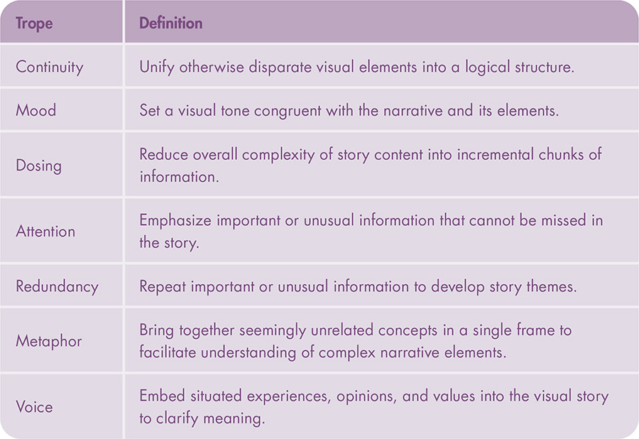
Table 3. Visual Storytelling Tropes. Visual storytelling tropes are design techniques used not to represent information, but rather to enhance the narrative. This table summarizes emerging tropes identified by Roth (2021). Two visual accenting solutions for focusing attention were examined in this study: color highlighting and leader lines, following Griffin and Robinson (2015).
In addition to differences in continuity by genre, we examined different methods for focusing attention on important or unusual information in the story that should not be missed (Gershon and Page 2001). Attention as a trope describes a range of design solutions that produce an “Isolation Effect,” making one item stand out over others in a visual scene (Lidwell, Holden, and Butler 2010, 254). Commonly used techniques for focusing attention in cartography and visualization include highlighting features through the visual variables (e.g., Robinson 2011); applying annotations such as leader lines, flow arrows, appended geometric frames, opacity masks, numbering, call-outs, and labels (e.g., Pearce 2008); and creating dynamic changes through blinking/flickering, panning/zooming, and focus+context visualizations (e.g., Weber Reuschel, Piatti, and Hurni 2014). We provided additional discussion of these focusing attention techniques in Roth (2021) using the catch-all term visual accenting. In the presented study, we specifically examined the differences in attention between leader lines and color highlighting within a single representation, similar to Griffin and Robinson’s (2015) investigation into the use of these two visual accenting techniques for focusing attention between two coordinated representations. Notably, Griffin and Robinson found leader lines to perform equally well as the more common color highlighting for focusing attention between coordinated views. We held all other visual storytelling tropes constant across tested materials.
INDIVIDUAL DIFFERENCES
Finally, we addressed the role of individual differences among the audience on the effectiveness of visual storytelling. Just like maps, stories and their meanings are not fixed or objective truths, but rather are shaped by the situated backgrounds and experiences of both storyteller and audience (after Haraway 1991; Rose 1997). While our contribution in this paper is to the design of map-based visual stories, and new ways that a cartographer or data journalist can shape the narrative, we recognize that the same design will conjure different understandings and evoke different responses from different people in different places (Pearce 2014). An advantage to taking a narrative approach to cartography is that it enables the embrace of pluralism—a data feminism principle—allowing designers to be more transparent in their positionality toward the story theme, while also inviting the audience to form multiple, equally-valid story meanings (adapted from D’Ignazio and Klein 2020). Considering the individual audience differences that influence visual storytelling can help cartographers and data journalists make more informed choices about their designs (Fish 2020b).
To this end, we drew upon work on mapping context and individual differences in cartography and visualization (see Griffin et al. 2017 for a comprehensive review and synthesis). Expanding upon our prior work (Roth 2009), we first collected several measures of our participants’ expertise—including their education, training, familiarity, and interest—regarding topics related to map-based visual storytelling. These included their experience with different news media (print and online), maps and information graphics, computing technology and the internet, and relevant news story themes.
We then collected measures of motivation regarding the same topics, an individual difference we have found to be as important as expertise for the success of web maps (Roth and Harrower 2008).
Finally, we assessed prior beliefs developed from past experience with topics related to the visual stories that may bias a reader in favor for or against a contentious position. Regarding map-based visual stories, prior beliefs may persist even in the face of evidence that invalidates them (Cohen 2012). Both tested themes followed Phillip’s (2012) cause and effect three-act narrative structure, and we embedded a subtle conservative lean in the US presidential campaign donations visual story and a subtle liberal lean in the US coastal sea-level rise visual story to balance prior beliefs for the other visual story design considerations. We did not assess the influence of other sociodemographic differences, given the sensitivity of the visual story themes and the focused goals of the research.
METHODS
PARTICIPANTS
One hundred twenty-five participants completed an online map study assessing their retention, comprehension, and reaction across different map-based visual story designs. We recruited participants from Amazon Mechanical Turk in March 2017—after first conducting a pilot survey with four participants in a controlled environment in the University of Wisconsin Cartography Lab to capture potential issues with the survey design. The pilot study resulted in small text and styling changes, but no major changes to the study design.
Recruitment using Mechanical Turk has both advantages and limitations for our study (see Hauser, Paolacci, and Chandler 2019 for expanded discussion). We chose Mechanical Turk over alternatives, such as university student recruitment pools, to capture greater demographic, geographic, and political diversity among participants, which was important for our ability to assess the influence of individual differences and, specifically, prior beliefs, on participants’ retention, comprehension, and reaction. However, recruitment with Mechanical Turk restricted us from purposefully sampling by individual differences without the risk of dramatically oversampling one group; accordingly the sample variability in individual differences may have an influence on the study results. Additional limitations include variable participant attention and experience with research studies, which we mitigated partially through questions on individual differences and balanced experimental procedure. Finally, Mechanical Turk has prompted new ethical considerations for human subjects research regarding the exploitation of labor and associated expected quality of experimental results (D’Ignazio and Klein 2020). We designed the survey to take 30 minutes to complete, and participants received $4 USD for compensation, a rate that exceeded the Wisconsin minimum wage at the time of the study ($7.25/hr USD). Participants completed the survey with a median time of 30.71 and average of 34.64 minutes.
Of the 125 participants in our sample, 71 identified as male and 54 as female, with zero responses to non-binary categories, and an average age of 35 years old. Nineteen participants did not attend college, 43 attended some college or were attending college, 55 completed an undergraduate degree, six completed a graduate degree, and two reported “Other.”
Online participants completed the survey on their own computing devices and were instructed to use non-mobile devices. Sixty-three participants completed the survey on a laptop computer and 62 on a desktop computer. Because all evaluated map-based visual stories dealt with US-based issues (see below), we limited participation to the US general public. Figure 1 provides an overview of participant characteristics; the Supplemental Materials include an additional breakdown of the sample by individual differences by experimental condition.
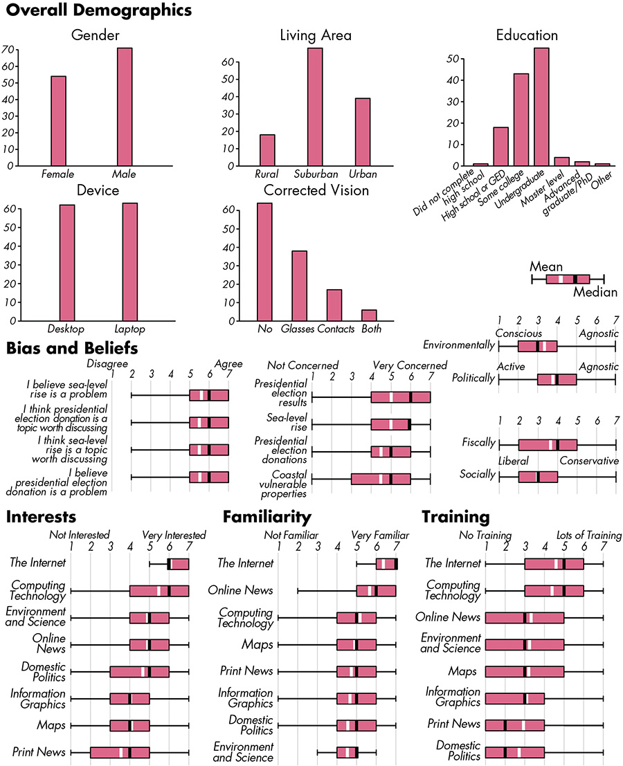
Figure 1. Participant characteristics.
MATERIALS
The online map study followed a 2×2×2 factorial design (Montello and Sutton 2012):
- Factor 1: Themes. Conditions consisted of stories on US presidential campaign donations and US sea-level rise, exemplifying Vujaković’s (2014) “Politics, Internal” and “Environment and Science” themes. Both conditions followed Phillip’s (2012) cause and effect three-act narrative structure and used real data for their contents, with US presidential campaign donations receiving a subtle conservative lean in the cause and effect structure and US sea-level rise a subtle liberal lean to balance effects from prior beliefs.
- Factor 2: Genres. Conditions consisted of longform infographics and dynamic slideshows. We first dosed story content for both conditions into nine-frame storyboards (three frames per act)—with each frame representing a different narrative element—and then assembled the frames using the continuity technique defining the given genre (continuous scrolling versus discrete slide advancement, respectively) to promote information equivalency between conditions. We loaded all nine frames onto the survey webpage for the longform infographics condition, although frames were spaced so that only one was visible at a time while scrolling up to a 1080p resolution screen in order to mimic “lazy loading” of content that was conventional in web design at the time of the study. In contrast, only one frame was loaded into the webpage at a time for the dynamic slideshow condition, again following convention at the time of the study of AJAX (Asynchronous JavaScript and XML) or separate webpages to load content on demand. The result was an intentional delineation in the experience between continuous and discrete scrolling. Participants could return to prior frames in both genres (i.e., scroll-up, previous slide), but were prevented from returning to the visual stories after advancing past the last frame.
- Factor 3: Tropes. Conditions consisted of two common design solutions for focusing attention, leader lines and color highlighting. We used black for color highlighting, as black was not used for symbolization and therefore could be applied consistently across the graphics. The use of black also avoided any potential issues with color vision deficiency in the participant sample. For design consistency, leader lines also used black strokes. The attention solutions were applied to the protagonist and antagonist in each design, leading to the introduction of two complementary place-based characters for each story.
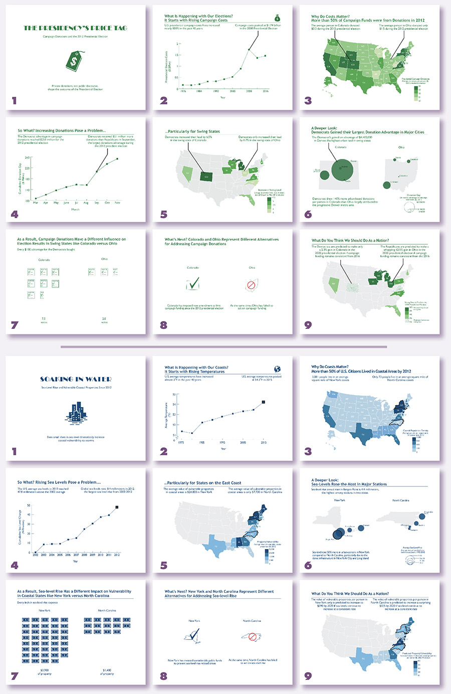
Figure 2. Visual Story Design. Both visual story themes were designed as a nine-panel sequence—with each panel representing a different narrative element (Table 1)—that could be presented as either a longform infographic or dynamic slideshow. Top: The US presidential campaign donations theme using leader lines. Bottom: The US sea level rise theme using color highlighting. High resolution versions of all tested materials are available as supplemental materials.
The 2×2×2 factorial design resulted in construction of eight unique stories (Table 4). The overall aesthetic style and layout (i.e., mood), the amount and complexity of story content (i.e., dosing), and the visualization designs remained consistent for comparability. Figure 2 provides an overview of the two, nine-frame visual stories and Figure 3 provides a preview of the survey interface for advancing both genres. All tested materials are included in the Supplemental Materials.
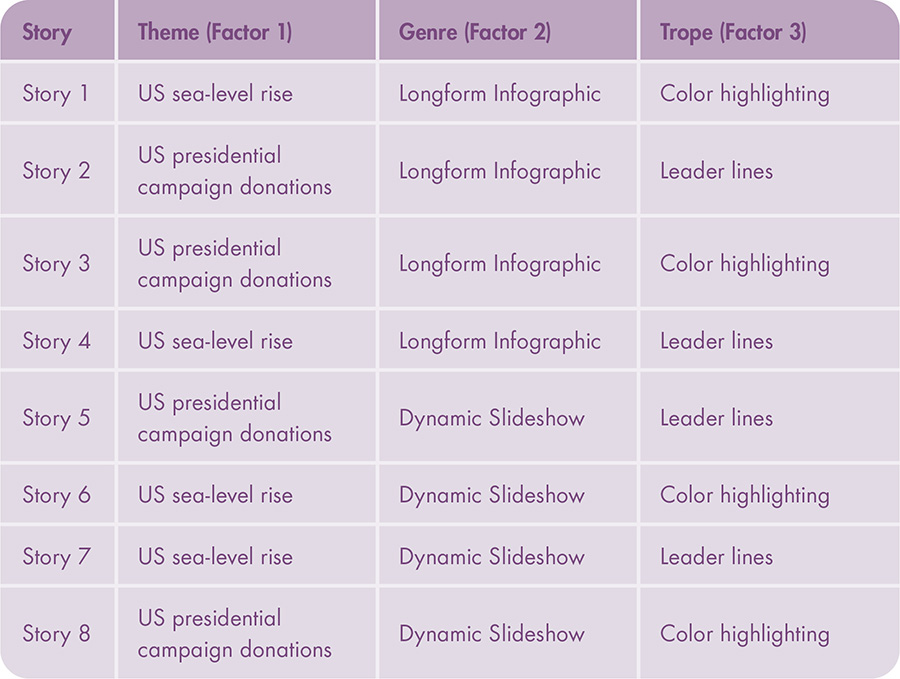
Table 4. Factorial Design. The study followed a 2×2×2 factorial design, resulting in eight unique visual stories.

Figure 3. Survey Design. The survey design used two different interactive techniques to advance frames based on the examined genre. Top: The longform infographic condition loaded all frames into the webpage and used browser scrolling by mouse wheel or side scroll bar to advance frames, spaced to show only one frame at a time. Bottom: The dynamic slideshow condition loaded one frame at a time and used bottom “Back” and “Next” buttons to advance frames.
PROCEDURE
The online map study began with an overview of project purpose and goals. After obtaining consent, participants completed a training block to combat learning effects. The training block contained the opening three frames of a third example visual story on US bookstore sales that followed the same design rules of other materials and included similar questions as the other experimental blocks (also included in Supplemental Materials). Participants were allotted as much time as needed to review the training block before progressing to the experimental blocks.
Participants then completed two experimental blocks covering the US presidential campaign donations and US sea-level rise themes (Table 5). We assigned Factors 1 (themes) and 3 (tropes) within-subjects, with assignment balanced so that each possible combination of themes and tropes was viewed by approximately one quarter of the study participants. We assigned Factor 2 (genres) between-subjects so that participants viewed just one linear structure during the survey, limiting confusion over layout and interface changes to the survey instrument between the two blocks.
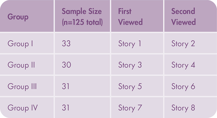
Table 5. Group Assignment. Each participant reviewed both visual story themes, with the visual stories presented in the same genre but using different trope solutions.
Participants responded to questions on separate survey pages after reviewing the visual story in full. Common measures of map design effectiveness include accuracy/correctness, response time, and completeness (Sweeney, Maguire, and Shackel 1993). However, Kosara and Mackinlay (2013) and Figueiras (2014) argue that the effectiveness of visual stories should instead be based on engagement and interest when reading the story, the ability to remember key points in the story, and the ability to make better informed decisions after reading the story. Finally, we have advocated in prior work to evaluate visual stories as much on their “effectiveness” as on how they make the audience feel about the depicted geographies (Roth 2021). Accordingly, participants responded to three kinds of questions about the story within each block, with each set of questions its own survey page:
- Retention: The retention page included 12 multiple choice questions built from benchmark mapping tasks (Roth 2013). We included these questions to supply baseline “accuracy” or “correctness” metrics common in empirical research on map design outside of visual storytelling (after Sweeney, Maguire, and Shackel 1993). The questions varied on the level of predicted difficulty: three ordinal compare tasks (easiest), three ordinal rank tasks, and six numerical identify tasks (hardest). All tasks were phrased at an elementary map reading level to focus attention onto specific narrative elements in the visual story (Andrienko, Andrienko, and Gatalsky 2003). The twelve questions were randomized to avoid learning effects between blocks. We placed the retention questions at the end of the experimental block to reduce short-term recall, with retention questions following the comprehension and reaction questions.
- Comprehension: Participants summarized the content of the story through a single, open-ended question, which we added to capture qualitative and potentially meaningful engagement and interest with the visual story (after Kosara and Mackinlay 2013; Figueiras 2014). We instructed participants to be as comprehensive as possible and to use their own words when phrasing their summary. We then coded the open-ended responses following tenets of qualitative data analysis (Caudle 2004), with codes based on the narrative elements shaping the visual stories: setting (space, time), characters (protagonist, antagonist), problem, cause, effect/resolution, and cliffhanger, as well as a final code to capture any mistakes in comprehension (e.g., see Table 1 for example statements that would be coded as “comprehended”). Thus, the coding scheme measured whether purposeful treatment of these narrative elements in the visual story design resulted in reader comprehension. The codes were binary based on presence or absence within the participant open-ended response (i.e., did the participant comprehend the narrative element correctly in their response). The first 10% of the comprehension responses were coded by two, independent coders to hone code definitions and clarify ambiguity in the coding scheme.
- Reaction: Participants responded to a series of seven-point Likert scales to capture how they felt about the visual stories and their depicted places and people (after Roth 2021). Reaction scales included participant interests in and beliefs about the visual story. Participants also self-reported their core affect in reaction to the visual story, including audience arousal (activated vs. deactivated) and hedonic valence (pleasant vs. unpleasant; Griffin and McQuoid 2012).
Participants completed this set of questions for both experimental blocks, resulting in responses to 250 unique blocks through the sample of 125 participants.
Participants concluded the study with an exit survey to characterize individual differences that might influence retention, comprehension, and reaction. The exit survey included questions on expertise, motivation, and prior beliefs using ordinal Likert scales. The complete online map study protocol is available in the Supplemental Materials.
ANALYSIS
Each factor (themes, genres, tropes) in the study design served as an independent variable, with responses to retention, comprehension, and reaction serving as dependent variables, respectively, and individual differences as interaction effects. We applied factorial ANOVA to assess the influence of the three factors on retention, comprehension, and reaction, as well as the pairwise interaction effects between factors to establish independence. We used factorial ANOVA instead of individual t-tests to mitigate alpha accumulation (Type I error) across a large number of hypothesis tests. We prepared a separate factorial ANOVA model for each unique retention (Table 6), comprehension (Table 7), and reaction (Table 8) measure, resulting in 23 total factorial ANOVA models. Figures 4, 5, and 6 visually illustrate differences by conditions for the retention, comprehension, and reaction measures, respectively, marking differences by themes, genres, or tropes identified as significant through factorial ANOVA.
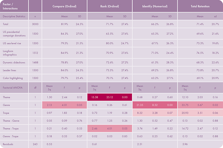
Table 6. Participant Retention Results. The table shows descriptive statistics (top) and factorial ANOVA (bottom) for retention. The table includes main effects by factor (theme, genre, and trope) as well as interaction effects between factors. The table includes four separate factorial ANOVA models on retention for compare (ordinal), rank (ordinal), identify (numerical), and total retention. Color indicates significance: p < 0.10, p < 0.05, p < 0.01, p < 0.001.
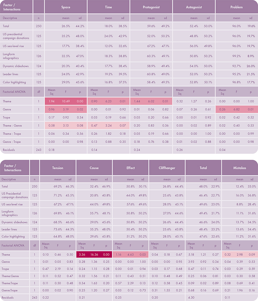
Table 7. Participant Comprehension Results (in two parts). The table shows descriptive statistics (top half of each part) and factorial ANOVA (bottom half) for comprehension. The table includes main effects by factor (theme, genre, and trope) as well as interaction effects between factors. The table includes nine separate factorial ANOVA models on comprehension for each of the nine evaluated narrative elements and two additional models for total comprehension across all elements and mistakes in comprehension. Color indicates significance: p < 0.10, p < 0.05, p < 0.01, p < 0.001.
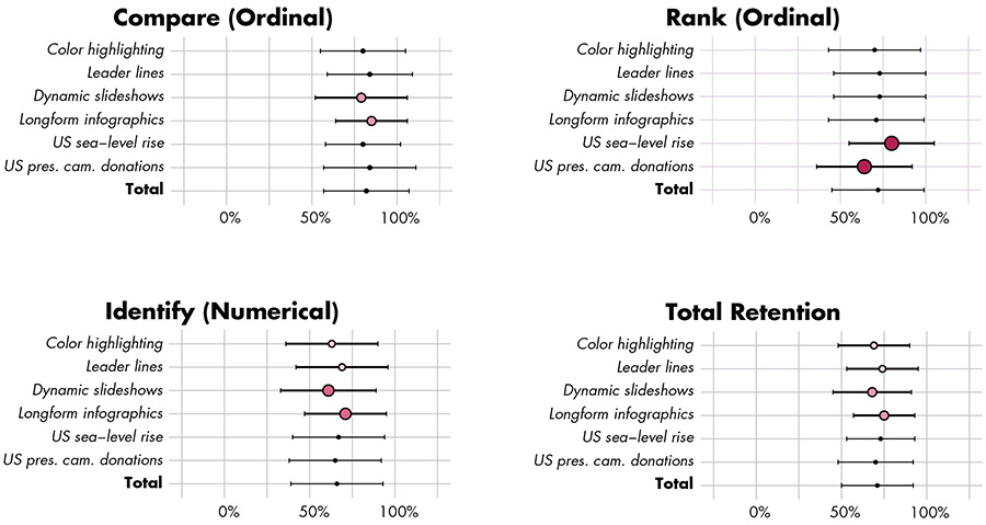
Figure 4. Retention Scores by Factorial Conditions. Color indicates significance: p < 0.10, p < 0.05, p < 0.01, p < 0.001. Size is used redundantly with color shading to indicate significance.
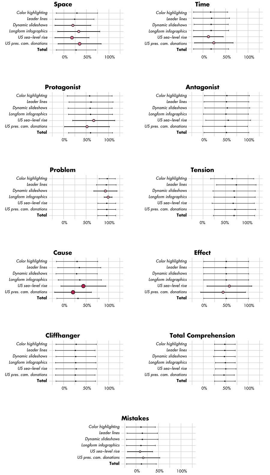
Figure 5. Comprehension Scores by Factorial Conditions. Color indicates significance: p < 0.10, p < 0.05, p < 0.01, p < 0.001. Size is used redundantly with color shading to indicate significance.
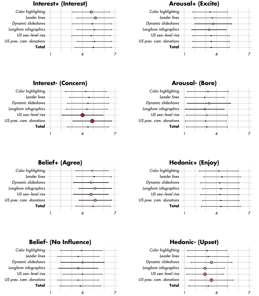
Figure 6. Reaction Scores by Factorial Conditions. Color indicates significance: p < 0.10, p < 0.05, p < 0.01, p < 0.001. Size is used redundantly with color shading to indicate significance.
We then used multiple linear regression (MLR) models to assess the influence of individual differences on retention and comprehension (Table 9). We used MLR over a series of Spearman rank correlations again to mitigate alpha accumulation. MLR quantifies the relationship of predictors to a single response variable in the form of B weight coefficients (Nathans, Oswald, and Nimon 2012). We chose the B weight, which is unstandardized, to assess variable importance because each predictor variable was measured in the same units (Allen 2017). A coefficient of zero indicates the predictor has no influence on the response variable while a positive/negative coefficient indicates that, with all other variables held constant, for every increase of one unit in the predictor, the response variable increases/decreases on average the value by of the coefficient respectively. Since some questions capturing individual differences were specific to one story over the other, we ran three different MLR models for comprehension and retention: responses to the US presidential campaign donations condition alone, the US sea-level rise condition alone, and pooled responses together for individual differences relevant to both conditions.
We used a version of ordinal linear regression (OLR) known as the proportional odds model (POM) to analyze the reaction Likert scales (Brant 1990; Table 10). POM is a non-parametric method that quantifies the proportional odds ratio (θ) between predictor variables and the response variable (McCullagh 1980). The range of the odds ratio is from 0 to positive infinity, with every one-point increase in the Likert scale predictor having x times (odds ratio) the odds of the response variable being a unit higher. For instance, a one unit increase in a predictor with an odds ratio of 1.4 increases the odds of the response variable being one unit higher by 40%. We ran eight models testing the influence of individual differences on each of the eight reaction Likert scales.
We also tested for multicollinearity among measures of individual differences to reduce the variance/standard error in the regression coefficient estimates. We calculated the variance influence factors (VIFs) for all individual differences and removed variables with VIFs over 4 to reduce multicollinearity, as VIF=4 means that the standard error for the coefficient of that predictor variable is 2 times (i.e., the square root of 4) larger than if that predictor variable had 0 correlation with the other predictor variables (Lavery et al. 2019). We removed seven of the collected individual difference measures as a result, which are highlighted in yellow in the results tables.
In the following discussion, we present retention results first, as comprehension and reaction enrich the quantitative analysis on retention. We present interaction effects from individual differences last.
RESULTS AND DISCUSSION
OVERALL RESULTS
Participants completed retention questions with an overall accuracy of 71.4%, suggesting that the retention questions were neither obvious nor impossible (Table 6). As expected, participants performed the best on the simpler compare (ordinal) tasks (81.9%) and worst on the more difficult to remember identify (numerical) tasks (66.2%), with the accuracy for rank (ordinal) tasks in the middle (71.7%).
Regarding comprehension, participants on average described 48.0% of the narrative elements included in the comprehension coding scheme (Table 7), a relatively rich discussion about the tested stories given the general audience recruited from Mechanical Turk and open-ended format of the comprehension question. In contrast, only 12.4% of the responses included a mistake in comprehension. Thus, comprehension results generally showed that three-act narrative structure was effective for map-based visual storytelling. There were several notable patterns in overall comprehension that provide insight into the visual design of elements in a three-act narrative. Nearly all participants (96.0%) clearly stated the problem of the story in their comprehension response, suggesting that the problem was the most salient narrative element in both visual story themes. Although an expected finding, confirmation that readers focused on the problem is useful for cartographers and data journalists, as this element should be emphasized in the story title and redundantly accented as a central motif throughout the story. The three next most commonly mentioned codes related to the characters in the story: 69.2% of participants described the tension—or the how the problem impacts the key characters—59.6% described the protagonist, and 52.4% described the antagonist. This suggests that the focus attention strategies applied to the characters were relatively successful (although differentially so by condition, as described in the results by tropes below). This description also provided evidence that readers can conceptualize places or regions as characters in an explicitly geographic story, presenting an opportunity to add dramatic narrative structuring to map designs in visual stories. While both stories used Phillip’s (2012) cause and effect narrative structure, the cause (32.4%) was discussed much less frequently than the effect (50.8%), showing a bias towards outcomes compared to drivers in visual story comprehension. Finally, spatial setting (26.5%), the cliffhanger (26.8%), and temporal setting (18.0%) were described infrequently. Given that the story was map-based, it was surprising that the geographic location and, to a lesser degree, the timeframe were not discussed more in the comprehension responses, although it is possible that the visual accenting of specific place-based characters diverted attention away from the overall spatiotemporal context.
The two strongest reaction registers to the visual stories were on interest and agreement, receiving an average response of 5.0/7 for both measures (Table 8). Thus, overall the visual stories captured participant interest—demonstrating the value of employing maps and graphics for visual storytelling—and participants generally agreed with the cause/effect narrative used to structure the story. Participants also provided slightly positive ratings for their concern about the story topic (4.5/7), but nearly neutral ratings about the story’s influence on them (3.8/7). There was marginal overall affective impact by arousal, with positive arousal (excitement; 3.5/7) and negative arousal (boredom; 3.1/7) both receiving less than the “neither agree nor disagree” midpoint of 4.0 out of 7. There was a slight positive affective response on the hedonic scale, with participants finding the experience more pleasant (enjoyment; 4.4/7) than unpleasant (upsetting; 3.2/7).
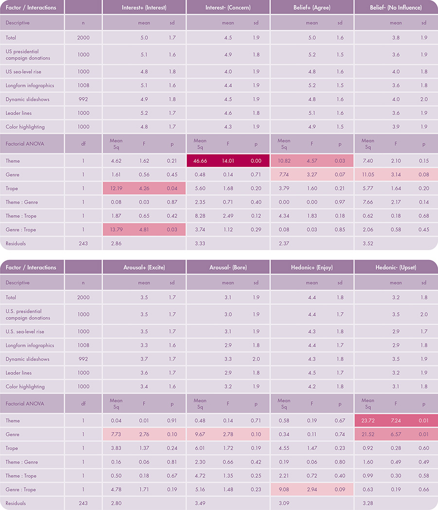
Table 8. Participant Reaction Results (in two parts). The table shows descriptive statistics (top half of each part) and factorial ANOVA (bottom half) for reaction. Likert ratings are out of 7 points. The table includes main effects by factor (theme, genre, and trope) as well as interaction effects between factors. The table includes eight separate factorial ANOVA models on reaction, one for each of the evaluated reaction measures. Color indicates significance: p < 0.10, p < 0.05, p < 0.01, p < 0.001.
STORY MAP THEMES (FACTOR 1)
Factor 1 included two conditions by visual storytelling theme: US presidential campaign donations and US sea-level rise. Starting with retention (Table 6), there was no statistical difference between themes regarding total retention (F = 2.03, p = 0.16). Thus, the theme did not impact the “accuracy” or “correctness” of reading the maps and graphics in the visual story, common metrics used in empirical map design research. This is a potentially exciting finding for cartographers and data journalists, suggesting that the visualized theme may not influence story retention for a general audience if the design follows a three-act narrative structure. Looking at specific retention questions, there were no significant differences between themes with regard to the easy compare (ordinal) tasks (F = 2.44, p = 0.12) and the difficult identify (numerical) tasks (F = 0.27, p = 0.60). However, there was a significance difference between themes in retention for the rank (ordinal) tasks (F = 25.12, p = 0.00) as well as a significant interaction effect between theme and tropes for rank (ordinal) tasks (F = 4.01, p = 0.05). The interaction possibly could be attributed to the phrasing of sea-level “rise” for the US sea-level rise condition, which may have suggested an increasing trend, thus requiring fewer visual cues to focus attention on to the highest ranked year (see Supplemental Materials).
Similarly, there was no statistical difference in total comprehension between themes in the average number of narrative elements discussed (F = 1.21, p = 0.27; Table 7), adding evidence that the visualized theme may not influence performance for a general audience if the design follows a three-act narrative structure. However, participants made more mistakes in comprehension for the US presidential campaign donations condition (16.0%) than the US sea-level rise condition (8.8%), a significant difference at alpha = 0.10 (F = 2.98, p = 0.09), potentially pointing to prior misconceptions about the 2016 US presidential election. There also were several notable differences in comprehension between themes for specific narrative elements. Participants discussed the spatial (F = 10.49, p = 0.00) and temporal (F = 6.23, p = 0.01) settings significantly more frequently in their open-ended responses for the US presidential campaign donations story than the US sea-level rise story. In contrast, participants discussed the cause (F = 16.36, p = 0.00) and effect (F = 4.63, p = 0.03) more frequently for the US sea-level rise story than the US presidential campaign donations story. While there may be a variety of explanations for these differences by specific narrative elements, we suspect that the setting (“swing states”) was implicitly more central to understanding the US presidential campaign donations story and the cause-effect relationship (“climate change”) was implicitly more central to understanding the US sea-level rise story, despite controlling the information and design complexity for these narrative elements in both visual stories. Thus, while the theme did not influence total comprehension, individual themes and unique visual story designs of these themes are likely to lend themselves better to some narrative elements over others. We also found a significant difference in comprehension for the protagonist (F = 6.02, p = 0.01), which might be a slight bias in recall for New York generally (the protagonist in the US sea-level rise story), a populous US state often dominating media coverage. Significant differences in comprehension were not observed for other narrative elements.
Interestingly, participants appeared to have a somewhat stronger reaction to the US presidential campaign donations story than the US sea-level rise story, although significant differences were not observed for all reaction metrics (Table 8). The largest difference in reaction between themes regarded participant concern: participants overall were concerned by the US presidential campaign donation story (4.9/7), but were neither concerned nor unconcerned with the US sea-level rise story (4.0/7), a significant difference at alpha = 0.01 (F = 14.01, p = 0.00). Participants also were more upset by the US presidential campaign donation story (3.5/7) than the US sea-level rise story (2.9/7), a significant difference at alpha = 0.01 (F = 7.24, p = 0.01), although on average both sets of participants disagreed with the statement (below 4.0/7) and therefore these ratings should be interpreted as a greater apathy towards the US sea-level rise story. Participants ultimately agreed more with the US presidential campaign donation story than the US sea-level rise story (F = 4.57, p = 0.03), perhaps because of the increased hedonic reaction to the former story. The influence of the story theme on participant reaction is possibly explained by the timing of the study, which was conducted four months after the polarizing presidential election of 2016. In contrast, sea-level rise and climate change broadly work on a longer time scale and within less well-defined geographic boundaries, a noted challenge for science communication in getting the public to care about climate change and its effects (Fish 2020a). Reaction differences by theme also may be explained by the fiscally and socially liberal lean in the participant sample (Figure 1), as the US presidential campaign donation story had a subtle conservative lean (the relationship between political leaning and reaction concern is discussed in more detail under individual differences). There was no statistical difference in other reaction metrics.
VISUAL STORYTELLING GENRE (FACTOR 2)
Factor 2 included two conditions by visual storytelling genre: longform infographics and dynamic slideshows. Unlike themes, overall differences in retention by genres were statistically significant (F = 5.47, p = 0.02) (Table 6). Participants correctly answered 74.5% of retention questions for visual stories presented as longform infographics, but only 68.3% for visual stories containing the same content but presented as dynamic slideshows. Thus, it was the technique used to enforce continuity across narrative elements (i.e., genres), and not the element content itself (i.e., themes), that influenced retention, with participants having greater difficulty remembering information from dynamic slideshows. This is an important finding for cartography and visual storytelling, as well as science communication and pedagogy generally, as visual material more commonly is presented as a discrete slide deck instead of a continuous graphic or webpage in educational settings and public presentations. Further, this finding points to the relevance of emerging design strategies made possible by new media for map-based visual storytelling, as longform infographics enable scrolling at an audience-controlled pace, whereas dynamic slideshows dose information at a designer-controlled pace. We found significant differences for the easier compare (ordinal) tasks (F = 4.01, p = 0.05) and more difficult identify (numerical) tasks (F = 8.52, p = 0.00) tasks, but not for the intermediate-difficulty rank (ordinal) tasks (F = 0.26, p = 0.61), perhaps because of the aforementioned interaction effect for rank (ordinal) tasks between theme and tropes.
Regarding comprehension, participants described 49.4% of the total narrative elements when the story was presented as longform infographics but only 46.6% when presented as dynamic slideshows, again indicating better performance with longform infographics. However, this was not a significant difference (F = 0.92, p = 0.34; Table 7), and overall we observed fewer comprehension differences by genres than theme for individual narrative elements. Interestingly, there was a significant difference by genres in discussion of the problem (F = 6.82, p = 0.01): while nearly all (99.2%) participants discussed the problem when viewing longform infographics, only 92.7% of participants discussed the problem when viewing dynamic slideshows. Therefore, the dynamic slideshows format and navigation caused a small set of participants to miss the main problem altogether in their discussion, a fatal erasure in comprehension. Thus, while the retention measures indicated that the dynamic slideshows inhibited recall of specific numbers for many participants, the comprehension measures indicated that the dynamic slideshows inhibited development of a general problem understanding for small set of participants, together representing the “worst of both worlds.” One potential explanation for the observed poorer retention and comprehension for dynamic slideshows is the manner in which they enforce continuity: clicking through the frames in dynamic slideshows interrupted the flow of the story, requiring reloading of new content that may be exacerbated due to bandwidth lags, altogether breaking audience concentration. Relatedly, participants discussed the spatial setting significantly more frequently when viewing longform infographics (32.5%) versus dynamic slideshows (20.3%), possibly because they could more readily access maps—included on only four of nine panels—through quick scrolling upwards versus reloading a prior slide. There was not a significant difference in the number of comprehension mistakes or for other comprehension codess between genres.
Genres did have a marginal impact on participant reaction (Table 8), although most differences were significant only at alpha = 0.10. Participants were more likely to believe (F = 3.27, p = 0.07) and more likely to have their views influenced by (F = 3.14, p = 0.08) stories when presented as longform infographics versus dynamic slideshows, an indication of increased influence and trust evoked by the emerging “scrollytelling” genre. Notably, participants reported feeling more upset when viewing dynamic slideshows than the longform infographics (F = 6.57, p = 0.01), a significant difference at alpha = 0.05. The negative hedonic reaction scale did not distinguish between the visual story content versus design (“I was upset by the visual story”), and it is possible the unpleasant reaction to dynamic slideshows is because of the broken experience of the discrete slide advance. However, this broken nature also may generate more suspense and anxiety, a characteristic of dynamic slideshows that may be useful when the story topic and framing require a congruently negative affective response (Anderson and Robinson 2022). Finally, dynamic slideshows were rated as both more exciting (F = 2.76, p = 0.10) and more boring (F = 2.78, p = 0.10) than longform infographics, a somewhat contradictory finding possibly indicating that dynamic slideshows garner a wider variety of reactions from the audience.
Notably, Factor 2 was assigned between subjects, unlike Factors 1 and 3, and therefore the results by genre may be influenced by potential imbalances in sampling (see Supplemental Materials). Participants who viewed longform infographics reported a greater interest in the internet (6.3/7 versus 5.2/7 for dynamic slideshows), computing technology (5.7/7 versus 4.5/7), and online news (5.1/7 versus 4.3/7), and a greater familiarity with computing technology (5.6/7 versus 4.8/7). Thus, the generally observed benefit of longform infographics instead may be explained by increased participant motivation derived from greater interest and familiarity with internet and computing technologies. In contrast, participants who viewed dynamic slideshows reported greater training in the internet (5.2/7 versus 4.4/7 for longform infographics), environment and science (4.1/7 versus 2.8/7), online news (4.2/7 versus 3.0), domestic politics (3.9/7 versus 2.4/7), information graphics (3.7/7 versus 2.8/7), maps (3.8/7 versus 2.9/7) and print news (3.4/7 versus 2.6/7). Thus, maps and visual storytelling generally were less novel for participants assigned to dynamic slideshows and therefore this could have influenced motivation, prior expectations, and, accordingly, performance with dynamic slideshows. Sampling by domain-specific characteristics not captured through participant demographics is difficult to manage through Mechanical Turk, and thus future research with purposeful participant recruitment is needed to investigate how well the observed differences by genre apply across different levels of interest, familiarity, and training.
VISUAL STORY TROPE (FACTOR 3)
Factor 3 included two conditions by visual storytelling trope, with both conditions employing a visual accenting technique for focusing attention: leader lines and color highlighting. Differences in retention by tropes were statistically significant at alpha = 0.10 (F = 3.51, p = 0.06; Table 6). Participants correctly answered 73.8% of retention questions for visual stories using leader lines as the focus attention strategy, but only 69.1% using color highlighting. While a weaker influence on retention than the genres condition in our study, the difference by tropes extends the Griffin and Robinson (2015) study in the context of visual accenting between coordinated representations, suggesting that leader lines are not only a viable alternative to color highlighting when color needs to be used elsewhere in design, but actually are a more salient focusing attention technique generally. There were no significant differences by tropes for the easier compare (ordinal) (F = 1.83, p = 0.18) or rank (ordinal) (F = 1.19, p = 0.28) retention questions, but differences by tropes for the more difficult identify (numerical) task were significant at alpha = 0.10 (F = 3.28, p = 0.07). Thus, the benefit of leader lines over color highlighting—and thus more salient focusing attention techniques—may increase as the difficulty in the task grows.
Tropes did not result in a significant difference in total comprehension (F = 0.11, p = 0.74), the number of comprehension mistakes (F = 0.29, p = 0.59), or any specific narrative element (Table 7). We were surprised that none of the tested factors resulted in significant differences in total comprehension. Although we found the comprehension discussion surprisingly rich, with participants on average describing 48.0% of the narrative elements, the simplicity of the comprehension question prompt and the online format of the survey perhaps limited the response length. Greater depth in comprehension instead may be elicited through alternative social science methods such as cognitive walkthroughs, think aloud studies, and post-hoc interviews and focus groups. However, our method did present an opportunity to investigate how the visual story design influenced discussion of the more important or obvious narrative elements in their shorter qualitative responses, resulting in the significant differences by themes and tropes for individual narrative elements described above.
The trope conditions did result in a significant difference in participants’ reported interest in the visual story (F = 4.25, p = 0.04; Table 8). Participants reported being more interested in visual stories using leader lines (5.2/7) to focus attention than color highlighting (4.8/7). “Interest’” suggests an activated affective state, and while we did not observe a significant difference in positive arousal (which uses the more suggestive word “excited” to describe reaction), increased interest in a visual story is a marked benefit of using focusing attention techniques in visual story design: in this case, leader lines better focused audience attention on important or unusual information in the story, avoiding distraction from other design elements or split attention with other tasks. There also was a significant interaction in reported interest between the genre and tropes factors (F = 4.81, p = 0.03), indicating that participants were most interested in visual stories using a combination of longform infographics and leader lines regardless of the theme. Again, this is a useful finding for cartographers and data journalists, as the specific theme may not influence the interest garnered from a general audience as long as the visual story follows empirically-derived design recommendations for a three-act narrative, genres, and tropes. There were no addition significant differences by tropes in the other participant reaction scales.
INDIVIDUAL DIFFERENCES
Finally, the exit survey collected a number of measures of individual differences, including expertise, motivation, and prior beliefs. Examination of individual differences identified many interaction effects on retention, comprehension, and reaction. Our discussion below focuses on the most prominent patterns.
Regarding retention, the relationship of individuals to technology and design was a stronger driver than their relationship to the theme or their prior beliefs (Table 9). In particular, participants with greater familiarity with the internet (β = 1.51, p = 0.00) retained significantly more information from the visual stories than their counterparts. This signals an important consideration for data journalism and visual storytelling, as differential familiarity (i.e., expertise) with the online delivery format of the map study may have impacted results, with participants unfamiliar with internet technology retaining less information from the online stories.
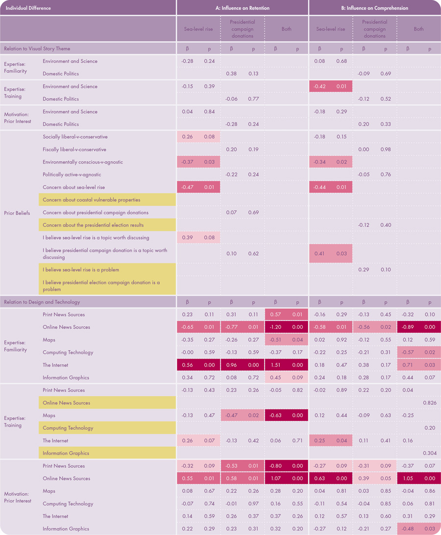
Table 9. Influence of Individual Differences on Retention and Comprehension. The table shows the results of multiple linear regression between individual differences and retention and comprehension. Color indicates significance: p < 0.10, p < 0.05, p < 0.01, p < 0.001. Yellow indicates an individual difference measure that we removed because it was collinear with another measure.
There was an interesting tradeoff in retention between familiarity and interest in print versus online news sources. Participants with interest in online news sources (β = 1.07, p = 0.00) retained significantly more information than their counterparts, while participants with interest in print news sources retained significantly less than their counterparts (β = -0.80, p = 0.00). Familiarity with online news sources (β = -1.20, p = 0.00) and print news sources (β = 0.57, p = 0.00) reflected an inverse pattern. While future research is needed to track and confirm this effect by individual differences, the results possibly suggest that performance with online visual stories is influenced by interest in online versus print news sources broadly, but also suggest a possible tendency to skim visually as familiarity with online news sources increases.
In contrast, the relationship of individuals to the theme and their prior beliefs was a stronger relative driver of comprehension than their relationship to technology and design (Table 9). As with retention, participants with increased familiarity with the internet (β = 0.71, p = 0.03) and interest in online news sources (β = 1.05, p = 0.00) comprehended the visual stories significantly better than their counterparts, although this effect was smaller than with retention. While increased familiarity with online news stories decreased comprehension (β = -0.89, p = 0.00), similar to retention, there were no observed effects from familiarity or interest in print news sources on comprehension.
Instead, increased prior beliefs that sea-level rise is a topic worth of discussion (β = 0.41, p = 0.03) led to increased comprehension with the US sea-level rise theme. Interestingly, increased participant training in environment and science (β = -0.42, p = 0.01) led to reduced comprehension about the US sea-level rise theme, suggesting that participants with some expertise about the theme actually gleaned fewer specific details from the visual stories, instead relying on their prior understanding rather than drawing from specific evidence in the story. This is an interesting finding, as untrained, non-experts actually may approach visual stories more objectively, and thus consider new information and the overall narrative more thoroughly, as long as they believe the topic is worthy of discussion. It is arguable, however, that the subjectivity exhibited by experts may be an appropriate, hard-earned subjectivity, allowing them to discredit flawed or incomplete information and narratives more quickly. Unexpectedly, increased environmental consciousness and increased concern about sea-level rise both led to reduced retention and comprehension for the US sea-level rise theme, an apparent contradiction to prior beliefs that sea-level rise is a topic worth discussion.
We did not find any significant relationships between prior beliefs and retention or comprehension of the US presidential campaign donations condition. This perhaps is due to the polarizing nature of the 2016 US presidential election, but broadly indicates that the specific theme matters when considering individual differences.
While there are some notable interactions with retention and comprehension, individual differences appeared to have a greater influence on participant reaction to the visual stories (Table 10). There were several broad patterns between individual differences and reaction worth discussing.
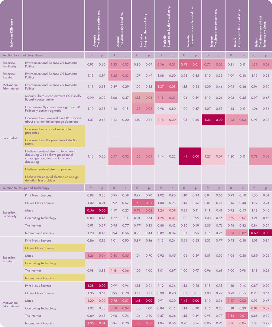
Table 10. Influence of Individual Differences on Reaction. The table shows the results of multiple linear regression between individual differences and reaction. Color indicates significance: p < 0.10, p < 0.05, p < 0.01, p < 0.001. Yellow indicates an individual difference measure that we removed because it was collinear with another measure.
First, familiarity and interest with maps and information graphics arguably had the largest influence on the reaction measures regarding participant relationships to technology and design. The more familiar participants were with maps, the less likely participants were excited by (θ = 0.56, p = 0.00) or enjoyed (θ = 0.73, p = 0.02) the visual stories, possibility suggesting that novelty in design plays a role in the reaction to map-based visual stories. However, greater interest in maps led to a decrease in boredom (θ = 0.75, p = 0.01) with the visual stories and an increase in enjoyment (θ = 1.41, p = 0.00), interest (θ = 1.42, p = 0.00), and agreement with the visual stories (θ = 1.27, p = 0.02). Similarly, greater interest in information graphics led to increased excitement (θ = 1.35, p = 0.01) and enjoyment (θ = 1.40, p = 0.01). Thus, individual differences in motivation around data-driven visuals like maps and graphics matter in the resulting reaction to visual stories containing these maps and graphics.
Second, with a few exceptions, familiarity with the story theme had a greater overall effect on reaction than training or interest in the topic. As with retention and comprehension, greater familiarity with the theme often resulted in a more negative reaction, as participants reported higher boredom (θ =1.33, p = 0.03) and maintenance of their beliefs about the topic (θ = 1.39, p = 0.01), as well as being less upset by (θ = 0.76, p = 0.03), interested in (θ = 0.71, p = 0.01), and concerned about (θ = 0.73, p = 0.02) the visual story when they had greater familiarity with the topic. While future research is needed to understand this relationship between expertise with and reaction to visual stories, these findings suggest that visual stories may evoke stronger positive reactions from general audiences less familiar with the story theme.
Third, as with comprehension, prior beliefs that the story theme was worth discussing did influence participant reaction. Participants more likely to find the topic worth discussing also were more likely to enjoy (θ = 1.26, p = 0.04) and be interested in (θ = 1.41, p = 0.00) the visual story as well as less likely to be bored by (θ = 0.77, p = 0.02) or maintain their beliefs about the visual story (θ = 0.78, p = 0.03). Thus, getting audiences to care about the topic is an important challenge—perhaps the challenge—in visual storytelling, as the way the audience values the topic before viewing the map appears to greatly influence how they subsequently react to the design and comprehend the depicted content. Unlike comprehension, this pattern does hold when reactions are pooled across the US presidential campaign donations and US sea-level rise themes.
CONCLUSION: IMPROVING the DESIGN OF MAP-BASED VISUAL STORIES
In this paper, we reported on an empirical study to understand and improve the intentional design of map-based visual storytelling using a case study in data journalism. Compared to their popularity and wide reach, empirical research on map-based visual stories remains limited. The research reported here tackled four emerging design considerations for visual storytelling with maps: story map themes and their constituent three-act narrative elements, visual storytelling genres, visual storytelling tropes, and individual differences among the audience. Specifically, we asked four research questions to address emerging design considerations for visual storytelling:
- What is the influence of story map themes and their constituent narrative elements on the audience’s retention, comprehension, and reaction? Our study provided initial evidence that a three-act narrative and its constituent narrative elements can be applied consistently and effectively across visual story themes, and therefore offers new design opportunities for cartography and data journalism. Story map themes did not significantly influence total retention, the “accuracy” or “correctness” measure used in this study, or total comprehension, our alternative performance measure capturing additional dimensions of engagement and interest. This finding points to the need for establishing a research and education agenda on map-based visual storytelling in both cartography and data journalism, as the efficacy of some design decisions are based on not on the story content, but on the intentional design of the narrative structure and presentation. Interestingly, participants discussed the spatial and temporal setting significantly more frequently for the US presidential campaign donations story and the cause and effect more frequently for the US sea-level rise story, potentially indicating that, while themes may not influence total comprehension, some individual narrative elements may be more or less germane to understanding a given visual story. In contrast, story themes did influence audience reaction, with participants feeling significantly more concerned about and upset with the US presidential campaign donations story, and they ultimately agreed more with this story, perhaps because of the increased negative hedonic reaction. While not a direct goal of our study, this finding reinforces noted challenges for communication and action on climate change in the United States.
There are many opportunities for future research on narrative structures for map-based storytelling, three-act or otherwise. First, we tested two visual story themes using the same three-act narrative structure as a control to establish a baseline for three-act narrative design in cartography and also mitigate bias from current events or prior beliefs given the broader visual story design considerations in the factorial design. More research is needed to test the baseline three-act narrative we described against alternative linear and non-linear narrative structures, as well as to isolate the influence of specific narrative elements within these structures to understand how they may be rearranged as narrative anchor points within a visual story. Further, we encourage comparison and evaluation of a wider range of Vujaković’s (2014) visual story themes and Phillips’s (2012) visual story structures, as well as correlation of how well these designs perform with individual differences. Finally, the three-act narrative structure relied mostly on static visuals, with user interactivity restricted to the genre mechanism for enforcing continuity in the factorial design (continuous scrolling versus discrete slide advancement). Extensions with interactivity range from martini-glass and reverse martini-glass narrative structures placing interactive maps at the bookends of the visual story (Segel and Heer 2010) to fully open-ended and user-controlled interactive digital narratives (Koenitz et al. 2015).
- What is the influence of visual storytelling genres on the audience’s retention, comprehension, and reaction? Visual storytelling genres did significantly influence total retention. Longform infographics outperformed dynamic slideshows for both retention and comprehension, although this difference was not significant for total comprehension. However, we did observe a significant difference in comprehension of the problem—the central confrontation, obstacle, or setback driving the story that formed perhaps the most important narrative element of the story—with nearly all participants discussing the problem in their open-ended responses when viewing longform infographics. Taken together, dynamic slideshows exhibited the worst of both worlds, causing participants to forget specific information (total retention) and, for some, to miss the overall point of the visual story (problem comprehension). The poorer performance with dynamic slideshows likely is attributed to the manner by which the genre enforces continuity and doses information, as longform infographics enabled continuous scrolling at an audience-controlled pace, whereas dynamic slideshows discretely dosed information in a designer-controlled pace. This finding also calls into question the optimal structure for dosing information in both research and teaching, given that material is commonly presented as a slideshow for in-person presentations. While the genre had a weaker influence on reaction than the story theme, participants were more upset with stories presented as dynamic slideshows, potentially an affective response attributed more to the broken nature of the genre structure than the story content.
Our study suggests that choosing a storytelling genre as described by Segel and Heer (2010) and Roth (2021) is a nontrivial design decision, and thus warrants additional research in cartography, data journalism, and related fields. We examined just two visual storytelling genres and future research is needed to fully understand the relative advantages and limitations of each genre to inform their selection, content, and design. Notably, our findings contradict those of Wieczorek et al. (2014) on non-visual text presentation, where pagination (slideshows) outperformed scrolling (longform structure). We hypothesize that this could be attributed either to the inherently two-dimensional nature of maps versus one-dimensional text or the difference in control of dosing in our study versus the increased dosing of the pagination conditions in the Wieczorek et al. study. Regardless, future research is needed to evaluate different combinations of text and visuals like maps across genres, as well as to compare text, visuals, and other multimedia directly against one another as alternative story content within any given genre. As noted above, further research also is needed to investigate how well the observed differences by genre apply across different levels of audience interest, familiarity, and training.
- What is the influence of visual storytelling tropes on the audience’s retention, comprehension, and reaction? As with genres, the focus attention strategies (one visual storytelling trope) significantly influenced total retention, although only at alpha = 0.10. Retention significantly improved when narrative elements were accented by leader lines instead of color highlighting. While a weaker influence than genres, this finding extends Griffin and Robinson’s (2015) recommendations for using leader lines for visual accenting across multiple representations, as leader lines are not just an alternative to color highlighting when using color elsewhere in design, but actually are a more salient focusing attention technique generally. The benefit of leader lines over color highlighting increased as the question difficulty grew, suggesting more salient visual accenting techniques are needed as task complexity increases. As with other factors, there was not a significant difference in total comprehension between focus attention strategies, and we encourage adapting, extending, and triangulating alternative social science methods in the future to explore additional dimensions of audience comprehension. As with genres, tropes had a weaker influence on reaction than the story theme, but we did observe a significant difference in reported interest by tropes, with leader lines better focusing audience attention on important or unusual information in the story and avoiding distraction from other design elements or split attention with other tasks.
For future research, we encourage evaluation of the additional visual accenting techniques for focusing attention in visual storytelling compiled in Roth (2021), including comparing static solutions like flow arrows, appended geometric frames, opacity masks, numbering, call-outs, and labels, against dynamic solutions like blinking/flickering, panning/zooming, and focus+context visualizations. Further, our attention solution primarily supported elementary tasks similar to Griffin and Robinson (2015), but the leader lines and color highlighting solutions also should be evaluated for general map reading tasks, such as providing overview and summary context for narrative and exploratory visualization alike (Shneiderman 1996). Finally, we examined continuity (tested through genres) and attention in our study, holding all other tropes constant for experimental control. Future research opportunities exist to explore and empirically test the roles of mood, dosing, redundancy, metaphor, and voice to support visual storytelling with maps.
- What is the influence of individual audience differences on their retention, comprehension, and reaction? Examining individual differences afforded insight into how dimensions of expertise, motivation, and prior beliefs influence retention, comprehension, and reaction. Familiarity with the internet and familiarity and interest with print versus online news sources most impacted retention. While familiarity and interest with online news sources remained influential on comprehension, prior beliefs that the topic is worthy of discussion also influenced comprehension. Notably, interaction effects regarding prior beliefs and comprehension were observed for the US sea-level rise theme only, suggesting that the visual storytelling theme does matter when considering individual differences. Whereas differences in genres and trope designs directly influenced retention and comprehension—with some variability by individual differences—individual differences, not the visual story design, appeared to have a greater overall influence on participant reaction to the visual stories. Familiarity with maps and information graphics, familiarity with the story theme, and prior beliefs that the story theme was worth discussing were among the influential individual differences on participant reaction.
Opportunities for future research on individual differences in visual storytelling (and cartography generally) are numerous. First, our use of Mechanical Turk, while successful in garnering wider demographic, geographic, and political diversity, limited our ability to assess the influence of individual differences on the tested visual story design considerations themselves (i.e., by theme, genres, or tropes). Future research is needed to replicate our results in a controlled setting with participants purposefully sampled by individual differences into comparable groups. Second, we evaluated just a small range of individual differences by expertise, motivation, and prior beliefs. Future research is needed to understand how individual differences and intersectional identities shape understandings from maps and visual stories (D’Ignazio and Klein 2020), with particular attention on how our reactions might change through time around critical events or across other lived experiences given the increased role maps play in new stories and data journalism. Relatedly, and following calls from Kosara and Mackinlay (2013) and Figueiras (2014), future research is needed to extend our initial treatment of retention, comprehension, and reaction to fully embrace new measures of engagement, empathy, and emotion resulting from different visual story designs, as the real test of visual storytelling is its ability to help us make better, more informed decisions in how we treat ourselves, each other, and our world. Finally, self-reported, Likert-based measures are a relatively simple method of capturing information about individual differences—necessarily so for the purpose of this study—and alternative methods that more reliably screen for interest, familiarity, training, and prior beliefs are needed to fully explore the role of individual differences on the design of map-based visual stories. This limitation also relates to the potential issues related to the sampling imbalance between genre conditions noted above.
ACKNOWLEDGEMENTS
This research was funded by NSF CAREER Grant #1555267 and the Wisconsin Alumni Foundation. We wish to thank Tanya Buckingham Andersen and Qunying Huang for their feedback on the online map study design and analysis.
REFERENCES
Allen, Mike, ed. 2017. The SAGE Encyclopedia of Communication Research Methods. Los Angeles: Sage Publications.
Anderson, Cary L., and Anthony C. Robinson. 2022. “Affective Congruence in Visualization Design: Influences on Reading Categorical Maps.” IEEE Transactions on Visualization and Computer Graphics 28 (8): 2867–2878. https://doi.org/10.1109/tvcg.2021.3050118.
Andrienko, Natalia, Gennady Andrienko, and Peter Gatalsky. 2003. “Exploratory Spatio-temporal Visualization: An Analytical Review.” Journal of Visual Languages and Computing 14: 503–541. https://doi.org/10.1016/s1045-926x(03)00046-6.
Bostock, Mike. 2014. “How To Scroll.” http://bost.ocks.org/mike/scroll.
Brant, Rollin. 1990. “Assessing Proportionality in the Proportional Odds Model for Ordinal Logistic Regression.” Biometrics 46 (4): 1171–1178. https://doi.org/10.2307/2532457.
Bushell, Sally. 2012. “The Slipperiness of Literary Maps: Critical Cartography and Literary Cartography.” Cartographica 47 (3): 149–160. https://doi.org/10.3138/carto.47.3.1202.
Cairo, Alberto. 2017. Nerd Journalism: How Data and Digital Technology Transformed News Graphics. Barcelona: Universitat Oberta de Catalunya.
Caquard, Sébastien. 2011. “Cartographies of Fictional Worlds: Conclusive Remarks.” The Cartographic Journal 48 (4): 224–225. https://doi.org/10.1179/000870411X13203362557264.
———. 2013. “Cartography I: Mapping Narrative Cartography.” Progress in Human Geography 37 (1): 135–144. https://doi.org/10.1177/0309132511423796.
Caquard, Sébastien, and William Cartwright. 2014. “Narrative Cartography: From Mapping Stories to the Narrative of Maps and Mapping.” The Cartographic Journal 51 (2): 101–106. https://doi.org/10.1179/0008704114Z.000000000130.
Caquard, Sébastien, and D. R. Fraser Taylor. 2009. “What is Cinematic Cartography?” The Cartographic Journal 46 (1): 5–8. https://doi.org/10.1179/000870409X430951.
Cartwright, William. 1999. “Extending the Map Metaphor using Web Delivered Multimedia.” International Journal of Geographical Information Science 13 (4): 335–353. https://doi.org/10.1080/136588199241238.
Cattoor, Bieke, and Chris Perkins. 2014. “Re-Cartographies of Landscape: New Narratives in Architectural Atlases.” The Cartographic Journal 51 (2): 166–178. https://doi.org/10.1179/1743277413Y.0000000076.
Caudle, Sharon L. 2004. “Qualitative Data Analysis.” In Handbook of Practical Program Evaluation, Second Edition, edited by Joseph S. Whorley, Harry P. Hatry, and Kathryn E. Newcomer, 417–438. San Francisco: Wiley
Chapin, Mac, Zachary Lamb, and Bill Threlkeld. 2005. “Mapping Indigenous Lands.” Annual Review of Anthropology 34: 619–638. https://doi.org/10.1146/annurev.anthro.34.081804.120429.
Cohen, Geoffrey L. 2012. “Identity, Belief, and Bias.” In Ideology, Psychology, and Law, edited by Jon Hanson, 385–403. Oxford: Oxford University Press.
Cronon, William. 1992. “A Place for Stories: Nature, History, and Narrative.” The Journal of American History 78 (4): 1347–1376. https://doi.org/10.2307/2079346.
D’Ignazio, Catherine, and Lauren Klein. 2020. Data Feminism. Boston: MIT Press.
Denil, Mark. 2017. “Storied Maps.” Cartographic Perspectives 84: 5–22. https://doi.org/10.14714/CP84.1374.
Eccles, Ryan, Thomas Kapler, Robert Harper, and William Wright. 2008. “Stories in Geotime.” Information Visualization 7 (1): 3–17. https://doi.org/10.1057/palgrave.ivs.9500173.
Elwood, Sarah. 2006. “Beyond Cooptation or Resistance: Urban Spatial Politics, Community Organizations, and GIS-Based Spatial Narratives.” Annals of the Association of American Geographers 96 (2): 323–341. https://doi.org/10.1111/j.1467-8306.2006.00480.x.
Engebretsen, Martin, and Helen Kennedy. 2020. Data Visualization in Society. Amsterdam: Amsterdam University Press.
Figueiras, Ana. 2014. “How to Tell Stories Using Visualization.” Paper read at 18th International Conference on Information Visualisation. https://doi.org/10.1109/IV.2014.78.
Fish, Carolyn S. 2020a. “Cartographic Content Analysis of Compelling Climate Change Communication.” Cartography and Geographic Information Science 47 (6): 492–507. https://doi.org/10.1080/15230406.2020.1774421.
———. 2020b. “Storytelling for Making Cartographic Design Decisions for Climate Change Communication in the United States.” Cartographica 55 (2): 69–84. https://doi.org/10.3138/cart-2019-0019.
Gershon, Nahum, and Ward Page. 2001. “What Storytelling Can Do for Information Visualization.” Communications of the ACM 44 (8): 31–37. https://doi.org/10.1145/381641.381653.
Gray, Jonathan, Lucy Chambers, and Liliana Bounegru. 2012. The Data Journalism Handbook: How Journalists Can Use Data to Improve the News: Sebastopol: O’Reilly Media.
Griffin, Amy L., and Julia McQuoid. 2012. “At the Intersection of Maps and Emotion: The Challenge of Spatially Representing Experience.” Kartographische Nachrichten 62 (6): 291–299.
Griffin, Amy L., and Anthony C. Robinson. 2015. “Comparing Color and Leader Line Highlighting Strategies in Coordinated View Geovisualizations.” IEEE Transactions on Visualization and Computer Graphics 21 (3): 339–349. https://doi.org/10.1109/TVCG.2014.2371858.
Griffin, Amy L., Travis White, Carolyn Fish, Beate Tomio, Haosheng Huang, Claudia Robbi Sluter, João Vitor Meza Bravo, Sara I. Fabrikant, Susanne Bleisch, Melissa Yamada, and Péricles Picanço. 2017. “Designing across Map Use Contexts: A Research Agenda.” International Journal of Cartography 3 (sup1): 90–114. https://doi.org/10.1080/23729333.2017.1315988.
Haklay, Muki, Alex Singleton, and Chris Parker. 2008. “Web Mapping 2.0: The Neogeography of the GeoWeb.” Geography Compass 2 (6): 2011–2039. https://doi.org/10.1111/j.1749-8198.2008.00167.x.
Haraway, Donna J. 1991. Simians, Cyborgs, and Women: The Reinvention of Nature: New York: Routledge.
Harley, J. B. 1989. “Deconstructing the Map.” Cartographica 26 (2): 1–20. https://doi.org/10.3138/E635-7827-1757-9T53.
Harrower, Mark, and Benjamin Sheesley. 2005. “Designing Better Map Interfaces: A Framework for Panning and Zooming.” Transactions in GIS 9 (2): 77–89. https://doi.org/10.1111/j.1467-9671.2005.00207.x.
Hauser, David, Gabrielle Paolacci, and Jesse Chandler. 2019. “Common concerns with MTurk as a participant pool: Evidence and solutions.” In Handbook of Research Methods in Consumer Psychology, edited by Frank R. Kardes, Paul M. Herr, and Norbert Schwarz, 319–337. New York: Routledge. https://doi.org/10.4324/9781351137713-17.
Hullman, Jessica, Steven Drucker, Nathalie Henry Riche, Bongshin Lee, Danyel Fisher, and Eytan Adar. 2013. “A Deeper Understanding of Sequence in Narrative Visualization.” IEEE Transactions on Visualization and Computer Graphics 19 (12): 2406–2415. https://doi.org/10.1109/TVCG.2013.119.
Joliveau, Thierry. 2009. “Connecting Real and Imaginary Places through Geospatial Technologies: Examples from Set-jetting and Art-oriented Tourism.” The Cartographic Journal 46 (1): 36–45. https://doi.org/10.1179/000870409X415570.
Kent, Alexander. 2017. “Trust me, I’m a Cartographer: Post-truth and the Problem of Acritical Cartography.” The Cartographic Journal 54 (3): 193–195. https://doi.org/10.1080/00087041.2017.1376489.
Koenitz, Hartmut, Gabriele Ferri, Mads Haahr, Diğdem Sezen, and Tonguç İbrahim Sezen. 2015. Interactive Digital Narrative: History, Theory and Practice. New York: Routledge.
Kosara, Robert, and Jock Mackinlay. 2013. “Storytelling: The Next Step for Visualization.” Computer 46 (5): 44–50. https://doi.org/10.1109/MC.2013.36.
Lavery, Matthew Ryan, Parul Acharya, Stephen A. Sivo, and Lihua Xu. 2019. “Number of Predictors and Multicollinearity: What are their Effects on Error and Bias in Regression?” Communications in Statistics-Simulation and Computation 48 (1): 27–38. https://doi.org/10.1080/03610918.2017.1371750.
Lidwell, William, Kritina Holden, and Jill Butler. 2010. Universal Principles of Design, Revised and Updated: 125 Ways to Enhance Usability, Influence Perception, Increase Appeal, Make Better Design Decisions, and Teach through Design. Beverly, MA: Rockport Pub.
Ma, Kwan-Liu, Isaac Liao, Jennifer Frazier, Helwig Hauser, and Helen-Nicole Kostis. 2012. “Scientific Storytelling Using Visualization.” IEEE Computer Graphics and Applications 32 (1): 12–19. https://doi.org/10.1109/MCG.2012.24.
Macfarlane, Robert. 2007. The Wild Places. New York: Penguin.
McCullagh, Peter. 1980. “Regression Models for Ordinal Data.” Journal of the Royal Statistical Society: Series B (Methodological) 42 (2): 109–127. https://doi.org/10.1111/j.2517-6161.1980.tb01109.x.
Miller, Christopher C. 2006. “A Beast in the Field: The Google Maps Mashup as GIS/2.” Cartographica 41 (3): 187–199. https://doi.org/10.3138/J0L0-5301-2262-N779.
Monmonier, M. 1989. Maps with the News: The Development of American Journalistic Cartography. Chicago: University of Chicago Press.
———. 1992. “Authoring Graphic Scripts: Experiences and Principles.” Cartography and Geographic Information Systems 19 (4): 247–260. https://doi.org/10.1559/152304092783721240.
Montello, Dan, and Paul Sutton. 2012. An Introduction to Scientific Research Methods in Geography and Environmental Studies. Thousand Oaks, CA: SAGE.
Moretti, Franco. 2005. Graphs, Maps, Trees: Abstract Models for a Literary History. London: Verso.
Muehlenhaus, Ian. 2014. “Looking at the Big Picture: Adapting Film Theory to Examine Map Form, Meaning, and Aesthetic.” Cartographic Perspectives 77: 46–66. https://doi.org/10.14714/CP77.1239.
Nathans, Laura L., Frederick L. Oswald, and Kim Nimon. 2012. “Interpreting Multiple Linear Regression: A Guidebook of Variable Importance.” Practical Assessment, Research, and Evaluation 17 (1): 9. https://doi.org/10.7275/5fex-b874.
Nielsen, Jacob. 2006. “F-shaped Pattern for Reading Web Content.” Nielsen Norman Group. https://www.nngroup.com/articles/f-shaped-pattern-reading-web-content-discovered.
Ormeling, Ferjan. 1995. “New Forms, Concepts, and Structures for European National Atlases.” Cartographic Perspectives 20: 12–20. https://doi.org/10.14714/CP20.890.
Pearce, Margaret Wickens, and Renee Pualani Louis. 2008. “Mapping Indigenous Depth of Place.” American Indian Culture and Research Journal 32 (3): 107–126.
Pearce, Margaret Wickens. 2008. “Framing the Days: Place and Narrative in Cartography.” Cartography and Geographic Information Science 35 (1): 17–32. https://doi.org/10.1559/152304008783475661.
———. 2009. “Place Codes: Narrative and Dialogical Strategies for Cartography.” Paper read at 24th International Cartographic Conference, November 15–21, Santiago, Chile.
———. 2014. “The Last Piece is You.” The Cartographic Journal 51 (2): 107–122. https://doi.org/10.1179/1743277414Y.0000000078.
Phillips, Jonathan. 2012. “Storytelling in Earth Sciences: The Eight Basic Plots.” Earth-Science Reviews 115 (3): 153–162. https://doi.org/10.1016/j.earscirev.2012.09.005.
Riche, Nathalie Henry, Christophe Hurter, Nicholas Diakopoulos, and Sheelagh Carpendale. 2018. Data-Driven Storytelling. Boca Raton: CRC Press.
Robinson, Anthony C. 2011. “Highlighting in Geovisualization.” Cartography and Geographic Information Science 38 (4): 373–383. https://doi.org/10.1559/15230406384373.
Rogers, Simon. 2014. “Data Journalism is the New Punk.” British Journalism Review 25 (2): 31–34. https://doi.org/10.1177/0956474814538181.
Rose, Gillian. 1997. “Situating Knowledges: Positionality, Reflexivities and Other Tactics.” Progress in Human Geography 21 (3): 305–320. https://doi.org/10.1191/030913297673302122.
Roth, Robert E. 2009. “The Impact of User Expertise on Geographic Risk Assessment under Uncertain Conditions.” Cartography and Geographic Information Science 36 (1): 29–43. https://doi.org/10.1559/152304009787340160.
———. 2013. “An Empirically-derived Taxonomy of Interaction Primitives for Interactive Cartography and Geovisualization.” IEEE Transactions on Visualization & Computer Graphics 19 (12): 2356–2365. https://doi.org/10.1109/TVCG.2013.130.
———. 2021. Cartographic Design as Visual Storytelling: Synthesis and Review of Map-based Narratives, Genres, and Tropes. The Cartographic Journal 58 (1): 83–114. https://doi.org/10.1080/00087041.2019.1633103.
Roth, Robert E., and Mark Harrower. 2008. “Addressing Map Interface Usability: Learning from the Lakeshore Nature Preserve Interactive Map.” Cartographic Perspectives 60: 46–66. https://doi.org/10.14714/CP60.231.
Segel, Edward, and Jeffrey Heer. 2010. “Narrative Visualization: Telling Stories with Data.” IEEE Transactions on Visualization and Computer Graphics 16 (6): 1139–1148. https://doi.org/10.1109/TVCG.2010.179.
Shneiderman, Ben. 1996. “The Eyes Have It: A Task by Data Type Taxonomy for Information Visualization.” Paper read at IEEE Conference on Visual Languages, at Boulder, CO.
Sieber, Renée E., Pamela J. Robinson, Peter A. Johnson, and Jon M. Corbett. 2016. “Doing Public Participation on the Geospatial Web.” Annals of the American Association of Geographers 106 (5): 1030–1046. https://doi.org/10.1080/24694452.2016.1191325.
Smith, Jonathan M. 1996. “Geographical Rhetoric: Modes and Tropes of Appeal.” Annals of the Association of American Geographers 86 (1): 1–20. https://doi.org/10.1111/j.1467-8306.1996.tb01743.x.
Stolper, Charles D., Bongshin Lee, Nathalie Henry Riche, and John Stasko. 2016. Emerging and Recurring Data-driven Storytelling Techniques: Analysis of a Curated Collection of Recent Stories. Redmond, WA: Microsoft. https://www.microsoft.com/en-us/research/publication/emerging-and-recurring-data-driven-storytelling-techniques-analysis-of-a-curated-collection-of-recent-stories.
Sui, Daniel, and Michael Goodchild. 2011. “The Convergence of GIS and Social Media: Challenges for GIScience.” International Journal of Geographical Information Science 25 (11): 1737–1748. https://doi.org/10.1080/13658816.2011.604636.
Sweeney, M., M. Maguire, and B. Shackel. 1993. “Evaluating User-computer Interaction: A Framework.” International Journal of Man-Machine Studies 38: 689–711. https://doi.org/10.1006/imms.1993.1032.
Thöny, Matthias, Raimund Schnürer, René Sieber, Lorenz Hurni, and Renato Pajarola. 2018. “Storytelling in Interactive 3D Geographic Visualization Systems.” ISPRS International Journal of Geo-Information 7 (3): 123. https://doi.org/10.3390/ijgi7030123.
Vujaković, Peter. 2014. “The State as a ‘Power Container’: The Role of News Media Cartography in Contemporary Geopolitical Discourse.” The Cartographic Journal 51 (1): 11–24. https://doi.org/10.1179/1743277413Y.0000000043.
Wallace, Timothy R. 2016. “Cartographic Journalism: Situating Modern News Mapping in a History of Map-User Interaction.” PhD diss., University of Wisconsin–Madison.
Weber Reuschel, Anne-Kathrin, Barbara Piatti, and Lorenz Hurni. 2014. “Data-driven Expansion of Dense Regions–A Cartographic Approach in Literary Geography.” The Cartographic Journal 51 (2): 123-140. https://doi.org/10.1179/1743277414Y.0000000077.
Weber, Wibke, and Hannes Rall. 2012. “Data Visualization in Online Journalism and its Implications for the Production Process.” Paper read at 16th International Conference on Information Visualisation. https://doi.org/10.1109/IV.2012.65.
Wieczorek, Anna Maria, Zuzanna Kłyszejko, Justyna Sarzyńska, Agnieszka Szóstek, Karolina Chmiel, Tomasz Soluch, and Aneta Brzezicka. 2014. “Mode of Text Presentation and its Influence on Reading Efficiency: Scrolling versus Pagination.” Studia Psychologica 56 (4): 309–321.
Young, Mary Lynn, Alfred Hermida, and Johanna Fulda. 2018. “What Makes for Great Data Journalism? A Content Analysis of Data Journalism Awards Finalists 2012–2015.” Journalism Practice 12 (1): 115–135. https://doi.org/10.1080/17512786.2016.1270171.