DOI: 10.14714/CP104.1923
© by the author(s). This work is licensed under the Creative Commons Attribution-NonCommercial-NoDerivatives 4.0 International License. To view a copy of this license, visit http://creativecommons.org/licenses/by-nc-nd/4.0.
Review of The Art of Insight: How Great Visualization Designers Think
By Alberto Cairo
John Wiley & Sons, 2023
301 pages, including numerous figures
Paperback: $40.00, ISBN 978-1-119-79739-5
Review by: Lily Houtman (they/them), The Pennsylvania State University
The Art of Insight: How Great Visualization Designers Think by Alberto Cairo features conversations with numerous visualization designers about the paths they took to creating some of their most unique stories. Cairo interviews over twenty data journalists and other data visualization experts, filling the book with images of the stunning graphics they have produced (along with a URL for the full story below each graphic). Each chapter features narrative and context from Cairo, although the inclusion of lengthy quotations also allows each designer to speak for themselves. The Art of Insight is Cairo’s fourth book, and is much more conversational than his other works, so readers looking for a “How To” guide may prefer one of his more instructional books. These conversations, however, are important and enjoyable, and get at the heart of what many of us love about design. This book will be of interest to cartographers looking to gain inspiration from great designers, but it also covers data visualization more broadly.
Cairo has divided the book into four sections: “Pragmatists,” “Eccentrics,” “Ambassadors,” and “Narrators,” and this permits each designer tell their own story while allowing Cairo to develop some broad, overarching themes, tying the collection together. Most sections feature six or seven interviews, though the first is shorter, at two. Most of the interviews are with a single individual about multiple pieces they have designed, although Chapter 18 features an interview with three members of the same news organization, Axios. Cairo provides plenty of his own commentary throughout the book, but the page design simplifies the task of distinguishing speakers, as his words are in black while the interviewee narratives are in a bright blue. Many of the images in the book are interesting on their own, while others will inspire the reader to open them on their computer to view them in full form. URL links are provided below each graphic.
In many of the chapters, Cairo describes the career paths these visualization designers took to get to their current jobs. Many did not begin in visualization-oriented careers, arriving instead via other avenues—information that may be inspiring to any readers at the beginning of, or hoping to switch, their careers. He also takes a global perspective, interviewing designers who have lived and worked in many parts of the world. While a majority of the projects discussed are ones published in news media or other formal platforms, some are personal projects. The variety of perspectives makes each chapter unique, keeping the book enjoyable and full of new ideas to discover.
It would be difficult to summarize every interview chapter in this short review, so I will instead share example stories from three of the chapters—one each from the “Eccentrics,” “Ambassadors,” and “Narrators” sections—that stood out to me.
Cairo opens the “Eccentrics” section (Chapter 3, “The Eternal Wanderer”) by interviewing Jaime Serra. The chapter begins, as do most of them, with a discussion of what Cairo likes about the subject’s work. Many of the interview subjects are Cairo’s friends and people he admires, which lead to conversations that are personal and detailed, and therefore joyful to read. Cairo highlights that Serra was one of the first data journalists in Spain, shaping the field through sometimes unconventional publications. For example, many of the data stories Serra shares are about his personal life, and include daily coffee habits, a road trip he took when quitting cigarettes, and even his daily sex life for a year! These stories are a reminder of the fun, human side of data visualization. Cairo also includes an in-progress image from one of Serra’s pieces (Figure 1), highlighting how the brilliant visuals we all admire take hours of thoughtful work.
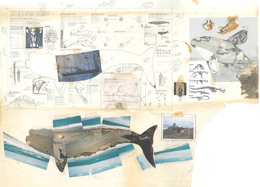
Figure 1. In progress work from Jaime Serra’s infographic, La ballena Franca (“The Southern Right Whale”). This particular image can be seen on Serra’s blog, and is featured on page 52 of The Art of Insight.
In the “Ambassadors” section, Cairo interviews Amanda Makulec (Chapter 10, “The Good Fighter”), who similarly writes stories of a deeply personal nature. Although motherhood, and particularly breastfeeding, can be a taboo subject, Makulec published a piece on breast milk bags, which turn out to sometimes vary considerably in size from what the labels claim. As Makulec says, “1.5 oz is very different from 2 oz when you’re feeding a tiny human” (127). Makulec also shares a sadder personal story about a tweet she posted a few years ago, sharing the loss of her second child. Unfortunately, anti-vaxxers, stumbling upon an earlier tweet where she reported her COVID-19 vaccination during her pregnancy, claimed it was the vaccine that caused her child’s death. As someone trained in public health, she found these accusations particularly troubling. Cairo shares that he, too, has been attacked online for posting about his child; in his case, one of his children that “is part of a minority that is subject to conspiracy theories and harassment” (128). These personal anecdotes from Cairo and Makulec, while not clearly tied to data visualization, help to show the humans behind the visualization and make the reader feel like they are part of a close-knit conversation. The remainder of the chapter goes on to detail the thoughtful ways Makulec thinks about data visualization for public health. Figure 2 shows some of her visuals for one article, and is also exemplary of Cairo’s skill in selecting figures for this text. This visual is interesting enough to draw the reader’s attention when static (I imagine Cairo had to exclude many amazing graphics because they may not translate well to the page!), yet still inspires additional exploration online to gain the full experience.
Cairo’s interview with Gurman Bhatia makes up Chapter 19, “Visceral Visualizations,” found in the “Narrators” section. Bhatia spent time in the United States but later returned to her home country of India to work as a graphics reporter. She describes how her initial excitement about working in Milwaukee, Wisconsin, gave way to homesickness during the very long, and ultimately unsuccessful, process of obtaining a work visa. Once her work visa application was rejected, she was excited to move home, closer to her parents, and work for a variety of Asian newspapers. One of her data visualizations for the Hindustan Times, “Women are fading out from Bollywood music,” featured the decline of female singers across Bollywood movies. Her research into the genders of singers in the top fifty Bollywood movies between 1950 to 2017 (the year prior to publication) involved manually seeking out information on each singer, as no database existed. The project took months to put together, but it was driven by passion, and reading about it prompted me to imagine stories that would inspire a similar dedication of time and effort. Cairo also shares another of Bhatia’s stories, “A window into Delhi’s deadly pollution,” that features hourly timestamped photographs. While still clearly a data visualization, Cairo admits that this story made him think differently than a traditional visualization on the same subject might, and encourages other visualization designers to similarly think outside of the box.
Throughout The Art of Insight, Cairo captures not just the beauty and power of the visuals themselves, but the spirit of the humans behind the designs. This commitment to showcasing individuals is particularly important in our fast-paced modern world where ideas can blur together, and visuals are often viewed without an awareness of who it was that made them. It is also important in a world of increasing automation and artificial intelligence, demonstrating that many of the most breathtaking visuals are still made by slow, careful human processes. Many designers, of course, make use of automation and code in crafting beautiful visuals, but they do not typically rely on them exclusively, seeing them instead as useful technologies in a well-stocked toolbox.
I do wish the book was formatted in a way that included the full name of the designer on each page of the chapter about them. It is a minor criticism, perhaps, but I think that it would better align with the book’s mission of emphasizing individual designers—and would be a particular help for people who, like me, are bad at remembering names.
I highly recommend this book to any cartographer who seeks to add beauty to their design. While most of the examples are not cartographic, many of the broad ideas can be extrapolated to maps. Every reader may not enjoy every chapter, but in a collection of over twenty interviews, everyone will enjoy at least some of the stories. Please be warned, though, that many of the examples are best enjoyed interactively on a computer, and therefore you may lose many hours exploring their beauty.