DOI: 10.14714/CP107.2063
© by the author(s). This work is licensed under the Creative Commons Attribution-NonCommercial-NoDerivatives 4.0 International License. To view a copy of this license, visit http://creativecommons.org/licenses/by-nc-nd/4.0.
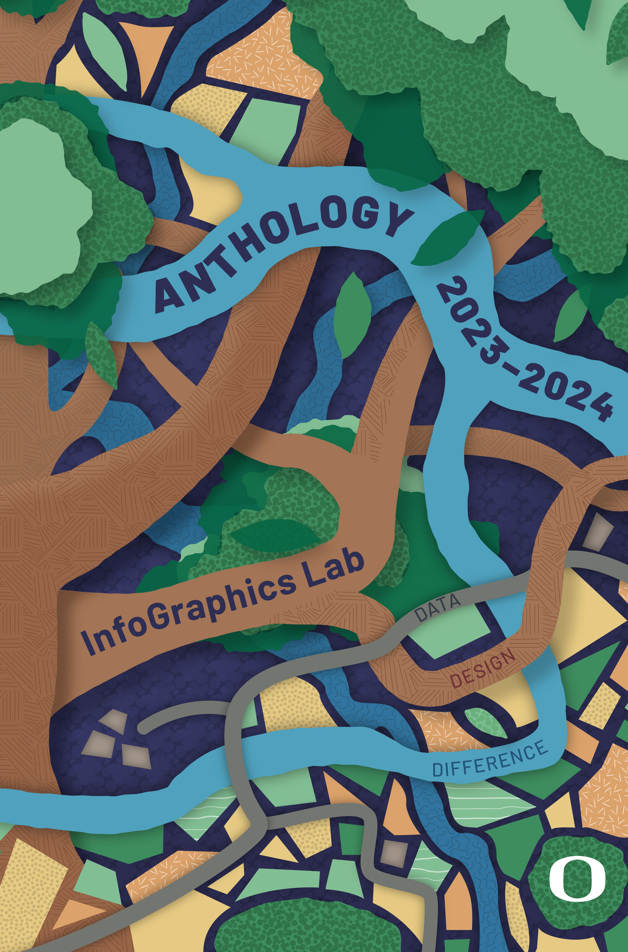
Review of The InfoGraphics Lab 2023–24 Anthology
By Erik Steiner, Peyton Carl, Alethea Steingisser, Mack Gray, Eden McCall, Atticus Tong, Jenna Witzleben, Maxim Johnson, Matthew Kauffman, Zoë Kleiner, Lily Lindros, Joanna Merson, Lauren Nguyen, and Clare Otcasek
University of Oregon, 2024
72 pages
eBook: Free (PDF Download)
Review by: Chiara Phillips (she/they), Seqana
In an era where rapid technological development has made it easier than ever to create and share data visualizations, it has become increasingly difficult to assess the level of truth behind them. This has led many cartographers to renew their emphasis on transparent, ethical design—evaluating how accurately and effectively maps convey information, and understanding how and why maps have been, and continue to be, created. By placing these questions of process, ethics, and communication to the forefront, The InfoGraphics Lab 2023–24 Anthology reminds readers that cartography is political: the choices cartographers make ultimately shape how knowledge, memory, and place are envisioned and reinforced. This collection of explorations of place, cartographic musings, and firsthand accounts of the University of Oregon’s InfoGraphics Lab’s projects and culture demonstrates that modern cartography can flourish through experiential learning, shared inquiry, and intentional design.
In his “Letter from the Director,” Erik Steiner reflects on returning to the InfoGraphics Lab after a varied and distinguished professional career he humbly describes as a “15-year detour.” It was not only the Lab’s map drawers, oak table, and poster-lined walls that felt so familiar, but also the community of creative, compassionate, talented, and purpose-driven mapmakers forged by its co-founder, Jim Meacham, over the course of three decades. As Steiner explains, the InfoGraphics Lab’s commitment to high-quality research and data-driven design has steered its direction since its inception (2).
Today, the Lab is known not only for its cartographic excellence but also its experiential learning program, where students work directly with faculty and external professionals to help manage and lead professional and academic publications—including Atlas of Oregon, Atlas of Yellowstone, and Wild Migrations—and other ventures such as the interactive works University of Oregon Sustainability Dashboard, Atlas of Essential Work, and Interactive Nolli Map (13). Its success is evidenced not only by the career paths of its alumni—who can be found at prestigious organizations such as National Geographic Maps, the US National Park Service, Esri, and Apple (65–66)—but also by the work featured in the anthology. The Lab empowers members to take ownership of their work and prepare for successful careers—and the anthology is a testament to that.
In the words of contributor Peyton Carl, the 2023–24 anthology wove “the InfoGraphics Lab mission of Data, Design, and Difference into three visual elements that resonate with the theme of ecosystems” (3). For Data, they “chose a colorful mosaic to represent the human influence on our work,” because “people are fundamental to our work, and we strive to make valuable and long lasting connections and impact on our students, staff, and beyond” (3). On the subject of Design, Carl notes that
Trees are used throughout this publication to exemplify the Lab’s commitment to design and to showcase the value of our collective creativity. We envision that the roots represent the people that came before us, creating a foundation for current Lab members. Branches serve as a symbol of involvement, the varying disciplines and broadening experience of the team. The leaves of the tree serve as a symbol of outreach and growth of our design values beyond the InfoGraphics Lab and receptivity of others (3).
Finally, the authors “adopted rivers as a symbol to represent the cycle of leadership and interconnectedness of our team and further, how the work of our lab members extends to the support of other efforts” (3). These design elements, as simple as they may seem, highlight the interdependent community that has established the InfoGraphics Lab as a space devoted to cultivating the next generation of cartographers.
Given the Lab’s supportive, inclusive learning community and today’s evolving technological landscape, it is no surprise that the creative process itself is a recurring theme in the anthology. One particularly charming example is the “Slow Data” chapter by Lily Lindros (23–24), in the Data section. In her discussion, Lindros describes her recent turn towards creating what she terms slow maps: maps crafted by hand that deliberately take longer to produce than what more efficient technology could enable. Lindros argues that by slowing down both the data analysis and the map composition, she was able to notice and focus on patterns and provide deeper insights into the data she was working with (23).
Lindros was first exposed to slow mapping in an earlier research project examining white flight and real estate practice in Washington, DC. Her role involved mining hundreds of historical property documents to discover, compile, and enter relevant thematic data. Despite the tedious nature of her work, she found that the process of manually reading and sorting through countless deeds allowed her to make connections about individual real estate agents and particular practices that might never have surfaced were she simply analyzing profits and losses. Lindros mentions that while the final map took years to create, it could not have taken the form it ultimately did without her slow, methodical processing of the piles of legal papers. This experience ultimately led Lindros to embrace slowness in other endeavors, such as Tree Chroma (Figure 1), a cross-stitched treemap diagram based on photos of a Japanese maple tree in different seasons. Although she started by processing her images digitally—reducing the number of colors in each image, and sorting each image’s pixels by color—she then chose to arrange the color blocks manually, before hand-stitching the results. Reflecting on her work as a data practitioner, Lindros states that “it is not only a privilege, but a responsibility, to make sure that my work makes the effort to interact more deeply with what I am representing. And that will always take time” (24).
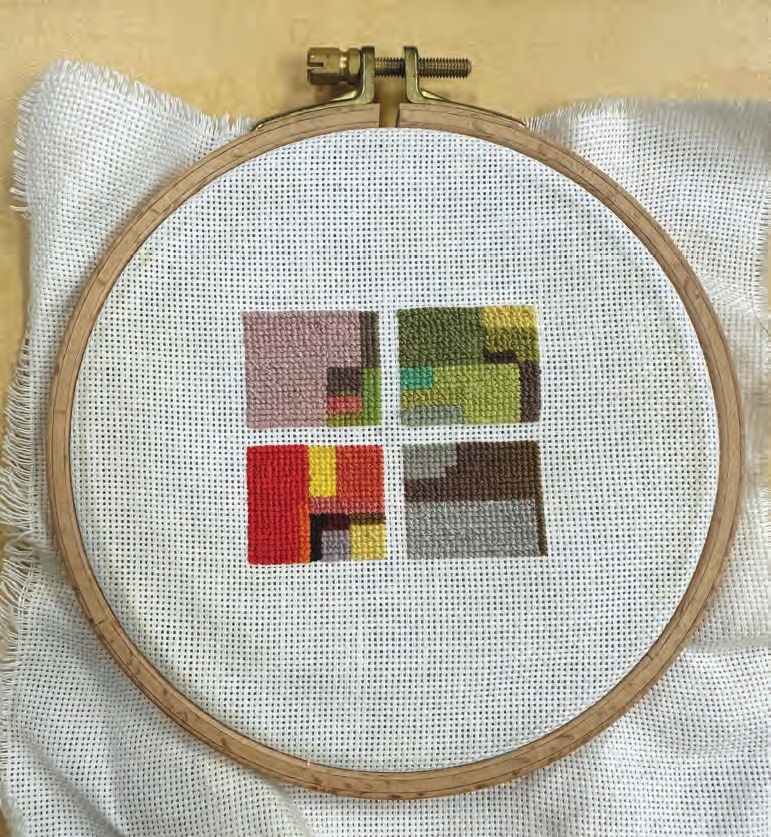
Figure 1. Tree Chroma, by Lily Lindros (23).
In a culture where creation is expected to be ever faster, Lindros’s choice to deliberately slow the process down is an important reminder of what can be lost when speed and efficiency are prioritized without reflection. Her approach suggests that patience and hands-on engagement allow for a different kind of relationship to data—one where patterns are not glossed over or obscured but rather emerge gradually, through sustained attention. While it is true that many professional mapping practitioners operate under significant time pressures that militate against such deliberate pacing, and not all tasks that can be automated must be done manually, it should be noted that Lindros is not advocating going slow for its own sake. Rather, she rightfully argues for the adoption of the values of slow mapping—namely, close attention to, and the cultivation of, a deeper relationship with data. By redirecting focus from pure speed to depth of understanding, contemporary cartographers can discover hidden insights that might have otherwise been overlooked.
In other parts of the anthology, that same spirit of reflection extends to questions of cartographic ethics and how cartographers represent place. A clear example of this is Jenna Witzleben’s “Tale of Two Jobs” (59–64), in the book’s Difference section, where the author describes their experience working as a Food Sovereignty Planner for the Burns Paiute Tribe while also working at the InfoGraphics Lab. As part of this work, Witzleben contributed to the InfoGraphics Lab’s not-yet-published Monumental Denial: An Atlas of U.S. Cultural Memory and White Innocence, which interprets and visualizes the ways US National Historic Landmarks are chosen and presented to the public so as to uphold narratives of colonialism and white supremacy (59).
Witzleben describes how the team appreciated the opportunity to challenge their own mental models around property and state boundaries. They repeatedly had to consider when to design visuals within the “worldview of the colonial nation-state (in order to depict and critique that worldview) versus when to challenge those white supremacist worldviews and depict an alternative” (59). In one example, Witzleben purposely left out US state boundaries when depicting the traditional lands of the Nüümü (Northern Paiute) alongside the much smaller reservations into which those people were forced (Figure 2). The reasoning behind this was that US state boundaries are themselves a colonial artifact and their inclusion would reinforce a colonial perspective (60). On another map—Valorization Sites in Wyoming (Figure 3)—the Monumental Denial team decided to include state boundaries, as they are closely linked to the processes of settler colonization that they were discussing in that section of the book (61).
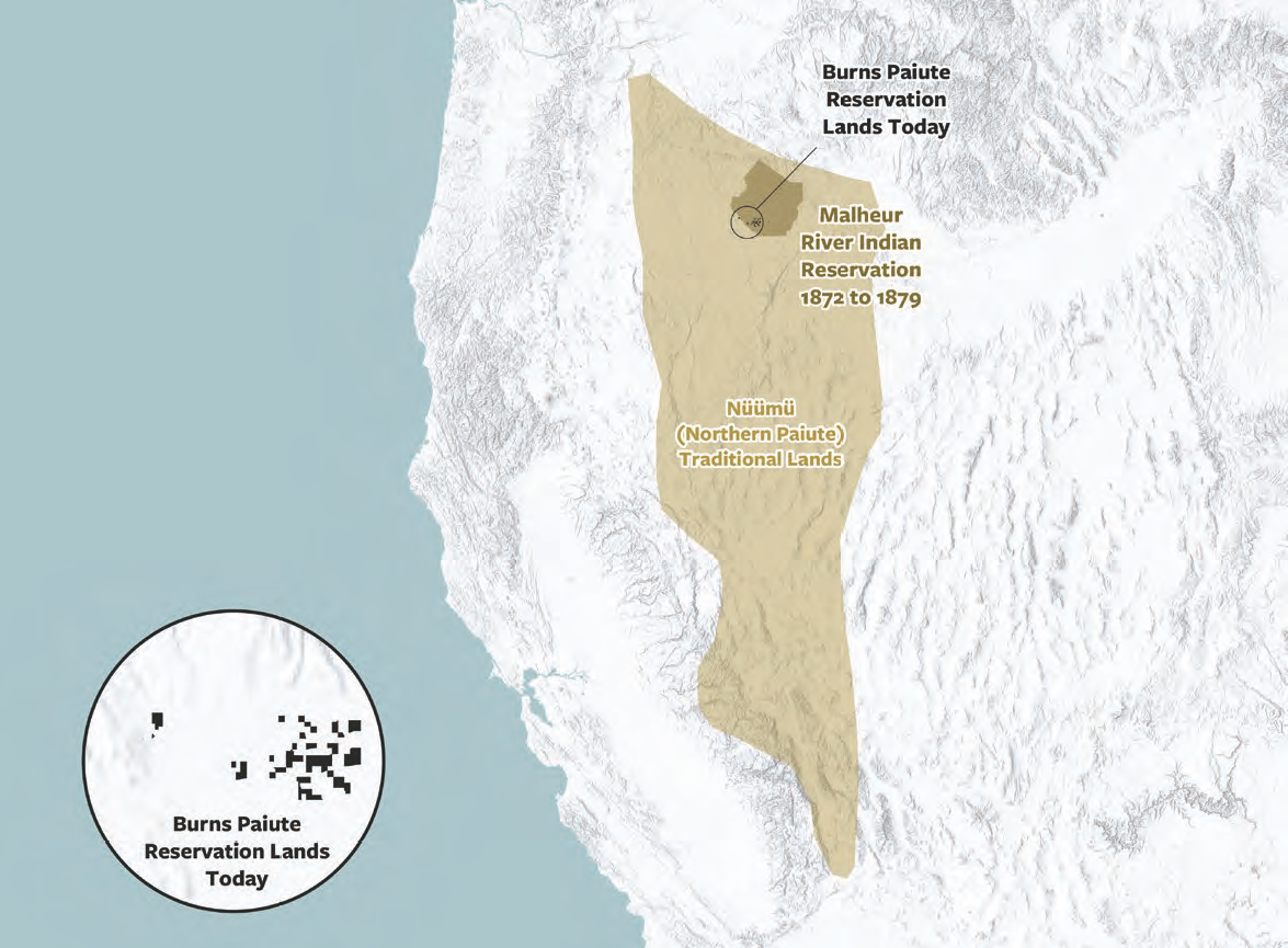
Figure 2. Land Theft over Time, by Jenna Witzleben (80).
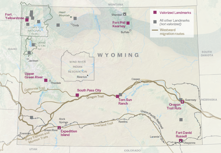
Figure 3. Valorization Sites in Wyoming, part of the Monumental Denial project (61).
Witzleben’s thoughtful approach also appears in their Food Sovereignty Assets map (Figure 4), which approaches labeling through a different lens; in this case, areas the tribe intended to use for their food sovereignty program were deliberately left unlabeled so as to protect their privacy (60). Witzleben’s decision process regarding the inclusion or omission of state boundaries or labels was one of the anthology’s more powerful illustrations of the inherently political nature of maps, and how mapmakers can choose to either resist or bolster colonial frameworks. Cartography has the power to disrupt established ways of seeing, a fact which at times sits in tension with its requirement of being comprehensible to its audience who have been taught to see the world in a certain way. This essay, and others throughout the anthology, remind us that in order for mapping to be conducted well, it demands reflection and dialogue.
Cartographic Perspectives has been informed that the "Food Sovereignty Assets" map has been withdrawn from The InfoGraphics Lab 2023–24 Anthology. Readers may consult the updated Anthology PDF for further information.
As this map no longer appears in the Anthology, the map illustration has also been removed from this review. Cartographic Perspectives apologizes to our readers and to the review writer.
A quiet but revealing theme within the anthology was the struggle of perfectionism, a challenge shared by students and professionals alike. Though the term appears only twice, its presence was an undercurrent across several pieces in the collection. My impression was that many of the project descriptions could have benefited from a deeper discussion of the map-design process, particularly when critique and revision were noted as important to the final product. This processual opacity might be seen as a reflection of a broader tendency within the field of cartography to showcase polished outputs without also showing the iterative work that produces them. As a general rule, of course, the duty of a cartographer is to communicate messages clearly to end users, and workflows are not typically a part of that message. In this anthology, however—where the intended audience is cartographic peers and educators, and where those very processes are so central to the InfoGraphics Lab’s functioning—more space could have been allowed for presenting and discussing the various evolutions many of the pieces went through. Future anthologies could build on this by including examples of early drafts or reflections on specific critiques alongside the final products. Such inclusions would be a valuable resource for education, for normalizing imperfection and iteration, and for fostering a culture of trust and openness about the realities of creative labor.
Taken as a whole, The InfoGraphics Lab 2023–24 Anthology demonstrates the breadth of contemporary cartography. The collection presents a creative and collaborative environment where students are encouraged to think critically about how their work impacts the world. From questions about representing ambiguity in Maxim Johnson’s “Mapping Coastal Salish Tribes and their Languages” (45–46) to the life-or-death nature of map-making in Atticus Tong’s “Journey to the InfoGraphics Lab” (55–58), the anthology demonstrates the wide spectrum of considerations and issues cartographers grapple with today. It will be of particular interest to prospective students considering work in data visualization and cartography, to educators seeking models for experiential programs that empower students, and to professionals curious about how the next generation is approaching questions around process and representation. As both a showcase of student work and a reflection on the political and ethical dimensions of mapping, the anthology is a valuable contribution to contemporary cartographic practice and pedagogy.