Cloud Mapping: Google Fusion Tables
Michael Peterson, Kelly S. Koepsell, Gabriel Pereda, and Spencer Trowbridge
University of Nebraska at Omaha | mpeterson@unomaha.edu
INTRODUCTION
The cloud is presenting new possibilities for mapping. Fusion Tables is a Google
service for storing, sharing, and visualizing data; it accepts data in a variety
of formats, including Excel and CSV. The ability to import KML files makes
mapping possible. Fusion Tables is still a beta product. Up to 250 MB per user
can be stored at no cost.
The following three articles all deal with mapping applications utilizing Fusion
Tables. The article by Koespell looks at how spatial and attribute data from the
US Census Bureau can be uploaded and mapped. Pereda relates how maps can
be styled within Google Fusion Tables. Trowbridge examines the layering of
data on maps.
These three contributions come from a graduate course entitled “Cartographic
Methods,” taught by Michael Peterson at the University of Nebraska at Omaha.
The course dealt with various ways of using cloud resources to make maps. The
next issue of Cartographic Perspectives will include three more articles on cloud
mapping.
-Michael Peterson
MAPPING CENSUS DATA IN THE CLOUD
by Kelly S. Koepsell
INTRODUCTION
Displaying and analyzing data from the US Census Bureau and other agencies
can be difficult without commercial geospatial software. Cloud-based tools
provide free solutions for the mapping of this data. The method outlined here
guides users in building a table of data and mapping the data through services
provided in the cloud.
DATA CONVERSION
Digital maps and attribute data can be found through the US Census Bureau
website. Basemaps are provided in the form of ESRI shapefiles. Attributes are
provided in tabular form.
In the example used here, a shapefile will be converted to a Keyhole
Markup Language (KML) file. Many free conversion services are
available, including Shape2KML, Geoserver, and Shape2Earth.
The conversion can be done online with some services, while others
require that the software be installed on the user’s desktop. All of
these services adequately convert shapefiles to KML.
Once the shapefile has been converted into a KML file, it can be
uploaded to a cloud application to display the map. Again, the
user has several choices. Google Fusion Tables is used in the steps
outlined here because it provides an “all-in-one” approach to database
table storage, geographic information display, and data display with
various mapping options. Many other cloud-based mapping services
are also available (e.g., GeoCommons, ESRI, and Geoserver).
When the KML file is uploaded into Google Fusion Tables, it is
split into its components, that are then placed into different columns
in the table (see Figure 1). The three columns will usually be titled
“description,” “name,” and “geometry.” The description column
contains the HTML code for the map display format and the
shapefile attribute table information. The name column contains the
name of the map as declared in the shapefile. The geometry column
holds the KML code of latitude and longitude points for drawing
the map.
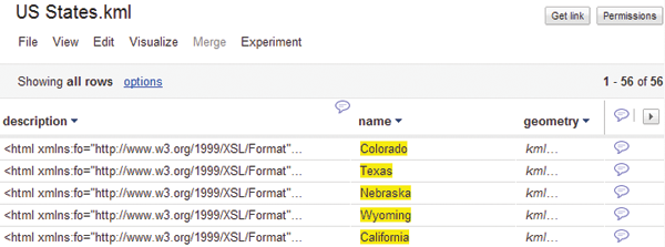
Figure 1. The imported KML file is displayed
in a Google Fusion Table. The three column
headings are the main subsections of the KML
file. The description column contains the HTML
code for map display format and the attribute
table data. The name column contains the
map’s name from the shapefile. The geometry
column holds the KML code for the points that
comprise the map from the shapefile. Notice
the number of entries is 56, for the 56 polygons
that correspond to the 56 states and territories.
SHAPEFILE DOWNLOAD AND CONVERSION
Shapefiles from the US Census Bureau website can be found under “TIGER”
(Topologically Integrated Geographic Encoding and Referencing). Files are
available for download in zipped form.
Some shapefile-to-KML converters require as input the zipped file and others
do not. Experimentation may be needed to find the solution that works best.
Some options produce a KMZ file, a zipped version of the KML. In this case,
unzipping to KML is required before the file can be imported into a Google
Fusion Table.
Access to Google Fusion Tables requires a Google account. In Google
Documents, select “Create” and then select “Table.” A dialog box will appear
with file import options. Select the KML file and import. When import is
complete, the KML file will be displayed as a table.
After the shapefile is uploaded, the demographic data needs to be acquired and
uploaded to a second Google Fusion Table.
DEMOGRAPHIC DATA DOWNLOAD AND MANIPULATION
Demographic data can be downloaded from the US Census Bureau by subject,
type, year, and geography. Many different data file types are available, including
PDF, Microsoft Excel, Rich Text Format, and Comma Delimited Format. A
comma-delimited format is selected here to enable uploading to the Fusion
Table, but the Excel option could also have been used (a size limit of 1 MB is
imposed upon .xls files; 100 MB for .csv files). The data file is downloaded as a
zipped file.
After the file is unzipped, minor manipulations of the demographic data file are
required in order to prepare the file for uploading into a Google Fusion Table.
These modifications can be done in Excel.
In the file provided by the US Census Bureau, the column headings occupy
three or four rows at the top of each column. In order to upload the spreadsheet
to a Google Fusion Table the column headings must be in one row. This change
is easily done in Excel with the Concatenate function, which combines all text
in select cells into one cell. Select the cell where the single heading row should
be and type “=concatenate” into the function bar. Then, enter the column/row
reference for each of the three or four cells containing the header information
desired, separated by a comma. After concatenation, a single heading row cell
will now contain a string of text from the input cells. Since the header is now in
a single row, it can be uploaded into Google Fusion Tables.
After the modified demographic data file has been uploaded, select “Create” and
then select “Table.” A dialog box will appear with upload options. Select the data
file and import into Google Documents. When import is complete the data file
will be displayed as a table (Figure 2).

Figure 2. The uploaded demographic data file in Google Fusion Tables.
Note the number of entries is equal to 30.
Note how the table organizes the demographic
data. The first four columns contain geographic
data relating to the data collection area. The
area’s name will be found under the “Geography”
column. This column will be used to merge the
demographic data with the geographic data
previously uploaded as a KML file. (Recall that in
the uploaded KML file, the column “name” was the
column that contained the map labels.)
MERGING THE TABLES AND DISPLAYING THE DATA
To merge the geographic (KML) data with the demographic data, open the
KML Fusion Table and select “Merge” from the menu (Figure 3).
In the dialog box, select the column (“name”) to be associated with the
geographic area column from the demographic table. On the right, select the
file to merge and select the column to be associated (“Geography”). The choice
to save the merged tables as a new table is made automatically; simply provide
a new file name in the space provided. Select “Merge tables,” and the new table
will be displayed when the merge operation is complete.
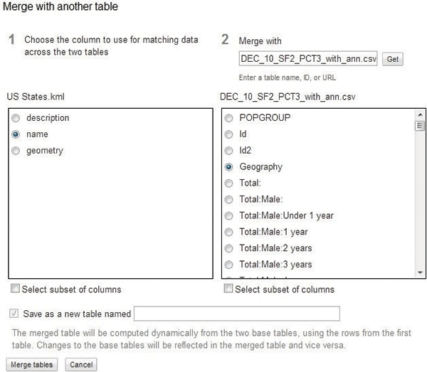
Figure 3. The “Merge Fusion Tables”
dialog box. Notice that the “Save as a
new table” checkbox is automatically
filled in. The dialog box also provides
guidance on how the tables will be
merged, which is explained in the text
of this article.
There are two parameters in the merge operation that require explanation.
The merging operation performed by Google Fusion Tables is “computed
dynamically,” meaning the data in the merged table will be updated if
the data in the original tables is changed. The note in the dialog box also
states if the data in the merged table is changed, the data in the original
tables will be changed as well. This is a very useful function if the user is
aware that this is happening. The user could merge tables, believing the
original tables and the merged table are separate and distinct entities.
However, changing one table will affect the data in the other table, as
stated in the merge dialog box. Without understanding this, the user might
inadvertently change data in both tables.
The other merge parameter the user needs to be aware of is the merging
order. The merge dialog box states that the tables will be merged “using
the rows from the first table.” In the examples below, the KML table (of
US States) is selected first and the demographic table is merged to the
KML table. The resulting table contains all the states listed in the original
KML table with their associated demographic data, but some states do
not have demographic data because they were not present in the original
demographic table (Figure 4).

Figure 4. Merged results of selected
KML file with demographic data file
merged to it. Notice that all states,
territories and districts in the US are
represented by the number of rows of
data in the table (56). In this figure,
Alabama, American Samoa, and
Arizona did not have corresponding
entries in the demographic data table.
Those maps are still in the table due to
the order of the merge (KML first).
Conversely, when the demographic table is selected first and the KML
table is merged to it, only the states in the KML table that have population
data in the demographic table are merged into the final table. This is
because the demographic table does not have data for all states listed in the
KML table (Figure 5).

Figure 5. Results of the table
merge when the demographic
table is selected first. Notice
the number of table rows is
reduced to 30. This represents
the number of rows in the
demographic data file.
From the Google Fusion Tables menu, select “Visualize” and then “Map”
to display the merged tables in a Google Map (Figure 6). This map may
now be styled and altered as desired using “Configure styles.” The specific
attribute that is mapped can also be changed. To share the data or the map,
click on the “Share” button in the top right hand corner of the page. This
modifies the permissions settings of the table to allow access for specified
users.
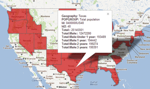
Figure 6. Map of the merged
Google Fusion Tables when the
demographic table is selected first.
Notice that only the states with
demographic factors are displayed.
To distribute this table as a map, three options are provided. In the map
menu bar, the first option, “Export to KML,” creates and downloads a
KML file for use in Google Earth or Google Maps. The next option,
“Get KML network link,” generates a website link that, when opened in a
browser, will download a KML for use in Google Earth or Google Maps.
The final option, “Get embeddable link,” generates an HTML inline frame
code for use on a website. The inline frame link specifies frame height and
width, and the map URL. By modifying this code prior to use, the website
author can adjust the size of the map displayed, and the map center, as the
map center latitude and longitude coordinates are specified in the URL.
The “Get link” button at the top right corner of the page enables sharing
via e-mail or instant messaging. Finally, using the Google Maps API, the
Google Fusion Table can be embedded into a webpage using the Google
Fusion Table “Numeric ID.” This can be found in the Google Fusion Table
interface by clicking “File,” then “About.” The dialog box that appears
contains all the properties of the table.
SUMMARY
The use of cloud computing tables and visualization tools, such as Google
Fusion Tables, is an easy and effective way to store, integrate, and display
census data. The free maps and data can be manipulated and customized in the
cloud environment with a few simple operations. The ability to combine the
geographic and demographic data via the merge operation provides the ability to
place a very large amount of data into a single geo-referenced source. Google’s
distribution methods for the mapped data table enhances this powerful array by
creating a flexible, accessible source for maps and data.
WEB RESOURCES
Arc2Earth. 2012. “Arc2Earth.” http://www.arc2earth.com. Accessed April 16,
2012.
ESRI. 2012. “ArcGIS Explorer Online.” http://www.arcgis.com/explorer.
Accessed April 16, 2012.
GeoIQ. 2012. “GeoCommons.” http://geocommons.com Accessed April 16,
2012.
GeoServer. 2011. “GeoServer.” http://geoserver.org/display/GEOS/Welcome.
Accessed April 16, 2012.
Shape2Earth.2012. “Shape2Earth.” http://shape2earth.com/default.aspx.
Accessed April 14, 2012.
US Census Bureau. 2012. “TIGER Products.”
http://www.census.gov/geo/www/tiger. Accessed April 17, 2012.
Zonum Solutions. 2011. “shp2kml 2.0: Shape-file to Google Earth.”
http://www.zonums.com/shp2kml.html. Accessed April 15, 2012.
CONFIGURE STYLES IN GOOGLE FUSION TABLES
by Gabriel Pereda
INTRODUCTION
Google Fusion Tables is a web service provided by Google for data management
in the cloud. The service was originally designed for organizations that struggle
with making their data available internally and externally, and for communities
of users that need to collaborate on data management across multiple
enterprises. Fusion Tables also provides a simple data integration platform
where users can join tables that may belong to different users. To collaborate,
users can share the data with a select set of collaborators, or make it public
and thus available to everyone. Fusion Tables is helpful for geocoding data, as
street addresses in a Fusion Table are automatically converted into latitude and
longitude coordinates. The map option under visualization is used to map the
results. However, one must have a Google account to make use
of all the web services.
CONFIGURE STYLES OPTIONS
Configure styles” is used within Fusion Tables to control the
display of the map. Figure 1 shows the default layout of the
different tabs under visualize. “Configure styles” allows the
user to manipulate the display of points, lines, and polygons on
the map.

Figure 1. The options available after clicking on the
Visualize tab.order of the merge (KML first).
POINTS
Points on a map are identified as markers. The default marker
is the standard upside down tear drop, although Fusion Tables
offers approximately 200 additional markers. Figure 2 shows
how the user can change the color of the icon under the fixed
tab. The fixed tab means that the user wishes to set all of the
points to be equal value. The column tab is used to provide a
specification for each row’s display in one of the table’s data
columns. This option provides the most specific control over
the appearance of features on the map. The Buckets tab is used
to classify the data. If the user wishes to represent multiple
classes of data, he or she can change the color of each class to
represent the data more accurately.
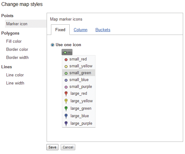
Figure 2. The available colors for icon markers
within “Configure Styles.”
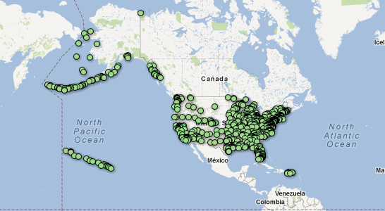
Figure 3. A point map with specified markers and color.
LINES
Lines on a map are another way to represent data. Similar
to polygons, lines can be styled with the “Fixed,” “Column,”
“Bucket,” and “Gradient” functions. Line
width can be manipulated as well with
“Fixed,” “Columns,” and “Bucket.” As
shown in Figure 4, the user can assign
a specific color and width to each line if
needed. Figure 5 shows the classification
of the contour lines using the “Buckets”
option.
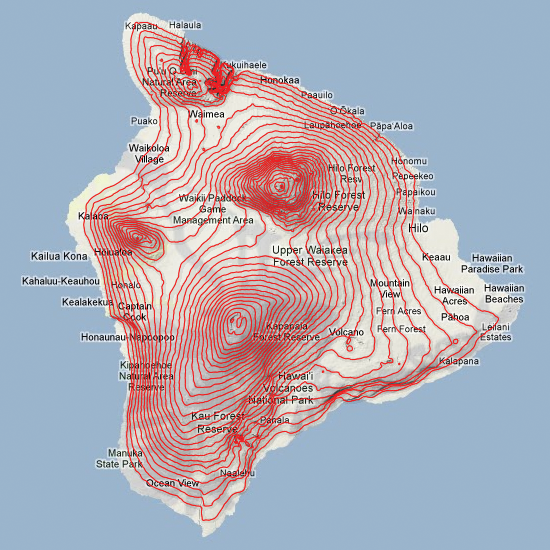
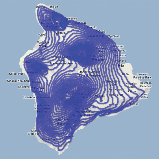
Figure 4. Map of contour lines on
the Big Island in Hawaii showing the
different colors and line width options
that are available in “Configure styles.”
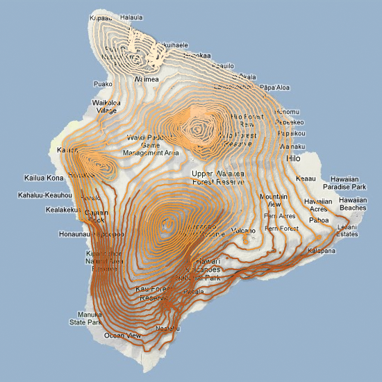
Figure 5. Contour lines are given a
certain value and divided into classes
with the “Buckets” function. Ranges are
distinguished by color value.
POLYGONS
Fusion Tables can also handle polygons.
Similar to points, a polygon can be
modified with the “Fixed,” “Column,” and
“Buckets” functions. “Buckets” control
the shading of the polygons. In Figure
6, “Buckets” is used to specify a range
of values to assign to each color. Style is
assigned to each row based on the value in
a numeric data column.
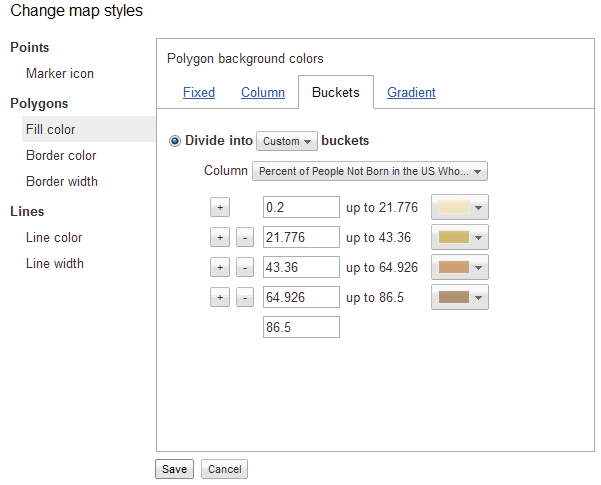
Figure 6. Buckets can be changed
according the desired color and
classification range.
Polygons introduce the use of a fourth
representation function, “Gradient.”
“Gradient” is an unclassed form of data
representation that does not classify
the data into categories but defines a
continuous range of colors. The user can
change the color of the overall gradient
as well as the opacity of the fill color. In
certain scenarios, where more than one
column of data is being represented, the
user needs to choose which column of
data to represent. An example is shown in
Figure 7.
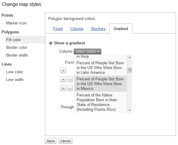
Figure 7. The user can select which
column of data they wish to manipulate.
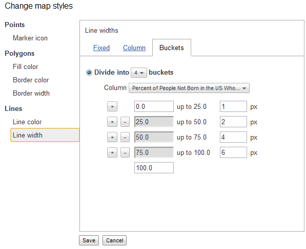
Figure 8. Lines can be represented
with the “Fixed,” “Columns,” and
“Buckets” functions.
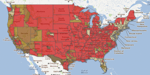
Figure 9. A map defined in Fusion Tables showing the percent of
population born in Mexico for each Congressional district.
WEB DISPLAY
Once the user has finished configuring the
styles, the map can be displayed within
a webpage. The JavaScript code example
shown on Figure 10 will display the map;
the user needs to change the numeric
ID in the code shown on line 27. By
clicking on the File tab, the user can see
the “About” button, that gives the user
the Number ID for the map. The center
of the map will also need to be changed
depending on which part of the world is
being mapped.
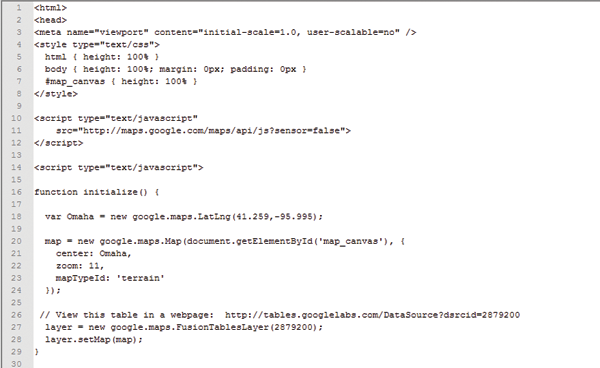
Figure 10. HTML/JavaScript code to display the Fusion Table Map.
LIMITATIONS
Google Fusion Tables have a number of limitations. A few to note are: a storage
limit of 250 MB per user account, 1 MB upload limit per Excel spreadsheet, no
legend, no choice in the map projection, and limited icon styles and colors. The
size difference between icons can be important due to the fact that larger icons
can block smaller icons behind them which can lead to data misinterpretation,
as shown in Figure 11. Incorrect geocoding is a frequent problem that can also
alter a map.
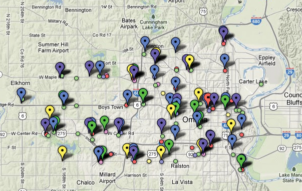
Figure 11. The use of different icon types and
colors can lead to misinterpretation of the data.
SUMMARY
More and more maps are being made and displayed
on the Internet through services in the cloud. Google
Fusion Tables are just one of the many web services
available that offer quick styling features and require no
software installation. Fusion Tables allows the user to
present their data in an appropriate manner and display
interactive maps on a website. Although there are
limitations to what the user can do with the application,
Google Fusion Tables is a quick and easy way to display
geospatial data on the web.
SOURCES
Halevy, Alon, and Rebecca Shapley 2009. “Google
Fusion Tables.” http://googleresearch.blogspot.com/2009/06/google-fusion-tables.html#!/2009/06/googlefusion-tables.html.
Gonzalez, Hector, Alon Halevy, Christian S. Jensen,
Anno Langen, Jayant Madhavan, Rebecca Shapley,
and Warren Shen. 2010. “Google Fusion Tables:
Data Management, Integration and Collaboration
in the Cloud.”
http://www.cse.ohio-state.edu/~agrawal/788-au10/Papers/Oct28/google-fusion-socc10.pdf.
Google. 2012. “Set Map Styles.” http://support.google.com/fusiontables/bin/answer.py?hl=en&answer=185991.
Shrader, William. 2012. “Contours Fusion Table,
Hawaii’s Big Island, 500ft contours.” http://wshrader.hostei.com/CM11/page2.html.
LAYERING MULTIPLE KML FILES IN GOOGLE MAPS WITH FUSION TABLES
by Spencer Trowbridge
INTRODUCTION
Maps on the web are often displayed as a series of user-selectable layers. Map
users seem to prefer a multi-layered map to a single map that displays all of
the information simultaneously. Toggling between layers allows the user to go
back and forth easily to compare the information depicted in each layer. Google
Fusion Tables can be used to display information in this manner.
Google Fusion Tables are a way of storing, sharing, and visualizing data tables
imported by users. The data is viewable in a spreadsheet format, and can be
queried, edited, or exported in formats like CSV and KML. Google Fusion
Tables is still described as experimental, and does have some limitations,
including the size of files to be uploaded, upload formats, and options for map
display.
Google Fusion Tables accepts map files in the KML format. Keyhole Markup
Language (KML) is based on the XML standard and is designed for the display
of geospatial information in Google Maps and Google Earth. Much of the
code can be generated within Google Earth. Options include the addition of
placemarks, lines, or polygons. Right-clicking on the newly-created layer allows
the copying of the KML that can be then edited with any text editor.
Up to five Fusion Tables can be displayed on one Google map as layers. In this
demonstration, stream channel changes will be depicted. This technique of using
layers within Google Maps can enhance the presentation of change.
CREATING RIVER CHANNEL LAYERS
Historic georeferenced aerial
photographs were obtained
as .tif files from http://www.historicaerials.com/aerials.
php?op=home. These files
were imported to ArcMap
10.0 (Figure 1). While
one can overlay images in
Google Earth and extract
the KML code, ArcMap was
chosen to allow the tracing
of stream locations. Using
ArcMap editing tools, the
outer margins of the stream
channels were traced from separate years for the Platte and Missouri Rivers near
Plattsmouth, Nebraska, and were digitized as lines on separate layers.
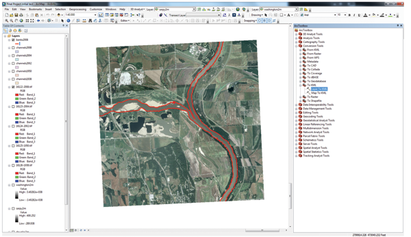
Figure 1. A digitized stream channel layer ready for export to KML from ArcMap.
The conversion tool “To KML” in the ArcToolbox menu was selected to export
each map layer. When the tool was opened, a selection window allowed the
selection of the appropriate layer and destination or “Output” location.
ArcMap exports the file as a KMZ and not a KML. This is shown in Figure 2.
A conversion from KMZ to KML is needed for importing into Google Fusion
Tables. The file was opened with Google Earth and viewed for accuracy. Any
styling that was done in ArcMap is not included in the KMZ file. The styling
of the map, including colors and line thicknesses is done in Fusion Tables.
Once the map displayed in Google Earth, that layer was highlighted within
“Temporary Places” in the left “Places” pane. By selecting “Save” under “File”,
a “Save Place As...” option is presented. The “Save as type” drop-down menu
allowed the file to be saved as a KML. This KML file was uploaded to Fusion
Tables.
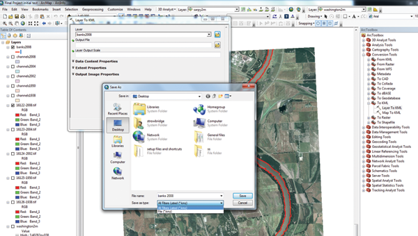
Figure 2. ArcMap exports to .kmz rather than to .kml format. A simple conversion is needed.
A Google account is required to import files and use Fusion Tables. Several file
types can be imported into a Fusion Table. These include spreadsheets, delimited
text files (.csv, .tsv, or .txt), as well as KML files.
The following steps are performed to import a file to a Fusion Table. These steps
are also illustrated in Figure 3. From the Google Docs Fusion Tables screen,
the blue “See my tables” button was selected. Once in the Google Docs page,
the red “Create” button was selected followed by “Table (beta)” from the drop
down menu. “Browse” was then clicked and the appropriate KML file previously
created was selected. After the filename was shown in the window, “next” was
selected. From the “Import new table” window, “Next” was selected followed by
“Finish.” The Fusion Table data was then displayed in a spreadsheet format. By
selecting “File” from the Google Docs menu followed by “About”, the Numeric
ID of the Fusion Table is available for reference.
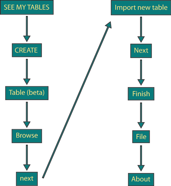
Figure 3. Steps needed within Google Docs to import a file and create a
Google Fusion Table.
To display the map while in Google Docs,
“Visualize,” then “Map” was selected from
the drop-down menu. The default color
red was changed after clicking “Configure
styles.” The line opacity was changed to
100%. The hexadecimal color codes of the
lines were written down for future use in
making a legend. This process was repeated
to add four more Fusion Tables to the
Google Docs list.
Up to five Fusion Tables can be displayed
on a Google Map. This can be beneficial
for showing intersections of different data
sets or change detection, especially when
toggle option is added. This can help to
avoid confusion by selecting which layers
are visible. When all five layers are visible,
they are difficult to visually separate, as
the top layers overlap others and conceal
information. The options to toggle layers
allow the user to adjust their view of the
data.
Displaying layers on a Google map does
require some basic knowledge of HTML
and JavaScript programming. The following
JavaScript code sets variables using the
Fusion Table numeric ID numbers. All
of the code for this tutorial was obtained from http://www.geocodezip.com/insight-projects_com_pedc_A.html available through the Google Maps example
page at http://www.geocodezip.com/.
<script type=”text/javascript”>
var tableid1 = 3469113 //1938
var tableid2 = 3468740 //1950
var tableid3 = 3468934 //2002
var tableid4 = 3469115 //2004
var tableid5 = 3468860 //2008
var layer1 = new google.maps.FusionTablesLayer(tableid1);
var layer2 = new google.maps.FusionTablesLayer(tableid2);
var layer3 = new google.maps.FusionTablesLayer(tableid3);
var layer4 = new google.maps.FusionTablesLayer(tableid4);
var layer5 = new google.maps.FusionTablesLayer(tableid5);
The following code sets the map center, zoom level, and basemap type:
- function initialize() {
- var mylatlng = new google.maps.LatLng(41.048, -95.885);
- //Lat-Long for center of map
- var myOptions = {
- zoom: 13,
- center: mylatlng,
- panControl: false,
- zoomControl: true,
- scaleControl: true,
- mapTypeId: google.maps.MapTypeId.SATELLITE
- };
This code toggles Fusion Table layers on or off using if/then statements. Only
one layer, 1938, is demonstrated in this code:
<h4><p align=”center” style=”color:#657383”>Click on the
checkboxes to display those layers</h4>
<!-- Form to turn layers on/off -->
<table width=90% align=”center”>
<tr align=”center”><td>
<form>
<tr align=”center”><td>
<!-- Map --><br>
<div id=”map_canvas” ></div>
</td></tr>
<p style=”position: absolute; left: 30%; top: 175;
color:#ff00ff”><input type=”checkbox” value=”3469113”
id=”1938” onclick=”changeLayer(this.value);”>1938
<p style=”position: absolute; left: 40%; top: 175;
color:#0000ff”><input type=”checkbox” value=”3468740”
id=”1950” onclick=”changeLayer(this.value);”>1950
<p style=”position: absolute; left: 50%; top: 175;
color:#00ff80”><input type=”checkbox” value=”3468934”
id=”2002” onclick=”changeLayer(this.value);”>2002
<p style=”position: absolute; left: 60%; top: 175;
color:#ffff00”><input type=”checkbox” value=”3469115”
id=”2004” onclick=”changeLayer(this.value);”>2004
<p style=”position: absolute; left: 70%; top: 175;
color:#ff0000”><input type=”checkbox” value=”3468860”
id=”2008” onclick=”changeLayer(this.value);”>2008
</form>
</td></tr>
</table>
Displaying five layers at once can be
confusing, as demonstrated in Figure
4. Comparison of the stream channels
is easier after toggling some layers off.
The basemap in this image is from
2012, a year after a historic flood
occurred along the Missouri River.
The tan area at the lower center of
the image is a large sandbar that is
devoid of vegetation as a result of the
flooding.
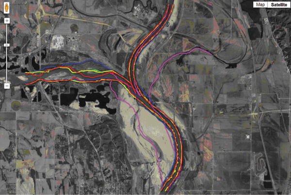
Figure 4. The display of all five years of stream channel locations can be confusing.
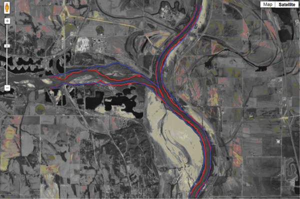
Figure 5. The display of only 1950 and 2008 stream channel locations. The 2012
stream location is visible in the underlying orthophoto.
SUMMARY
Many types of data can be placed into
a Fusion Table. Lists of addresses can
be imported and mapped. Associated
attribute data will be displayed in
a popup bubble on the map if the
marker is clicked. Census TIGER/
Line shapefiles can be downloaded
and imported into Fusion Tables.
Once the shapefile is in Google Docs,
it can be merged with other tables.
The display of data in Google
Maps as layers that can be toggled
can be beneficial for detecting and
demonstrating change. The procedure
for creating Google Fusion Tables is
straightforward, as has been shown in
this demonstration. One only needs a
free account with Google, some basic
computing skills, and some creativity.
The finished map and HTML code
for this demonstration can be found
at http://maps.unomaha.edu/GoogleMapGallery/LineLayers/.
REFERENCES
US Census. 2010. “Census TIGER/Line Shapefiles.” http://www.census.gov/geo/www/tiger/tgrshp2010/tgrshp2010.html. Accessed April 25, 2012.
Google. 2012. “KML Tutorial.” https://developers.google.com/kml/documentation/kml_tut. Accessed April 22, 2012.
Google. 2012. “Layers.” https://developers.google.com/maps/documentation/javascript/layers#FusionTable. Accessed April 22, 2012.
NETR Online. 2012. “Historic Aerials.” http://www.historicaerials.com/aerials.php?op=home. Accessed April 22, 2012.
University of Alaska Fairbanks. 2012. “Keyhole Markup Language (KML).”
http://ge.images.alaska.edu/workshop/kml.htm. Accessed April 22, 2012.
Trowbridge, Spencer. 2012. “Five Map Layers.” http://strowbridge.herobo.com/finalprojectspring2.htm. Accessed April 23, 2012.