DOI: 10.14714/CP77.1239
Looking at the Big Picture: Adapting Film Theory to Examine Map Form, Meaning, and Aesthetic
Ian Muehlenhaus, James Madison University | ian.muehlenhaus@gmail.com
ABSTRACT
Film and maps have much more in common than is often believed. In this paper, it is argued that film offers cartographers many concepts that can be used to better understand map form, aesthetics, and meaning. After reviewing these concepts as taught in film studies and originally formulated by Kenneth Burke, this article explores how these concepts can be applied by cartographers in their map design and by map critics. Several examples of adapting these theories to understand maps are provided. The paper concludes by arguing that cartographers can only benefit by more whole-heartedly embracing and adapting film theory concepts and methods. Doing so will likely result in clearer communication, storytelling, and argumentation, as well as offer a more nuanced method for determining what makes certain maps memorable.
KEYWORDS: map form; map meaning; map aesthetics; film theory
INTRODUCTION
At first glance, it may seem that the relationship between cinema and traditional cartography is tenuous at best. After all, until recently maps were largely represented on paper—a static medium to say the least—and at its core, cinema is all about “moving pictures.” Obviously, it is easier to see a connection between animated cartography and cinema (for examples, see Harrower 2004 and Tobler 1970). Even when maps are animated, however, one might opine that the goals of filmmaking and mapmaking are largely incongruent. The overarching purpose of this paper is to convince you that such assumptions are likely naïve; the connections between film and mapmaking are numerous and there is much that cartographers might learn from looking at this field. The following pages set out to achieve two specific goals: (1) to explore how certain film theory perspectives might be usefully adapted to better conceptualize map form, aesthetic, and meaning; and (2) to begin the process of articulating the concept of map form based on existing literature found outside the discipline of cartography.
This paper is an exploratory exercise, but one that I feel has the potential to help the cartographic community better address a variety of questions. First, in recent years interest in map aesthetics has resurfaced (Buckley et al. 2012; McCleary 2012). As will be shown shortly, in film studies the concept of aesthetic is a component of film style (i.e., eloquence), which in turn is dependent on film form. I believe that until cartography better problematizes what is meant by map form, the discipline will never be able to sufficiently address what is meant by map aesthetics. Second, as with maps, not all films are designed to achieve the same goals. Both cinema and cartography can serve multiple communicative purposes, including explanation, narration, and argumentation. Achieving these purposes is done through the manipulation of form. Changes in form impact how effective a map is at achieving its purpose with an intended audience. Finally, meaning is far more nuanced in film studies than it is in general cartography. As I will argue, whereas cartographers tend to focus on achieving particular referential and explicit meanings, we might learn a lot by adopting film theory’s use of implicit and symptomatic meaning into our design and critiques of maps.
CINEMA : FILM :: CARTOGRAPHY : MAP
Before continuing, a handful of terms need to be clearly defined. Cinema refers to the science and art of filmmaking. Cinema does not represent a film, but rather the process of designing, producing, distributing, and promoting films. Similarly, cartography in this paper refers not to a map itself but to the process of designing, producing, distributing, and promoting maps. Film as used in the rest of this paper represents a motion-picture product. Granted, many “films” these days are not actually produced on film, but rather digitally. However, the moniker is still used here and includes all motion pictures produced on film, VHS, or digitally. Assuming many readers of this piece are professional cartographers, and therefore have very individualized and nuanced definitions of what a map is, it is important to note that for the rest of this paper a map is simply defined as the end product of cartography: a visual communication of spatial information.
THE MYRIAD CONNECTIONS BETWEEN CINEMA AND CARTOGRAPHY
Though not garnering as much attention as the linkages between cartography and graphic design (or Brad Pitt and Angelina Jolie, for that matter), cinema and cartography have an established on-again, off-again history together. The relationship between the two can be broadly broken down into three areas: (1) rhetoric and persuasion; (2) conceptual and technological developments; and (3) theoretical conceptualizations of how films and maps (re)present space.
1) RHETORIC AND PERSUASION
Beginning in the early twentieth century, those in positions of social power quickly began to realize the ability of cinema to influence audiences’ perceptions of and feelings about the world. In the 1930s, Germany created the first television network and a variety of films to help promote Nazi ideology and cultural values (Kloft 1999). During World War Two, Western academics began fearing that cartography could be used by the Germans to do the same. In fact, Germany did actively produce atlases and maps for propagandist purposes to convince both those in Germany and those residing overseas of Germany’s just cause for war (Herb 1989; Mayer 1976; Pickles 1992; Wirsing 1941). Speier (1941) was arguably the first to note the relationship between persuasive mapping and filmmaking, noting that “entirely new possibilities in the use of maps for political propaganda are revealed by the [use of] film. The German propagandists have realized [this]…” Due to their dramatic and appealing nature, Speier saw moving-picture maps as an area ripe for propagandist manipulation. Ironically, though many were paranoid about German use of animated propaganda maps, one of the most renowned examples of such a map was produced by Disney during World War Two (Harrower 2004).
Boggs (1947) was next to dramatically argue that, as in films, “maps may be true in every detail, but in their omissions and their perverse emphases they may be socially poisonous—as chlorine by itself is a poisonous gas but an essential element in common salt” (471). Boggs was, in very dramatic fashion, making the connection that both films and maps are fake—neither show reality, only a director’s or cartographer’s (re)presentation of reality. What is left off the map, as Boggs feared, often has more impact on shaping people’s perspectives than what is left on it.
Recently, I examined persuasive maps found online, many of which incorporate film-like animation (Muehlenhaus 2014). One example, an Israeli Defense Forces YouTube video map, so nearly replicates particular scenes from the film Starship Troopers (Verhoeven 1997) that one might feel a citation is in order! In the video, entitled “What Gives Israel the Right to Defend Itself?” the IDF omits a great amount of contextual information in its review of the Gaza crisis (Figure 1). The map is part of a larger “just war” discourse (Flint & Falah 2004), using sound effects, voiced-over narration, and a presentation of one-sided violence to justify Israel’s actions in Gaza. Now that films are easier than ever to produce and distribute, I surmise that such persuasive film-maps will become increasingly common.

Figure 1: Top two images: screen captures from the Israeli Defense Forces YouTube video entitled What Gives Israel the Right to Defend Itself? Available at: youtu.be/LxX6f5R4-3E. Bottom two images: screen captures from several propaganda news clips in the film Starship Troopers (Verhoeven 1997) with very similar looking animated maps and a Would You Like to Know More button.
2) CONCEPTUAL AND TECHNOLOGICAL CONNECTIONS
Film’s most direct influence on cartographic thought and theory is arguably in the realm of visual variables and technological conceptualization. Cartographic design, indeed nearly all visual information design, depends on the intelligent use of visual variables. Bertin (1983) was the first to specifically outline the core visual variables for use in static information graphics. His work has greatly influenced cartography ever since. Bertin ignored animation at the expense of static graphic variables partly because he believed that it was merely a single variable—and one that was too overpowering to be of much use in information design (MacEachren 1995, 278).
As digital cartography made map animation easier, DiBiase et al. (1992) argued that Bertin was incorrect: a review of cinema demonstrated that films presented at least three new visual variables: duration, rate of change, and order. Soon thereafter, MacEachren (1995, 281–287) proposed three additional variables: display date, frequency, and synchronization. As maps have increasingly shifted from paper to interactive screens, the visual variables that cinema has illuminated for mapmakers have become increasingly important.
Beyond cinema’s contribution of visual variables to cartography, Caquard (2009) has pointed out that cinema has largely foreshadowed technological developments in cartography. In fact, everything from real-time data animation (Dr. Strangelove), slippy-maps (Goldfinger), Google Earth (Casablanca), and global to inside-building zoom capabilities (Enemy of the State) were foreshadowed by cinema years, even decades, before cartographers created similar maps. Caquard provides numerous reasons why Hollywood “cinemaps” highlighted cutting-edge maps before academic cartographers could, including the fact that filmmakers did not need to make real, functioning maps, and that cinemaps do not have to be truly interactive. Regardless of the reasons, Caquard’s work demonstrates that cinema has played an intrinsic and large role in guiding cartographic theory and development.
3) THEORETICAL CONCEPTUALIZATIONS OF HOW FILMS AND MAPS (RE)PRESENT SPACE
The third area of investigation between cinema and cartography is more theoretical—the exploration of films as maps. Castro (2006), for example, has outlined how a trove of French documentary films shot around the world in the early twentieth century are best defined and analyzed as an atlas. Castro notes that just like maps, documentary films—or collections of documentary films sequencing their content like the pages of an atlas (e.g., Cosmos)—are strongly informed and contextualized within the imperialist and societal discourses of their times (Shohat & Stam 1994, 100–136). In later work, Castro (2009) expands upon her earlier work and shows that films also act as maps through their panoramic shots and aerial views. Films visually communicate spatial information about places.
In his comprehensive effort to evaluate film from a cartographic perspective, Conley (2007) more explicitly connects cinema and cartography. He ties films and maps together by viewing them as two sides of the same coin—rhetorical, ideological tools meant to shape how people perceive the world:
“Maps and films might be said to be strangely coextensive. Of vastly different historical formation, cinema and cartography draw on many of the same resources and virtues of the languages that inform their creation. A film can be understood in a broad sense to be a ‘map’ that plots and colonizes the imagination of the public it is said to ‘invent’ and, as a result, to seek to control. A film, like a topographic projection, can be understood as an image that locates and patterns the imagination of its spectators. When it takes hold, a film encourages its public to think of the world in concert with its own articulation of space. The same could be said for the fascination that maps have elicited for their readers since the advent of print-culture or even long before. Both maps and films are powerful ideological tools that work in consort with each other.” (1–2)
In other words, both filmmakers and mapmakers know that what they are producing is not reality. What both often tend to deemphasize, or conveniently deny, is that the visual representations they are producing inevitably, and irrevocably, help shape reality for viewers. All films and maps create, or at minimum reify, false, ideological-based realities.
Delving even further into the philosophical connections between cinema and cartography, Lukinbeal (2010) uses Pickles’ (2004) concept of the “cartographic paradox” to argue that cinema and cartography are ideological technologies facilitating two contradictory types of spatial hegemony. Film acts as the ultimate tool for making linear perspective “natural” and ontologically pure. Linear perspective is just that: one invented, artificial view of the world (Dondis 1973). But, since the Renaissance, this art method has become synonymous with reality for many people. Though generally accepted by the public at large, work in human perception has shown that there is no visual reality—everything we “see” is interpreted and frequently interpreted poorly (Hoffman 1998). At the other extreme, cartographers have made the projection of the Earth ontologically accepted as well (i.e., the God’s-eye trick of projecting what is impossible to see all at once, explained in Roberts et al. [1995]). Neither images shown in perspective (e.g., a fade-out sequence of a sunset) nor projection (e.g., the world in a Web Mercator) are real. Both are ideologically hegemonic representations of reality that, through repetition and exposure (Battersby 2009), as well as dominant societal discourse, are now largely accepted as real by viewers (Lukinbeal 2010).
Obviously, the connections between cinema and cartography are deep. Film and maps both do the same thing: they give people meaning (e.g., feelings, facts, thoughts, or ideas) about real and imaginary places. They use similar methods to achieve their goals. Films use props, sets, lighting, framed shots, and differently distorted lenses to represent places. Cartographers use data, symbols, visual hierarchy, layouts, and differently distorted projections.
In this paper, I propose a novel idea, similar to the aforementioned links between cinema and cartography: if cartographic theory can be used to analyze films, then it is probable that cinematic and form theory can be used to analyze maps. One area that remains a conundrum for cartographers is map aesthetics. What makes a map beautiful, stylish, or timeless? How can we better determine which maps are of exceptional quality and which are “B-film” material. The answers to these questions may lie in further developing the concept of map form, eloquence, and meaning. These are all concepts that film experts use when designing, critiquing, and looking for meaning in films.
Below, I will first review the key concepts of film form and meaning, followed by a discussion of how these concepts can be applied to cartography and map design. The paper concludes with the idea that conceptualizing map form and meaning using a more film studies-like method could lead to the development of map critiques, evaluations, and potentially genres, which are not based on how data are represented on a map but on the form of a map itself.
THE CONCEPT OF FILM FORM
“Form is the creation of an appetite in the mind of an auditor, and the adequate satisfying of that appetite” (Burke 1968, 31).
All types of media have what is called “form.” However, film form is so important for effective cinematic communication that it has been and remains a central focus in film analysis. What is form? Bordwell (2004, 49) notes that broadly form is best thought of as “the overall system of relations that we can perceive among the elements in the whole film.” Thus, it is simply the structure containing all components of film communication. Film form is everything that a film contains, including such diverse elements as plots, plot-twists, narration, soundtracks, characters, credits, points-of-view shots, special effects, scenes, and all content. Everything. Crucially, form includes the relationships (i.e., symbiosis) between all film elements. Form is not merely a collection of elements; form is the entire system within which these elements interact with one another. It is a holistic structure.
FORM ELOQUENCE
A film’s style is a manifestation of its form. Style has nothing to do with the perceiver; it is audience-independent. A film’s style is completely fabricated and created by the director. Style is the result of the filmmaking process, including all decisions made regarding how dialog, camera movements and angles, narrative ordering, credit and title fonts, sub-plots, minor characters, costuming, make-up, product placements, visual cues, and pace of story interact and fit with one another. Style is a vague and loaded term, imbued with many different meanings. Therefore, throughout the rest of this article the concept of style will be substituted with Burke’s (1968) more refined concept of “eloquence.”
The eloquence of a film’s form is what determines whether a piece of art will be satisfying and memorable. All films have form but some are more eloquently formed than others. Slightly modifying Burke’s (1968, 37) original definition of eloquence as it pertains to form in the arts, we can say that eloquence is “the minimization of [audience] interest in fact” so that how the facts are presented becomes key to understanding. If a film has eloquent form, all its composite parts work well together and affect viewers emotionally. It is films with superb form that people enjoy viewing many times over, for these films do more than provide information: they make an audience feel immersed in, indeed consumed by, a description, a narrative, or an argument.
In other words, eloquence of form has little to do with the individual film elements or content being presented, and everything to do with how all of the elements work together to arouse and fulfill audience desire (Burke 1968, 124). Content (i.e., information) is certainly a component of form, but it loses its narrative power after one showing (e.g., how many times can someone sit through An Inconvenient Truth and maintain peak interest?). After information has been viewed once, most of its enticement for viewers is spent (Burke 1968). Eloquence is more than information; it is about presentation. As Burke notes, it is all about giving the audience a meaningful taste of something that makes them want to come back and experience a piece of art again (34–35). Eloquence makes a lasting impression and impact on viewers that does not grow old quickly.
Eloquence itself can be broken down into two broad categories: mannered and styled (Burke 1968, 165–167). Films featuring mannered eloquence are more formalized and syllogistic. Mystery films, for example, tend to follow exactly the same sequences. They start with a crime; an investigation begins; several subplots develop and a handful of characters are suspected; slowly but surely all suspects are ruled out until the case is resolved. Though the audience knows how the film is going to unfold—often before they even begin viewing it—the film itself maintains eloquence through the introduction of surprising and suspenseful plot elements, and by not providing resolution until the end, maintaining an appetite in the audience.
Contrarily, styled eloquence tends to break away from conventional or formal sequences. It may present a variety of film elements that at first seem distinct and diverse but when recalled and contextualized within the entirety of the film, they coalesce together to help viewers make meaning. Perhaps there is no better example of this than the film 2001: A Space Odyssey (Kubrick 1968). One reason this film is considered a classic is due to its styled and unpredictable form. The first twenty minutes of the film have no dialog, merely monkey-like creatures slaughtering pig-like creatures. This then cuts away to scenes on space stations floating around Earth and a formal meeting on the lunar surface. One hour into the film, the audience is suddenly introduced to, arguably, the main characters on a spacecraft approaching Jupiter. The film ends with an indecipherable, phantasmagoric lava-lamp sequence and scenes of the main character aging before presumably turning into a floating fetus in space overlooking the planet Earth (see Figure 2). The film is completely styled, following no playbook or genre. In the end, an appetite is created and it is up to members of the audience to create resolutions and meaning themselves. Styled form is what helped make this film a classic.
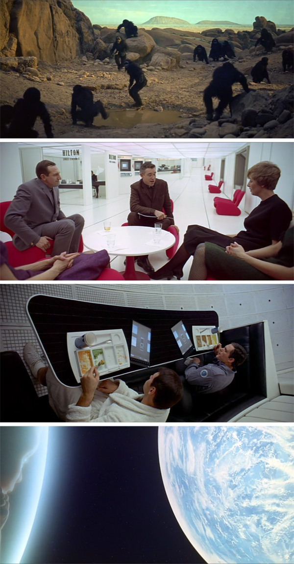
Figure 2: Top to bottom: four chronological scenes from the beginning to the end of the film, 2001: A Space Odyssey (Kubrick 1968). The film’s form offers anything but mannered eloquence.
There are benefits and drawbacks to both mannered and styled form. The benefit of mannered eloquence in film is that it tends to induce within viewers a psychology of power over what is being viewed; the form is conventional and easy to predict (Burke 1968, 167). However, mannered eloquence also presents a danger of monotony. Unless something distinct is introduced in the form—a unique plot twist, for example—viewers may not become as emotionally involved or accurately perceive the ideology of a film. For example, how many standard romantic comedies can one see before becoming completely disinterested in finding meaning from them? The meanings of such films are almost expected to be cliché, and therefore people generally do not absorb much meaning from them.
Styled eloquence is often far more complex and interesting for viewers, particularly when it comes to finding meaning in an art form. The downside of styled eloquence is that it runs the risk of diffusing the communication of a film to an extent that a director’s desired meaning, or main point, is completely lost. The film 2001: A Space Odyssey has resulted in an inordinate number of hypotheses looking for deeper meaning. Perhaps, as is sometimes the case with art, the form itself was merely meant to provoke thought—there was no intent to foster a specific meaning. However, meaning is created and constricted by form, and the styled eloquence of this film has obviously resulted in a breadth of idiosyncratic perceptions of what the film is “really” about.
A viewer’s interpretation and appreciation of a film is still very much a cognitive process. People will interpret films differently based on their previous experiences, beliefs, cultural traits, and current moods. As occurs with those reading maps, film viewers have formal expectations about the form that films should take. When these expectations are not met, viewers will either become excited or agitated. Also, there are film conventions and expectations to adhere to; one who goes against the grain too much risks becoming a pariah. On the other hand, if successful, they could become the next Stanley Kubrick or Fritz Lang. Determining which type of eloquence to lean toward—mannered or styled—is always a difficult but fundamental task for any filmmaker developing a new project.
FILM FORM AND INTERPRETATION
As they begin viewing a film, audiences start looking for patterns that will allow them to create expectations about its form. Effective form gets an audience involved: “You as a viewer or listener don’t simply let the parts [of a film] parade past you. You enter into an active participation with them, creating and readjusting expectations as the pattern develops” (Bordwell & Thompson 2004, 51). Form impacts film viewing mostly because it creates the impression that everything is there; you will not need to look outside of the film to understand the information being presented. Thus, the better the elements of a film interact with one another, refer to one another, mimic one another, and complement one another, the easier and generally more enjoyable film interpretation will be. For example, people expect prominent characters from early in a film to appear again at some point. If characters are introduced in detail and never again appear, film viewers will be confused, if not downright disappointed. People look for resolution. A great example of whetting people’s appetites is found in Pulp Fiction (Tarantino 1994). The film starts with a couple contemplating burgling a diner and cuts away as soon as they begin the process. For over two hours the movie continues by introducing numerous characters and plots in a non-chronological fashion. Though most in the audience do not realize it, viewers are immediately looking for resolution: what did the first scene have to do with the movie? The answer only comes at the very end when the film cuts back to the diner (Figure 3). The audience’s appetite, created by cutting away at the beginning of the film, is satiated.
Audiences also tend to enjoy motifs—dominant and repetitive themes throughout films—that help them tie different film elements and scenes together. In film, this is often done through repetitive dialogue. In The Big Lebowski, the main character sees President George H. W. Bush say “This aggression will not stand,” on a television in the background. Throughout the rest of the film the line is repeated. In Clerks, the line “I’m not even supposed to be here today!” is repeated throughout the film to tie numerous, erstwhile scenes together. The effective repetition of motifs can also be used to better help audiences pick up on implicit meanings. District 9 is a film that is explicitly about aliens being treated as second- or third-class citizens. However, through derogatory and pejorative language toward the aliens that mimics that of racist America and South African apartheid, implicit meanings can be made between the aliens in the movie and the treatment of undocumented immigrants and minorities today.
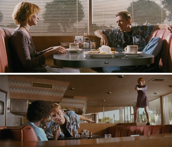
Figure 3: The characters introduced in the first scene of Pulp Fiction (top; Tarantino 1994) are never referred to again until the last scene (bottom), bringing the audience resolution.
FORM AND MEANING
As with maps, the main point of all films is to communicate—be it a narrative, an argument, or description broadly. In essence, it is often the goal of the filmmaker to construct a piece of art that conveys a desired meaning to those viewing it. Film viewers are constantly looking for larger significance, suggestions, and discrepancies in what is being presented. Though the director of a film cannot control what or how people find meanings in a film, what they do with a film’s form (i.e., structure) will both limit and guide viewers’ options. Form shapes the possible meanings that can be created from a film. Bordwell and Thompson (2004, 55–58) break film meanings down into four types: referential, explicit, implicit, and symptomatic. All films can be scrutinized by these four meanings, though many viewers never consciously consider them.
Referential meaning is a “bare-bones plot summary” that is “very concrete” (Bordwell & Thompson 2004, 55). For example, in the film Snow White and the Seven Dwarfs (Cottrell et al. 1937), an evil stepmother is upset that she is no longer the most beautiful woman in the kingdom. She orders her stepdaughter, Snow White, to be killed, but the person put in charge of doing this lets her escape. Snow White makes friends with some dwarves in the forest. The stepmother finds her and poisons her. She is revived when a prince kisses her. She and the prince fall in love and live happily ever after. This is a banal, generalized recitation of what the film shows us. It is merely referential.
Explicit meaning represents the core ideological point of the film. It is typically quite clearly presented in the film’s form and points to the moral or global ideology being promoted. In the case of Snow White, it is something akin to “good triumphs over evil.” The kindhearted are rewarded.
Implicit meanings are always myriad. Audiences create implicit meaning based on what they feel a film “suggests or implies.” Thus, implicit meanings are always open to interpretation. In the case of Snow White, the implicit meanings range from cliché—“stepmothers are evil”—to socially complex and controversial (e.g., “ideal women are well-mannered housekeepers”). Other implicit meanings might include a scathing critique of narcissism and promotion of mirror-phobia.
Symptomatic meanings are the least likely to be created by general audiences but are very useful for film analysis and critique. Symptomatic meanings stemming from film form are those that are subsumed within a dominant ideology (i.e., mode of thought) at the time of production. Films are accidentally and purposefully embedded with contemporary beliefs, tensions, fears, or thoughts that dominate society at the time of their creation (e.g., patriarchy, capitalism, racism, political correctness, environmentalism, nationalism, right to privacy, etc.). Dominant ideologies are always manifest within films to some extent; however, films can also be used to promote counter-ideologies and critiques of society (Taylor 1999). For example, the film South Park: Bigger, Longer & Uncut (Parker 1999) is a complete take-down of United States prime modernity—American society’s self-image. In Snow White, it might be surmised that patriarchy is one symptomatic meaning—women depend on strong men for survival: the huntsman, the dwarves, or the prince. This was a dominant discourse of the era, and the film effectively reified gender roles—by contrasting Snow White’s discourse on gender roles to more contemporary animated films such as Brave and Frozen, the import of symptomatic meanings becomes hard to ignore. Also, the happy ending in Snow White is symptomatic of the fact that the United States was in the midst of an incredibly long depression when the film arrived in theaters; it represented hope for the future, even though it may have seemed as though all was lost.
THE LINK BETWEEN FILM AND MAP FORMS
All communication, and any subsequent meanings derived from it, depends on form. Though film (and to be fair, literature and graphic design) studies have theorized, conceptualized, and operationalized form so that it can be analyzed and critiqued, cartography has yet to come up with an easily applied strategy for doing so. The rest of this paper outlines how the above cinematic concepts might be parlayed into new approaches for analyzing and critiquing map design.
DEFINING MAP FORM
Like all forms, map form has a foundation. The foundation of map form is the medium on which it is presented. Just as a book’s form is typically found between two bound covers, a paper map’s form consists of everything encompassed on the sheet of paper. If instead one is using an interactive map on a tablet, then form is everything found on the screen. The meanings, ideologies, and eloquence of a map’s communication will always be built upon its medium through the construction of form.
Map form is much more than just the content found within a frameline. Crucially, form includes how objects found within the medium interact with and relate to all other objects found therein. Cartographers have traditionally called many of these objects map elements and data (Dent, Torguson, & Hodler 2008). The key to understanding how a map helps users create meaning (e.g., understanding) is found in how well all map elements interact—their symbiosis. How accurately data are presented is frequently only one aspect of this. Evidence is beginning to accrue that emotional response to form is just as, if not more, important than the richness of data content when it comes to impactful visual design (Muehlenhaus 2012; Wrigley 2013). Map communication is always enhanced or hurt by decisions made about map form.
Unfortunately, cartography has a tendency to miss the big picture. Cartography textbooks often dwell on individual element design, with each element being treated and discussed in isolation, instead of focusing on map form broadly. For example, in a mapping class an instructor might spend considerable time teaching the appropriate design of a legend for quick and easy interpretation of a map. This is an example of map element fixation. When mapmakers are critiqued on the arrangement of elements inside a legend instead of how well the legend itself interacts with the other map elements, cartographers avoid discussing the main point of the map: how well it facilitates an interpreted meaning (Wood & Fels 1986). Yes, the legend has its own form, and there are conventions to be followed in most circumstances, but all of these rules should be broken if they do not support the effectiveness of the entire map’s form. Just as films with good form will often tie scenes together via motifs, repetitive dialog, or color schemes, maps with good form will tie map elements together to facilitate the ideology or broader meanings a map is attempting to communicate (see Figure 4). Effective map form demands elements act in concert with one another.
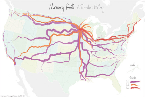
Figure 4: An example of a minimalist legend that reinforces motif and plays an important role in the entire form of the map (by Brita Swanson, University of Wisconsin–River Falls).
Form includes everything, including the outcomes of data model decisions regarding what content to include in the mapped area and how to represent it. Many academic geographers still have indigestion over the ubiquitous use of the Web Mercator projection and the potential impact it will have on people’s view of the world (Battersby, Finn, Usery, & Yamamoto 2014)—myself included—without admitting to themselves that any other projection is also an ideological decision and just as unreal as a Web Mercator. Deciding which projection to use as a cartographer is little different than filmmakers deciding which camera angle and lens-type to use when filming a scene: reality is constructed regardless of the lens chosen (Figure 5). Decisions made about how to present map elements and which elements to include are as central to map design as they are to a director deciding what to include in the background set of a studio shot. Like props on a set, a north arrow may help your map communicate more clearly or look more scientific, but it may also distract from the meaning (i.e., interpretations) one is attempting to communicate. In some films, minimalism is the motif, whereas in others visual overstimulation is the goal. This is no different with maps; mapmaking involves making design decisions about what to include and exclude on a case-by-case basis, depending on your communicative goals.
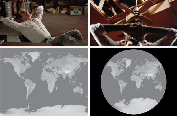
Figure 5: Top row: from the film Blood Simple (Coen 1984), a camera view showing an office from the top down (i.e., the floor is visible but not the ceiling or walls), followed by a camera viewpoint from near the ground upward (i.e., the ceiling is visible but not the floor or walls). Both represent the office differently. Below, an example of two different projections used to show the Earth, both of which show the impossible: the entire world at once. Both of these scenes are fake: the office is a studio set; the Earth image is made-up and speculative of what the Earth would look like without humans.
MAP ELOQUENCE
Anyone who has used more than a handful of maps in their life knows that some maps are more eloquent in form than others. The emotional impact one receives viewing a map in the Atlas of Design (Wallace & Huffman 2012) or the Atlas of World Affairs (Smith 2012) is going to be much different than when looking at a map of the same information in a default GIS template. In cartography circles the eloquence of a map’s form is often referred to—sans operationalized definition—as map style or aesthetics. In recent years there has been an alarmist concern among many cartographers—myself at times included—that map style and aesthetics are worsening. However, without a clear definition of what makes a map style better or worse, it has been very difficult to do much more than worry and opine about stylistic changes.
Applying Burke’s (1968) concept of eloquence proves quite useful here. Rather than saying that map style and aesthetics are worsening with the ubiquity of GISs, or Web mapping APIs, it may be more accurate to say that a majority of these maps are exceedingly mannered in form and not always as effective as they might be. Contrarily, many of the maps created by those without a cartographic background and sans GISs may naturally end up having a more styled form. Many of these mapmakers’ ideas of what a map is or should be are not guided by disciplinary conventions. An analogy might be made to watching a show produced for C-Span (or any other public news channel) versus one produced for MTV. C-Span information is very documentarian; MTV’s is more visceral. However, if MTV-esque form were used in C-Span programming, it would cease being C-Span to a majority of its viewers; they would likely rebel.
No maps are purely mannered or styled in form. All maps fall somewhere on an axis in between the two extremes. Those that fall in the middle are often the least eloquent in design; their form is confusing and ineffectual. The benefit of adopting Burke’s (1968) mannered-versus-styled eloquence concept for use in studying map aesthetics is that it has already been accidentally expanded upon in graphic design and cartographic literature. Without stating as such, Dondis (1973) and Muehlenhaus (2011) have both proposed methods for analyzing different dimensions of form eloquence. Dondis (1973) proposes that all images, including film, can be analyzed based on different design decisions the designer makes. She breaks these down into numerous “continua” lying between two extremes—which she terms harmony and contrast (Dondis 1973, 110–125). In turn, I adapted many of Dondis’ continua for use in map analysis (Muehlenhaus 2010; 2011). I was specifically interested in studying persuasive maps, but argued that the concepts were likely universal and applicable to all maps. Figure 6 highlights some of the continuums I proposed, placing them within Burke’s (1968) mannered-versus-styled eloquence model. Theoretically, it may be possible to analyze maps based on these different continuums of map form, analyze the relationships between the continuums, and figure out which techniques coupled together result in more mannered or styled forms of eloquence. If we combine the hypotheses of Burke, Dondis, and myself, we should be able to, at least cursorily, analyze the eloquence of form in different maps.
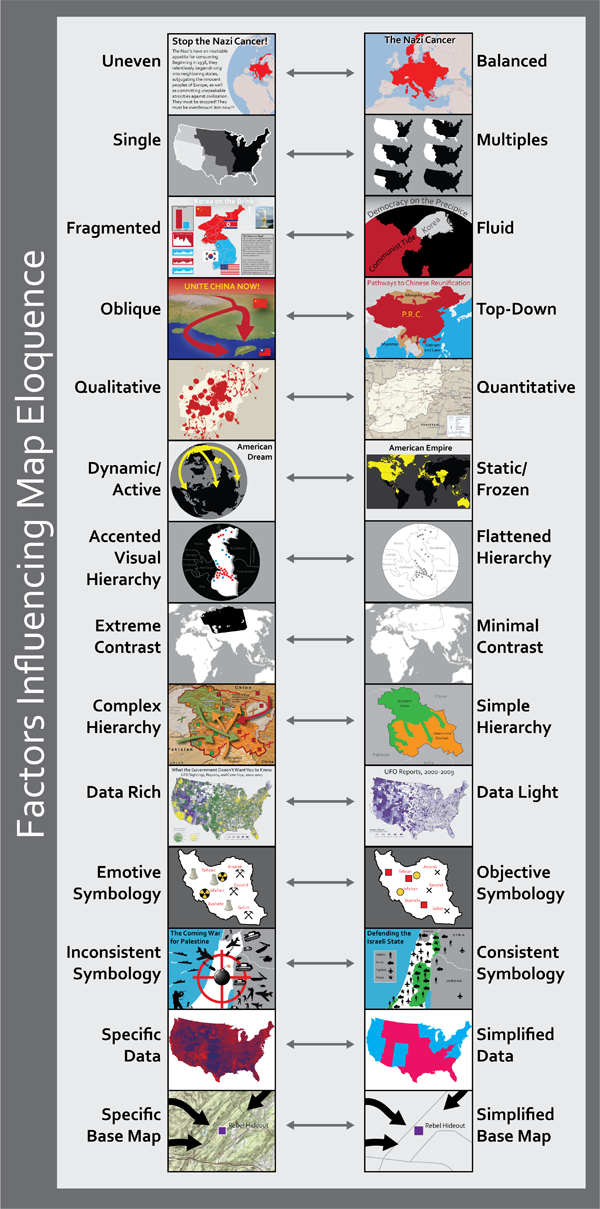
Figure 6: How my 2010 continuums based off of the work of Dondis (1973) might be arranged within Burke’s (1968) model of eloquence. Further exploring and modifying these design concepts may allow cartographers to systematically address map form and determine which combinations of form manipulation produce more styled or mannered map aesthetics.
EXAMPLE: EXPLORING THE ELOQUENCE OF A MINARD MAP
Charles Joseph Minard’s maps from the 1800s are considered some of the greatest thematic cartographic works ever produced (Robinson 1982). His cartographic contributions are typically considered to be extraordinarily innovative when it comes to visualizing quantitative information (Tufte 1991). Thus, in this section one of his more famous flow maps (see Figure 7) has been chosen for exploratory analysis to better highlight the potential of analyzing map eloquence using ideas borrowed from film. In this map, Minard used the concept of proportional flow lines to highlight global migration in 1862. At first glance, one cannot help but opine that this map has certain panache and style that few maps from 1862 had. It is unique. Yet, this does not go very far in helping us understand why it still strikes people as a visual classic today.
Taking Burke’s theory of eloquence and my own adaptation of Dondis for maps, we can quickly begin to break down map form into design decisions. The map is asymmetrical but balanced. It is a single map with a fragmented layout, top-down perspective, and quantitative representation. It is dynamic; it screams movement and interconnection. It has an accented visual hierarchy, punctuated by bright colors. The contrast is not unobvious but not excessively extreme. The visual hierarchy is quite simple for the amount of data being shown. By today’s standards this map is fairly straightforward and might be considered data-light: it is not multivariate. The symbology is geometric and consistent. Though light on data, the representation of the data is extremely accurate. Numerous flow branches break off from the main immigration routes to show detail to relatively small places. Also, data numbers are provided throughout the map to help the map user interpret true values. The base map is intentionally generalized and simplified. The projection appears to be a legitimate cylindrical projection, but the landmasses are grossly distorted to fit the communication goals of the map (e.g., look at the size of Réunion Island in the Indian Ocean).
Though the above paragraph presents an admittedly unromantic cursory analysis of Minard’s map, using a more specific approach to understanding map form might help cartographers better learn how to design timeless pieces of their own. Every map’s form lies somewhere on the continuum between mannered and styled eloquence. I hypothesize here that it may be possible to standardize and analyze the eloquence of a map’s form by further modifying or adapting my own (Muehlenhaus 2010; 2011) map design continuums. Though beyond the scope of this paper, it seems reasonable to suggest that mannered map forms probably tend to use opposite visual techniques than styled map forms. Regardless, the key takeaway from film studies is that cartographers can start exploring and critiquing map eloquence (i.e., aesthetics) more systematically and holistically than has been done previously. It will require, however, a leap of faith on the part of cartographers: a need to value map form over data accuracy and richness.
MAP FORM, AUDIENCE EXPECTATIONS, AND MAP INTERPRETATION
As with film, map viewers bring expectations and thoughts about what maps are and should look like when they view them. In many situations, producing a map in a mannered style is ideal, because it makes use of visual cues that will allow map viewers to preemptively know what they should look for. Playing off of people’s expectations is extremely useful, as it allows people to make decisions quickly and navigate a visual design. To use an earlier example, mystery dramas are not boring or bad by default, though a vast majority of these films follow exactly the same narrative structure. One reason mysteries are so widely watched is because familiarity of the film’s form means that the audience can focus on its idiosyncratic aspects: subplots, characters, unique settings. In fact, Ovans (2014) has argued that narratives are so predictable they can be quantified and broken down into types. The same thing is possibly true for mannered maps.
For example, when viewing a You-Are-Here map in a mall, little is more frustrating than not being able to find where you are. One expects a large arrow. When such maps do not heed this convention, map users often become confused and angry. Searching for where you are on a map takes away from observing where one is in relation to other features on the map and also from the task of determining a route. When designing a You-Are-Here map, mannered form is ideal. People expect it. When designing maps for navigational uses, one should always consider map user expectations.
On the other hand, many maps benefit from a styled form because it is their form that makes them worth viewing at all. If these maps were not styled, they may never have garnered one’s attention to begin with. Examples of such form over function maps are those comprised entirely of typography (Figure 8). If one were simply to write the name of the most commonly used word found on each country’s “History of…” Wikipedia page and label each country with it, few people would bother to look. However, the form and styled eloquence of the map—with its unexpected and flamboyant style and countries drawn using only type—draws people in. It makes the message exciting. It screams to be looked at; it wants the map user to create meaning from it. Contrary to what many academics espouse, people are very happy to choose form over function if the style is enticing. This has been known in cinema for a long time; people are happy to pay to see action movies with minimal plots and poor scripts over going to critically acclaimed dramas. Mannered form may earn critical accolades, but in most media, styled form earns income.
Like films, maps serve myriad purposes. Academic cartographers love to focus on information visualization and rightfully so. Arguably, maps can communicate far more spatial information, far more quickly, than any other method of communication invented. However, map form does not need to aspire to the rules of quantitatively accurate representation. In fact, many times it should not. Meaning is not created through the presentation of facts; meaning is created through the interpretation of form—which may or may not accurately represent facts (Burke 1968).
A map’s form will impact how it is interpreted. It will cue readers as to the purpose of the map. As with film and writing (Chatman 1990), map form can be designed to do one of three things: (1) it can explain and describe (expository cartography); (2) it can narrate (narrative cartography); or (3) it can argue (persuasive cartography). These three objectives are not mutually exclusive; they often overlap. Narrative design can be used to help make an argument or explain something. Expository designs can be used to make ideological arguments or contextualize a narrative.
EXAMPLE: FORM, EXPECTATIONS, AND INTERPRETATION
Weapons for Destruction (Figure 9) was designed by Nathan Noble, an undergraduate student in my introductory cartography class. He created the map for a flow map lab assignment. As it was Nathan’s first map and GIS course, he had not been indoctrinated with the idea that maps should strive to be objective. I was expecting the students to turn in a bunch of mannered, expository flow maps.
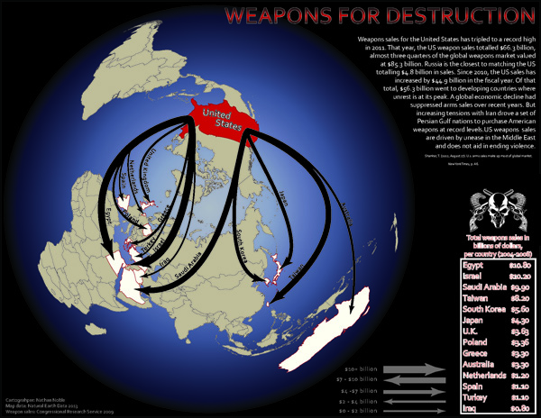
Figure 9: This map describes small arms shipments from the United States of America to the rest of the world (expository) and argues that the United States plays a negative role in the world because of its small arms sales (persuasive/argumentative). Map created by Nathan Noble, @THENateNoble, 2013, Department of Geography and Earth Science, University of Wisconsin–La Crosse.
Weapons for Destruction is anything but a mannered, expository flow map. The unique projection places the United States at the top of the map, implying an overlord like power over the entire world. The flow arrows pierce out of the demonically colored United States like evil tentacles. The countries being penetrated by the arrows are colored white, implying the end of their innocence. Most tellingly, however, is the title. The title immediately informs the map user that this is not just another fake-objective map—it is a call to action! The map not only provides data, it provides an anti-US arms sales message, and acts in addition to this as a narrative map, providing a modern history of United States’ arms sales to the world. Though some of the design decisions may not win any awards, the form of the map itself will garner attention by going against contemporary data map expectations, and people will likely interpret this map very differently than other representations of arms sales due to the map’s complex overlap of expository, argumentative, and narrative purpose.
As with film, map users are not passive interpreters. They engage the material and, depending on form, they will interpret the goals of a map differently. If the goal of one’s map is to make an argument, to take a position on the way reality ought to be, then designing your map elements in such a way as to subjectively highlight one’s biased position may be ideal. It will help map users immediately realize that the map is making an argument. Rather than turn map users off, overt subjectivity may actually make the argument being presented more convincing (Muehlenhaus 2012). Map form cues users about what to expect on a map and also about how to respond to it. The least meaningful maps are often those that do not adequately use form to promote a particular meaning.
MAP MEANINGS
“To create is not to have an idea that searches for its form; to create is rather to have a form that searches for its meaning.” — Gunnar Olsson (in Buttimer & Haegerstrand 1984, 01:01:30)
Maps have never been about presenting data; they have always been about guiding an audience to create certain meanings—meanings that enlighten, persuade, or tell stories. Since Wood and Fels (1992), if not less explicitly before (Harley 1989), it has been known that something as banal as a state highway map is loaded with meanings beyond getting from point A to point B. As in film, the most objective-looking maps make effective use of form to help map users “suspend their disbelief” (i.e., they stop being aware of the fact that what is being viewed is a completely fabricated version of reality). The power of maps is never truly found in their referential meanings; the power of maps is found in their explicit, implicit, and symptomatic meanings.
Determining a map’s multiple meanings is a creative process. It begins with the cartographer, who uses map form to limit and guide map users’ interpretations. It then moves on to the map user who, given a variety of visual cues, must create meaning from the map using a combination of previous map-reading experience, expectations, cultural norms, and personal biases. Here the four types of meaning espoused in film studies again prove useful when adapted to maps. For even though a map user may think they are only creating a referential meaning when looking at a map (e.g., number of whales harpooned off of Norway each year), and perhaps an explicit meaning (e.g., whale hunting is bad), subconsciously they are creating or at least reifying other implicit meanings (i.e., Norway is bad because it allows whale hunting). Figure 10 represents a map with myriad meanings (Windsor & Muehlenhaus 2013). From an information visualization standpoint, this map may generalize too much and may not satisfactorily attempt to be objective. However, evaluated on the basis of map form, the map is layered with meaning.
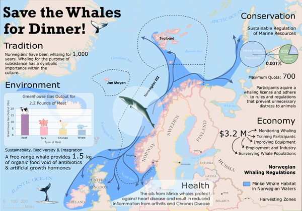
Figure 10: This map was created for a project testing the impact of persuasive map design (Windsor and Muehlenhaus 2013). The map is pro-Norwegian whale hunting. The goal was to create a map that made map viewers explicitly, and preferably implicitly, decide that Norway’s whale hunting was probably ethical and not bad for the environment. Map created by Mary Windsor, University of South Carolina, who, for the record, does not condone whale hunting.
Symptomatic meanings are often completely left unattended by a map user, but they are also there to be interpreted and created in every map. What is the rationale or reason for the existence of a map about Norwegian whale hunting? This question is generally too philosophical or abstract for general audiences to focus on, but it is a question that those in the geographical sciences should be as interested in as any other. What is any given map’s role in society at large? Why did it come out when it did, and why was it distributed to a certain population? Why was its reception so positive, negative, or neutral? These are the questions used to understand a map’s symptomatic meaning. Certainly such research contextualizing mapmaking is ongoing (see for example work by Jeremy Crampton [1995] and Pickles [2004]), but often critical cartography is treated separately from cartographic design. It should not be; interpreting the symptomatic meanings of maps is as fundamental to understanding how maps work as knowing about appropriate quantitative representation.
EXAMPLE: IDENTIFYING THE MEANINGS OF BIG DATA MAPS
Every map has meaning; in some maps, however, meaning is more difficult to find than in others. Big data maps often suffer from this problem. It can be difficult to consciously create explicit or implicit meanings from big data maps, as the maps are often data-centric and the information being presented is non sequitur. For example, what are the implicit and explicit meanings of a map animating one million live tweets about the Super Bowl (see srogers.cartodb.com/viz/1b9b0670-8d15-11e3-8ddf-0edd25b1ac90/embed_map)? The big data maps that will truly stand out are those that adequately posit explicit and implicit meaning. Generally, this will require presenting a description, narrative, or argument of intrinsic value to those viewing the map—e.g., climate change, human trafficking, etc. Though a cool looking animation, Super Bowl tweets probably will not make the cut.
This is not to say that the thousands of big data maps being produced these days have no value or meaning. In fact, they are fascinating in what they tell us about society at large. Big data maps might best be described as manifestations of society’s obsession with the massive amounts of social data being collected and shared right now. These maps represent creative outlets stemming from contemporary society’s data-fetishism. Though the data being mapped may not highlight anything of interest, the maps themselves still have meaning. They are symptomatic of, and reinforce what might best be called the “Positivism 2.0” ideology that dominates in the sciences right now.
RETHINKING MAP EVALUATION AND CRITIQUE
Map evaluation and critique are key components of the cartographic discipline. It is through critique that mapmakers hone their skills. It is through emulation of exemplars that standards are set and conventions become assigned. All disciplines have their own rules for evaluating what is conventional and unconventional. Such rules are not only used to forge discipline standards, but to maintain the socially constructed discipline itself. Though mapmaking has been around forever, cartography as a discipline has not (McMaster & McMaster 2002; Wood 2003). During this time, the cartographic discipline has had a limited, indeed quite academically conservative, view of how maps should look (Muehlenhaus 2013). In the discipline, maps are often evaluated based on content instead of form.
Accuracy is often at the forefront of critique in cartography. However, film studies illustrate the power of critiquing media based on form. It is proposed here that critiquing maps not on discipline conventions but instead on their form may result in more useful and meaningful evaluations. Adopting film studies-like critiques in cartography, we can start evaluating maps based on how layered and nuanced their meanings are, and how eloquently they achieve their purpose, instead of basing our evaluations on a hodge-podge of traits such as how accurate, scientific, and modern they are. Instead of grading maps based on depth of data, we can analyze them on the depth of their expositions, narratives, and arguments—how convincingly they make us suspend our disbelief and open new paths of understanding.
Additionally, analyzing contemporary maps’ symptomatic meanings will indubitably shed far more light on how unique or creative a map design truly is. Joseph Minard’s maps were symptomatic of the rise of the nation-state and showed the potential power of thematically representing newly acquired economic and demographic data (Robinson 1982). He experimented with flow maps that today the best GIS programs still cannot mimic. The reason his maps are remembered, though, is not for their quantitative depth or flow lines: it is because of their form. They are stunningly eloquent. Likewise, in 10 years all of the Beck-themed maps of highway and anatomy systems—many of which are indeed quite beautiful—will likely be more accurately seen for what they really are: a symptom of a Reddit MapPorn addiction, while Beck’s original map will remain a classic (for a critique of the contemporary abundance of Beck-themed maps, see Cartwright & Field [2013]).
FUTURE DIRECTIONS
Adapting cinema’s concept of form for cartography is not necessarily an end in itself; it potentially opens up numerous avenues for map analysis and classification. Though form and meanings are unique for each map and individual map user, it is likely that certain genres exist and are identifiable. Genre is central to film analysis, but its definition is a bit looser than that of film form. The word comes from French and means “kind” or “type.” It is a way of grouping films together based on their form, meanings, and other attributes (Schatz 1981). A map genre therefore might be defined as clusters of map types determined by map form, purpose, and meaning.
An argument could be made that map genres are already defined. After all, cartographers talk about thematic, reference, and perceptual maps. Within thematic cartography we have a variety of sub-categories (e.g., choropleth, isarithmic, and dot maps). We also have Web maps, persuasive maps, and story maps. Theoretically, all of these might be thought of as genres. However, if cartographers start focusing on map form, a more robust and aesthetics-centric group of genres may present themselves. New genres and subgenres that were never obvious may emerge as well. Most interestingly, establishing map genres based on form may help us better identify what makes certain maps “classic.” It may also shed light on major shifts in map aesthetic and eloquence, as certain maps might be identified as genre-busters (i.e., some may break the mold of a genre to create new sub-genres or redefine what a genre is). For example, Beck’s underground map would almost certainly qualify as a genre buster when it comes to reference maps. More recently, the definition of a reference map was shattered by Google Maps’ multimedia, multi-scaled, slippy map approach.
Another area of film studies to look at adapting may be in the area of discourse-texts. Chatman (1990) argues that films and literature take one of three broad discourse structures: descriptive (i.e., expository), narrative (i.e., story), or persuasive (i.e., argumentative). More systematically addressing how map discourse is constructed based on film and literature theory may be help us better understand map types that are not merely expository. This would be of particular benefit given the contemporary resurgent interest in narrative cartography fueled in part by Esri Story Maps. Stories can be told in a multitude of ways, and exploration of how to implement different plot-development and argumentative devices into maps is an area definitely ripe for exploration.
CONCLUSION
Cartography and film have a synergetic relationship. Just as filmmakers are increasingly turning to cartographic theory to learn more about their art form, cartographers stand to gain by adapting relevant film concepts. I have argued here that applying film theory’s concept of form to maps will help us better define and understand map aesthetics, purpose, and meaning.
Embracing the concepts of form, eloquence, and meaning is imperative for designing effective maps. The manipulation of form is what guides and fosters meanings among map users. The concept of eloquence may be a foundational cornerstone that finally allows cartographers to better address map aesthetic. Furthermore, evaluation of map form and meaning—instead of particular map objects and or data content—may provide cartographers a more sophisticated and nuanced method of map critique.
ACKNOWLEDGEMENTS
I would like to thank Sebastien Caquard for his instrumental helpfulness in getting my literature review underway and answering a variety of questions I had. His work on “cinemaps” has been inspirational. I would also like to thank Robert E. Roth and Anthony Robinson for organizing the session at the 2014 Association of American Geographers Annual Meeting where a (very preliminary) draft of this paper was presented. This manuscript simply would not exist if not for Dr. Roger Miller, who combined film studies into many of his geography classes at the University of Minnesota, and inspired me to explore film more thoroughly in my own research. You are missed.
REFERENCES
Battersby, S. E. 2009. “The Effect of Global-Scale Map-Projection Knowledge on Perceived Land Area.” Cartographica 44 (1): 33–44. doi:10.3138/carto.44.1.33.
Battersby, S. E., M. P. Finn, E. L. Usery, and K. H. Yamamoto. 2014. “Implications of Web Mercator and Its Use in Online Mapping.” Cartographica 49 (2): 85–101. doi:10.3138/carto.49.2.2313
Bertin, J. 1983. Semiology of Graphics. Translated by W. J. Berg. Madison, Wisconsin: University of Wisconsin Press.
Boggs, S. W. 1947. “Cartohypnosis.” The Scientific Monthly 64(6): 469–476.
Bordwell, D., and K. Thompson. 2004. Film Art: An Introduction, 7th edition. New York: McGraw-Hill College.
Buckley, A., L. Larsen, S. Benzek, and J. Richards. 2012. “The Aesthetics of Mapping.” Presentation at the NACIS Annual Meeting, Portland, OR, October 17–19.
Burke, K. 1968. Counter-Statement. Berkeley, California: University of California Press. http://books.google.com/books?hl=en&lr=&id=_UarDNRfPqYC&pgis=1.
Buttimer, A., and T. Haegerstrand. 1984. History of Geographic Thought: The Language Prison of Thought and Action. Sweden: International Geographical Union. http://youtu.be/YR25BPFU8Io.
Caquard, S. 2009. “Foreshadowing Contemporary Digital Cartography: A Historical Review of Cinematic Maps in Films.” Cartographic Journal 46 (1): 46–55. doi:10.1179/000870409x415589.
Cartwright, W., and K. Field. 2013. “Beck to the Future: Time to Leave It Alone.” Proceedings of the 26th International Cartographic Conference. Dresden, Germany: International Cartographic Association. http://www.icc2013.org/_contxt/_medien/_upload/_proceeding/439_proceeding.pdf.
Castro, T. 2006. “Les Archives de la Planète: A Cinematographic Atlas.” Jump Cut: A Review of Contemporary Media 48. http://ejumpcut.org/archive/jc48.2006/KahnAtlas/index.html.
———. 2009. “Cinema’s Mapping Impulse: Questioning Visual Culture.” Cartographic Journal 46 (1): 9–15. doi:10.1179/000870409X415598.
Coen, J., and E. Coen. 1984. Blood Simple. United States: Circle Films.
Chatman, S. 1990. Coming to Terms: The Rhetoric of Narrative in Fiction and Film. Ithaca: Cornell University Press.
Conley, T. 2007. Cartographic Cinema. Minneapolis, MN: University of Minnesota Press.
Cottrell, W., D. Hand, W. Jackson, L. Morey, P. Pearce, and B. Sharpsteen. 1937. Snow White and the Seven Dwarfs. United States: Disney.
Crampton, J. 1995. “The Ethics of GIS.” Cartography and Geograhpic Information Systems 22 (1): 84–89. doi:10.1559/152304095782540546.
Dent, B. D., J. Torguson, and T. Hodler. 2008. Cartography: Thematic Map Design. New York: McGraw-Hill.
DiBiase, D., A. M. MacEachren, J. Krygier, and C. Reeves. 1992. “Animation and the Role of Map Design in Scientific Visualization.” Cartography and Geographic Information Systems 19 (4): 201–214. doi: 10.1559/152304092783721295.
Dondis, D. A. 1973. A Primer of Visual Literacy. Cambridge, Massachusetts: The Massachusetts Institute of Technology.
Flint, C., and G. Falah. 2004. “How the United States Justified its War on Terrorism: Prime Morality and the Construction of a ‘Just War.’” Third World Quarterly 25 (8): 1379–1399. doi:10.1080/0143659042000308429.
Harley, J. B. 1989. “Deconstructing the Map.” Cartographica 26 (2): 1–20. doi:10.3138/E635-7827-1757-9T53.
Harrower, M. 2004. “A look at the History and Future of Animated Maps.” Cartographica 39 (3): 33–42. doi:10.3138/7MN7-5132-1MW6-4V62.
Herb, G. H. 1989. “Persuasive Cartography in Geopolitik and National Socialism.” Political Geography Quarterly 8 (3): 289–303. doi:10.1016/0260-9827(89)90043-8.
Hoffman, D. D. 1998. Visual Intelligence. New York: Norton and Company, Inc.
Kloft, M. 1999. Television Under the Swastika. Germany: Spiegel TV.
Kubrick, S. 1968. 2001: A Space Odyssey. United States: MGM.
Lukinbeal, C. 2010. “Mobilizing the Cartographic Paradox: Tracing the Aspect of Cartography and Prospect of Cinema.” Educacao Tematica Digital 11 (2): 1–32.
MacEachren, A. M. 1995. How Maps Work: Representation, Visualization, and Design. New York: Guilford Press.
Mayer, S. L. 1976. Best of Signal: Hitler’s Wartime Picture Magazine. Englewood Cliffs, NJ: Prentice-Hall, Inc.
McCleary, G. 2012. “Beyond Map Layout and Design… Aesthetics?” Presentation at the NACIS Annual Meeting, Portland, OR, October 17–19.
McMaster, R. B., and S. McMaster. 2002. “A History of Twentieth-Century American Academic Cartography.” Cartography and Geographic Information Science 29(3): 305–321. doi:10.1559/152304002782008486.
Muehlenhaus, I. 2010. “Lost in Visualization: Using Quantitative Content Analysis to Identify, Measure, and Categorize Political Cartographic Manipulations.” PhD diss., University of Minnesota.
———. 2011. “Genealogy that Counts: Using Content Analysis to Explore the Evolution of Persuasive Cartography.” Cartographica 46 (1): 28–40. doi:10.3138/carto.46.1.28.
———. 2012. “If Looks Could Kill: The Impact of Rhetorical Styles in Persuasive Geocommunication.” Cartographic Journal 49 (4): 361–375. doi:10.1179/1743277412Y.0000000032.
———. 2013. “The Design and Composition of Persuasive Maps.” Cartography and Geographic Information Science 40 (5): 401–414. doi:10.1080/15230406.2013.783450.
———. 2014. “Going Viral: The Look of Online Persuasive Maps.” Cartographica 49 (1): 18–34. doi:10.3138/carto.49.1.1830.
Ovans, A. 2014. “To Tell Your Story, Take a Page from Kurt Vonnegut.” HBR Blog Network. Accessed June 19. http://blogs.hbr.org/2014/04/to-tell-your-story-take-a-page-from-kurt-vonnegut?.
Parker, T. 1999. South Park: Bigger, Longer & Uncut. United States: Comedy Central Films.
Pickles, J. 1992. “Text, Hermeneutics and Propaganda Maps.” In Writing Worlds: Discourse, Text, and Metaphor in the Representation of Landscape, edited by T. J. Barnes & J. S. Duncan, 193–230. New York: Routledge.
———. 2004. A History of Spaces: Cartographic Reason, Mapping, and the Geo-coded World. London, New York: Routledge.
Roberts, S. M., R. H. Schein, M. Dear, D. Gregory, and N. Thrift. 1995. “Earth Shattering: Global Imagery and GIS.” In Ground Truth, edited by J. Pickles, 171–195. New York: Guilford Press.
Robinson, A. H. 1982. Early Thematic Mapping in the History of Cartography. Chicago: University of Chicago Press.
Schatz, T. 1981. Hollywood Genres: Formulas, Filmmaking, and the Studio System. New York: Random House.
Shohat, E., R. Stam. 1994. Unthinking Eurocentrism: Multiculturalism and the Media. London: Routledge.
Smith, D. 2012. The State of the World Atlas. New York: Penguin Books.
Speier, H. 1941. “Magic Cartography.” Social Research 8(3): 310–330.
Tarantino, Q. 1994. Pulp Fiction. United States: Miramax.
Taylor, P. J. 1999. Modernities: a Geohistorical Interpretation. Minneapolis: University of Minnesota Press.
Tobler, W. 1970. “A Computer Movie Simulating Urban Growth in the Detroit Region.” Economic Geography 46: 234–240. doi:10.2307/143141.
Tufte, E. R. 1991. Envisioning Information. Cheshire, Conn.: Graphics Press.
Verhoeven, P. 1997. Starship Troopers. United States: TriStar Pictures.
Wallace, T. R., and D. P. Huffman, eds. 2012. Atlas of Design. Milwaukee: North American Cartographic Information Society.
Windsor, M., and I. Muehlenhaus. 2013. “See What We Mean? Measuring the Effectiveness of Different Map Rhetorical Styles for Persuasive Geocommunication.” Presentation at the Association of American Geographers Annual Meeting, Los Angeles, California, April 9–13.
Wirsing, G. 1941. Der Krieg 1939/41 in Karten. Munich: Verlag Knorr und Hirth.
Wood, D. 2003. Cartography Is Dead (Thank God!). Cartographic Perspectives 45: 4–7. doi:10.14714/CP45.497.
Wood, D., and J. Fels. 1986. “Designs on Signs: Myth and Meaning in Maps.” Cartographica 23 (3): 54–103. doi:10.3138/R831-50R3-7247-2124.
———. 1992. The Power of Maps. New York: Guilford Press.
Wrigley, C. 2013. “Design Dialogue: The Visceral Hedonic Rhetoric Framework.” Design Issues 29 (2): 82–95. doi:10.1162/DESI_a_00211.